- Power BI forums
- Updates
- News & Announcements
- Get Help with Power BI
- Desktop
- Service
- Report Server
- Power Query
- Mobile Apps
- Developer
- DAX Commands and Tips
- Custom Visuals Development Discussion
- Health and Life Sciences
- Power BI Spanish forums
- Translated Spanish Desktop
- Power Platform Integration - Better Together!
- Power Platform Integrations (Read-only)
- Power Platform and Dynamics 365 Integrations (Read-only)
- Training and Consulting
- Instructor Led Training
- Dashboard in a Day for Women, by Women
- Galleries
- Community Connections & How-To Videos
- COVID-19 Data Stories Gallery
- Themes Gallery
- Data Stories Gallery
- R Script Showcase
- Webinars and Video Gallery
- Quick Measures Gallery
- 2021 MSBizAppsSummit Gallery
- 2020 MSBizAppsSummit Gallery
- 2019 MSBizAppsSummit Gallery
- Events
- Ideas
- Custom Visuals Ideas
- Issues
- Issues
- Events
- Upcoming Events
- Community Blog
- Power BI Community Blog
- Custom Visuals Community Blog
- Community Support
- Community Accounts & Registration
- Using the Community
- Community Feedback
Register now to learn Fabric in free live sessions led by the best Microsoft experts. From Apr 16 to May 9, in English and Spanish.
- Power BI forums
- Forums
- Get Help with Power BI
- Desktop
- Re: How to use one slicer to apply the filter to t...
- Subscribe to RSS Feed
- Mark Topic as New
- Mark Topic as Read
- Float this Topic for Current User
- Bookmark
- Subscribe
- Printer Friendly Page
- Mark as New
- Bookmark
- Subscribe
- Mute
- Subscribe to RSS Feed
- Permalink
- Report Inappropriate Content
How to use one slicer to apply the filter to the columns in different tables
Hi,
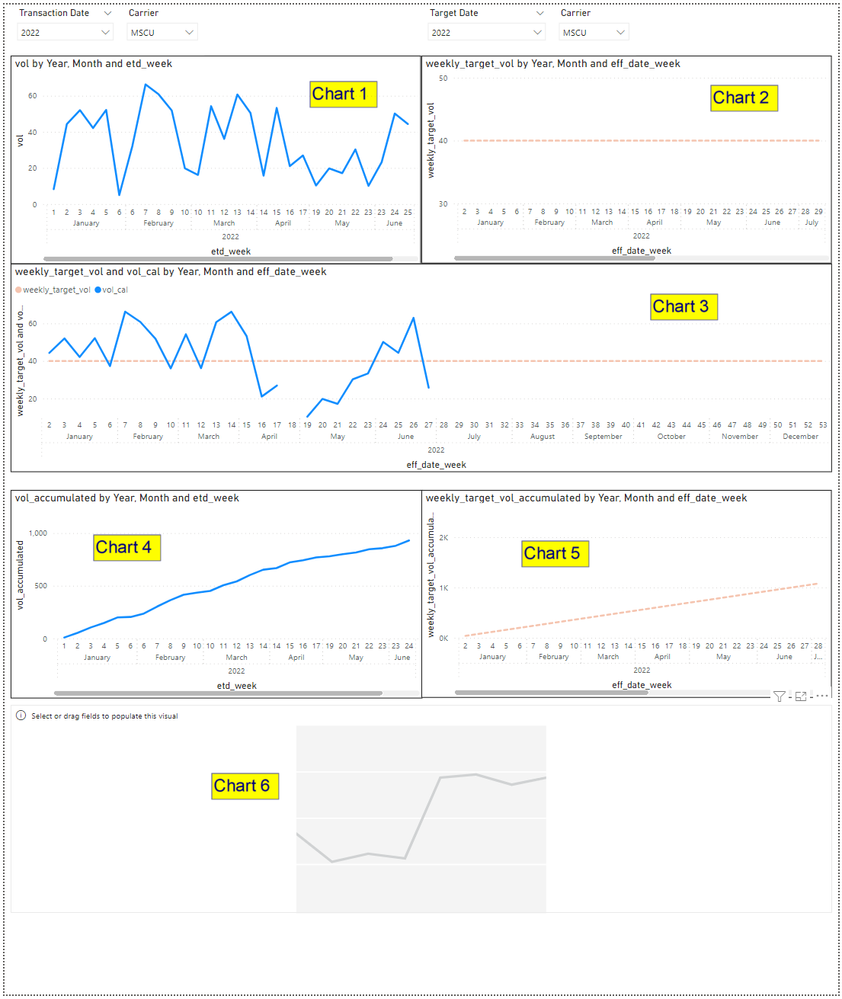
I'm preparing a report with 2 different tables, one is transaction volume table and the other is the target volume master table. There are columns e.g. Date and Carrier containing same content across the two tables. It is required to prepare the charts below:
Chart 1: Transaction Volume by Transaction Date (weekly basis) - done
Chart 2: Target Volume by Date (weekly basis) - done
Chart 3: Combine Chart 1 and Chart 2 into one single Chart - done
And it is required to create one date slicer and one carrier slicer which can apply the filter at the same time to all the 3 charts. But no luck to make it happen. Please any expert can help.
Chart 4: Accumulated Transaction Volume by Transaction Date (weekly basis)
Chart 5: Accumulated Target Volume by Date (weekly basis)
Chart 6: Expected to combine Chart 4 and Chart 5 to one single chart but not work.
Moreover, the above slicers are expected to apply the filter to Chart 4-6 altogether. Hope anyone can help. I have spent more than few days to investigate but still failure. Thanks in advance.
P.S. The file link can download the PBI file currently I have worked.
https://filetransfer.io/data-package/nl5CQOQp#link
- Mark as New
- Bookmark
- Subscribe
- Mute
- Subscribe to RSS Feed
- Permalink
- Report Inappropriate Content
Values in Chart 1 and Chart 3 are corresponded to each other. It seems different because the x-axis of Chart 1 based on the ETD such that data on the week 6 count separately to Jan & Feb. When the data appear in Chart 3, the x-axis of Chart 3 based on the EFF Date and the week 6 count on Jan only. That's why you may see the value of vol on week 6 in Chart 3 is the sum of the two values of vol on week 6 in Chart 1.
Morevover, on week 18, there is no vol data in Chart 1 but the line still link together because x-axis also without week 18. But in Chart 3, because x-axis has week 18 but no vol vol data, that's why the line look like broken and different from Chart 1.
For Chart 6, it is expected similar to Chart 3 that combine Chart 4 and Chart 5 together.
On the other hand, the original question still outstanding about using one slicer to apply the filter on different charts.
- Mark as New
- Bookmark
- Subscribe
- Mute
- Subscribe to RSS Feed
- Permalink
- Report Inappropriate Content
Hi @MRSpedag ,
How did you combine chart1 and chart2?
The value in chart1 does not correspond to the value of vol_cal in chart3 at all.
So what is the expected result for chart6?
Best Regards,
Jay
If this post helps, then please consider Accept it as the solution to help the other members find it.
Helpful resources

Microsoft Fabric Learn Together
Covering the world! 9:00-10:30 AM Sydney, 4:00-5:30 PM CET (Paris/Berlin), 7:00-8:30 PM Mexico City

Power BI Monthly Update - April 2024
Check out the April 2024 Power BI update to learn about new features.

| User | Count |
|---|---|
| 114 | |
| 99 | |
| 83 | |
| 70 | |
| 60 |
| User | Count |
|---|---|
| 150 | |
| 115 | |
| 104 | |
| 89 | |
| 65 |

