- Power BI forums
- Updates
- News & Announcements
- Get Help with Power BI
- Desktop
- Service
- Report Server
- Power Query
- Mobile Apps
- Developer
- DAX Commands and Tips
- Custom Visuals Development Discussion
- Health and Life Sciences
- Power BI Spanish forums
- Translated Spanish Desktop
- Power Platform Integration - Better Together!
- Power Platform Integrations (Read-only)
- Power Platform and Dynamics 365 Integrations (Read-only)
- Training and Consulting
- Instructor Led Training
- Dashboard in a Day for Women, by Women
- Galleries
- Community Connections & How-To Videos
- COVID-19 Data Stories Gallery
- Themes Gallery
- Data Stories Gallery
- R Script Showcase
- Webinars and Video Gallery
- Quick Measures Gallery
- 2021 MSBizAppsSummit Gallery
- 2020 MSBizAppsSummit Gallery
- 2019 MSBizAppsSummit Gallery
- Events
- Ideas
- Custom Visuals Ideas
- Issues
- Issues
- Events
- Upcoming Events
- Community Blog
- Power BI Community Blog
- Custom Visuals Community Blog
- Community Support
- Community Accounts & Registration
- Using the Community
- Community Feedback
Register now to learn Fabric in free live sessions led by the best Microsoft experts. From Apr 16 to May 9, in English and Spanish.
- Power BI forums
- Forums
- Get Help with Power BI
- Desktop
- How to use Multiple columns in same visual
- Subscribe to RSS Feed
- Mark Topic as New
- Mark Topic as Read
- Float this Topic for Current User
- Bookmark
- Subscribe
- Printer Friendly Page
- Mark as New
- Bookmark
- Subscribe
- Mute
- Subscribe to RSS Feed
- Permalink
- Report Inappropriate Content
How to use Multiple columns in same visual
Hi all!
I hope there is a way to do what I want to do ![]()
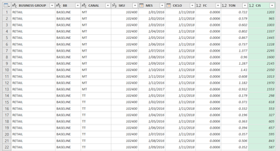
I have this table with the values I need to use in 2 different columns (Ton and Cases) and I want to switch between them in the same visuals (lines, bars, tables, etc) using a slicer or something different.
I used Unpivot option, however, I will exceed the number 1M rows soon if I do so.
Is there any other option I can use??
Tks for the support.
LM
Lima - Peru
Solved! Go to Solution.
- Mark as New
- Bookmark
- Subscribe
- Mute
- Subscribe to RSS Feed
- Permalink
- Report Inappropriate Content
Hi @LuisMedrano
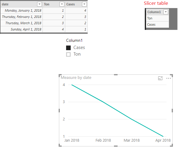
Show a simplified sample as below. First, create the slicer table first. Second, create a measure to get the visual as requested. If it is not your case, please share more details for your scenario so that we could help further on it.
Measure =
IF (
    SELECTEDVALUE ( Slicer[Column1] ) = "Cases",
    CALCULATE ( SUM ( Table2[Cases] ) ),
    IF (
        SELECTEDVALUE ( Slicer[Column1] ) = "Ton",
        CALCULATE ( SUM ( Table2[Ton] ) )
    )
)
Regards,
Cherie
If this post helps, then please consider Accept it as the solution to help the other members find it more quickly.
- Mark as New
- Bookmark
- Subscribe
- Mute
- Subscribe to RSS Feed
- Permalink
- Report Inappropriate Content
Hey,
I'm not sure if I understand your requirement correctly, but I think this post will provide what you are looking for:
https://www.fourmoo.com/2017/11/21/power-bi-using-a-slicer-to-show-different-measures/
If this is not the case, please consider to provide the sample data from your first post as a dataset that we can reuse easily, e.g. upload an Excel file to onedrive or dropbox and share the link.
And also explain in more detail how you visual should look like.
Regards,
Tom
Did I answer your question? Mark my post as a solution, this will help others!
Proud to be a Super User!
I accept Kudos 😉
Hamburg, Germany
Helpful resources

Microsoft Fabric Learn Together
Covering the world! 9:00-10:30 AM Sydney, 4:00-5:30 PM CET (Paris/Berlin), 7:00-8:30 PM Mexico City

Power BI Monthly Update - April 2024
Check out the April 2024 Power BI update to learn about new features.

| User | Count |
|---|---|
| 113 | |
| 99 | |
| 80 | |
| 70 | |
| 59 |
| User | Count |
|---|---|
| 149 | |
| 114 | |
| 107 | |
| 89 | |
| 67 |


