- Power BI forums
- Updates
- News & Announcements
- Get Help with Power BI
- Desktop
- Service
- Report Server
- Power Query
- Mobile Apps
- Developer
- DAX Commands and Tips
- Custom Visuals Development Discussion
- Health and Life Sciences
- Power BI Spanish forums
- Translated Spanish Desktop
- Power Platform Integration - Better Together!
- Power Platform Integrations (Read-only)
- Power Platform and Dynamics 365 Integrations (Read-only)
- Training and Consulting
- Instructor Led Training
- Dashboard in a Day for Women, by Women
- Galleries
- Community Connections & How-To Videos
- COVID-19 Data Stories Gallery
- Themes Gallery
- Data Stories Gallery
- R Script Showcase
- Webinars and Video Gallery
- Quick Measures Gallery
- 2021 MSBizAppsSummit Gallery
- 2020 MSBizAppsSummit Gallery
- 2019 MSBizAppsSummit Gallery
- Events
- Ideas
- Custom Visuals Ideas
- Issues
- Issues
- Events
- Upcoming Events
- Community Blog
- Power BI Community Blog
- Custom Visuals Community Blog
- Community Support
- Community Accounts & Registration
- Using the Community
- Community Feedback
Register now to learn Fabric in free live sessions led by the best Microsoft experts. From Apr 16 to May 9, in English and Spanish.
- Power BI forums
- Forums
- Get Help with Power BI
- Desktop
- How to use 2 different filters on the same value i...
- Subscribe to RSS Feed
- Mark Topic as New
- Mark Topic as Read
- Float this Topic for Current User
- Bookmark
- Subscribe
- Printer Friendly Page
- Mark as New
- Bookmark
- Subscribe
- Mute
- Subscribe to RSS Feed
- Permalink
- Report Inappropriate Content
How to use 2 different filters on the same value in one graph
Hello,
I am using one graph (line chart) for the visualization of one value and I need to extend this visualization. I want to display the second value in the line chart. This is not a problem. The problem is that I need to display the same value, but only apply a different filter to it. Is there any way how to do it in one line chart? I do not want to have two line chart graphs. I want to see the difference in one graph.
Thank you for your help.
Jakub
Solved! Go to Solution.
- Mark as New
- Bookmark
- Subscribe
- Mute
- Subscribe to RSS Feed
- Permalink
- Report Inappropriate Content
Hi @jakub_vana
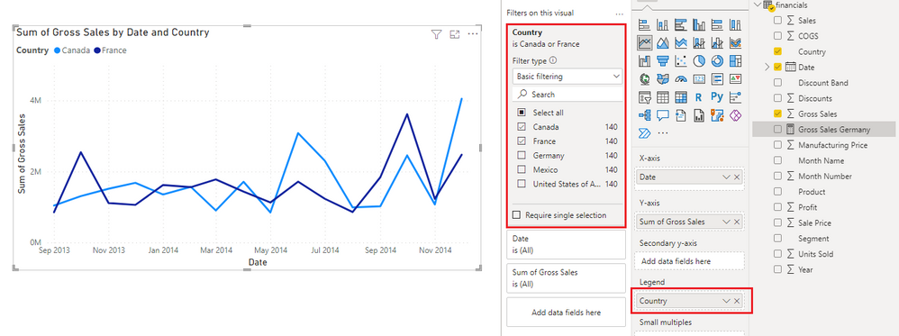
Are the two filters on the same column or on different columns? If it is on the same column, you can add that column to Legend field of the line chart. Then in Filter pane, filter the legend column to show only values you want to see.
Another solution is to create two measures and add filter expressions in the measures. For example,
Gross Sales France = CALCULATE(SUM(financials[Gross Sales]),financials[Country]="France")

Gross Sales Germany = CALCULATE(SUM(financials[Gross Sales]),financials[Country]="Germany")
Add both measures to Y-axis of the line chart.
If the two filters are on different columns, you can use the latter solution with measures.
Hope this helps.
Best Regards,
Community Support Team _ Jing
If this post helps, please Accept it as Solution to help other members find it.
- Mark as New
- Bookmark
- Subscribe
- Mute
- Subscribe to RSS Feed
- Permalink
- Report Inappropriate Content
Thank you very much, it helps me a lot!
- Mark as New
- Bookmark
- Subscribe
- Mute
- Subscribe to RSS Feed
- Permalink
- Report Inappropriate Content
Hi @jakub_vana
Are the two filters on the same column or on different columns? If it is on the same column, you can add that column to Legend field of the line chart. Then in Filter pane, filter the legend column to show only values you want to see.
Another solution is to create two measures and add filter expressions in the measures. For example,
Gross Sales France = CALCULATE(SUM(financials[Gross Sales]),financials[Country]="France")

Gross Sales Germany = CALCULATE(SUM(financials[Gross Sales]),financials[Country]="Germany")
Add both measures to Y-axis of the line chart.
If the two filters are on different columns, you can use the latter solution with measures.
Hope this helps.
Best Regards,
Community Support Team _ Jing
If this post helps, please Accept it as Solution to help other members find it.
Helpful resources

Microsoft Fabric Learn Together
Covering the world! 9:00-10:30 AM Sydney, 4:00-5:30 PM CET (Paris/Berlin), 7:00-8:30 PM Mexico City

Power BI Monthly Update - April 2024
Check out the April 2024 Power BI update to learn about new features.

| User | Count |
|---|---|
| 110 | |
| 98 | |
| 78 | |
| 64 | |
| 56 |
| User | Count |
|---|---|
| 143 | |
| 109 | |
| 89 | |
| 84 | |
| 66 |


