- Power BI forums
- Updates
- News & Announcements
- Get Help with Power BI
- Desktop
- Service
- Report Server
- Power Query
- Mobile Apps
- Developer
- DAX Commands and Tips
- Custom Visuals Development Discussion
- Health and Life Sciences
- Power BI Spanish forums
- Translated Spanish Desktop
- Power Platform Integration - Better Together!
- Power Platform Integrations (Read-only)
- Power Platform and Dynamics 365 Integrations (Read-only)
- Training and Consulting
- Instructor Led Training
- Dashboard in a Day for Women, by Women
- Galleries
- Community Connections & How-To Videos
- COVID-19 Data Stories Gallery
- Themes Gallery
- Data Stories Gallery
- R Script Showcase
- Webinars and Video Gallery
- Quick Measures Gallery
- 2021 MSBizAppsSummit Gallery
- 2020 MSBizAppsSummit Gallery
- 2019 MSBizAppsSummit Gallery
- Events
- Ideas
- Custom Visuals Ideas
- Issues
- Issues
- Events
- Upcoming Events
- Community Blog
- Power BI Community Blog
- Custom Visuals Community Blog
- Community Support
- Community Accounts & Registration
- Using the Community
- Community Feedback
Register now to learn Fabric in free live sessions led by the best Microsoft experts. From Apr 16 to May 9, in English and Spanish.
- Power BI forums
- Forums
- Get Help with Power BI
- Desktop
- Re: How to union the effect of different filter sl...
- Subscribe to RSS Feed
- Mark Topic as New
- Mark Topic as Read
- Float this Topic for Current User
- Bookmark
- Subscribe
- Printer Friendly Page
- Mark as New
- Bookmark
- Subscribe
- Mute
- Subscribe to RSS Feed
- Permalink
- Report Inappropriate Content
How to union the effect of different filter slicers?
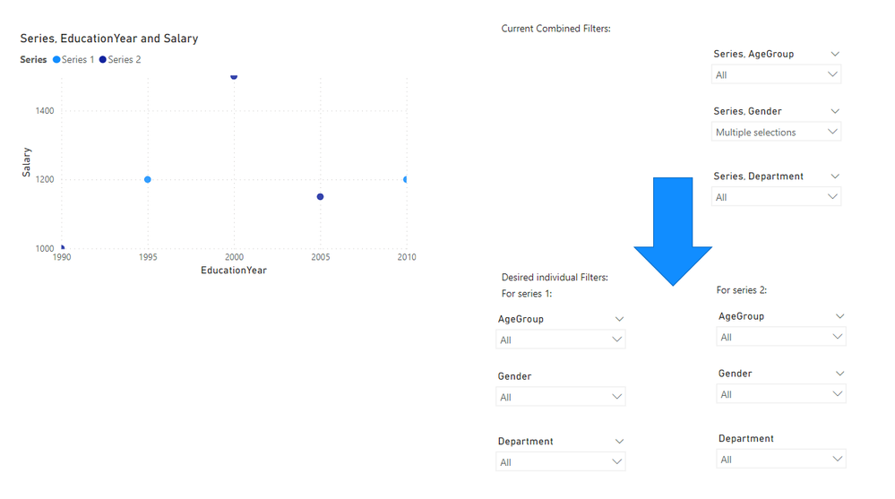
I have a report that has filter slicers and each slicer has entities. Each slicer has a data column "Series" and another desired quantity. This way I managed to make a scatter plot to compare different datasets on a single visual.
What I want to achieve is to separate the filter slicers and remove the "Series" from the slicers, in a way that instead of 3 filter slicers for both Series1 and Series2, I have 6 filter slicers (3 for Series1 and 3 for Series2 as shown in the picture below). The results on the visual should of course stay unchanged.
Link to the sample PBIX file:
https://tinyurl.com/yc5nrcap
Any help is appreciated.
@OwenAuger Do you happen to have an idea for this problem? For now I put separate scatter plots with separate set of filter slicer on top of each other to mimic having several series on a single scatter plots 🙂
Solved! Go to Solution.
- Mark as New
- Bookmark
- Subscribe
- Mute
- Subscribe to RSS Feed
- Permalink
- Report Inappropriate Content
Hi @MoeData
I have had a look at this 🙂
One possible solution is as follows, with PBIX attached.
Set up your data model like this, with two copies of DimEmployees branching off from the original table, with inactive relationships.
- DimEmployees1 & DimEmployees2 are used for the slicers.
These tables are set up this way since they must not filter each other, and also not actively filter DimEmployees (hence inactive relationships). - Series is a calculation group with two calculation items, Series1 & Series2, which each activate one of the inactive relationships.
- Measures EducationYear Value and Salary Value are similar to the versions from your other post, but I just used SELECTEDVALUE here.
- On the matrix visual:
- Values: DimEmployees[EducationYear] & DimSalary[Salary]
(drill down to lowest level) - X Axis: [EducationYear Value]
- Y Axis: [Salary Value]
- Legend: Series[Series]
- Values: DimEmployees[EducationYear] & DimSalary[Salary]
The DAX code is:
Series calculation group (created with Tabular Editor)
CALCULATIONGROUP Series[Series]

    CALCULATIONITEM "Series 1" =
        CALCULATE (
            SELECTEDMEASURE (),
            USERELATIONSHIP ( DimEmployees[EmployeeID], DimEmployees1[EmployeeID] )
        )

    CALCULATIONITEM "Series 2" =
        CALCULATE (
            SELECTEDMEASURE (),
            USERELATIONSHIP ( DimEmployees[EmployeeID], DimEmployees2[EmployeeID] )
        )
Measures:
Salary Value =
SELECTEDVALUE ( DimSalary[Salary] )

EducationYear Value =
IF (
    NOT ISEMPTY ( DimSalary ),
    SELECTEDVALUE ( DimEmployees[EducationYear] )
)
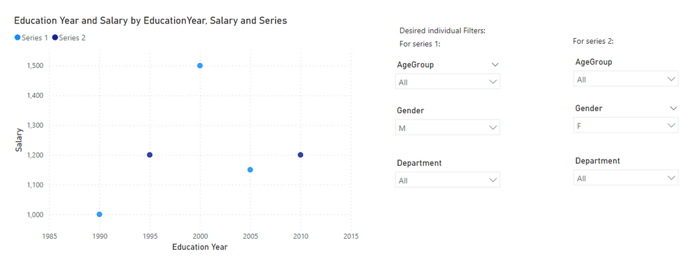
Final appearance:
Kind regards,
Owen
- Mark as New
- Bookmark
- Subscribe
- Mute
- Subscribe to RSS Feed
- Permalink
- Report Inappropriate Content
Hi @OwenAuger;
It works amazing, thanks!
Is it possible to differentiate the different series using different size of markers, while being able to add the trendlines and min/max lines on the plot?
I can only change the color and the marker shape of each series individually, but not the size!
- Mark as New
- Bookmark
- Subscribe
- Mute
- Subscribe to RSS Feed
- Permalink
- Report Inappropriate Content
Hi again @MoeData
Just on your last question - with the built-in Scatter Chart, it seems impossible to have trendlines when a field is provided for Size 😞
There could be a custom scatter chart visual out there that might allow it. I tested a couple but no luck so far.
I imagine it might be possible with Deneb as well, but that's a bit beyond me at the moment.
Regards,
Owen
- Mark as New
- Bookmark
- Subscribe
- Mute
- Subscribe to RSS Feed
- Permalink
- Report Inappropriate Content
- Mark as New
- Bookmark
- Subscribe
- Mute
- Subscribe to RSS Feed
- Permalink
- Report Inappropriate Content
Hi @MoeData
I have had a look at this 🙂
One possible solution is as follows, with PBIX attached.
Set up your data model like this, with two copies of DimEmployees branching off from the original table, with inactive relationships.
- DimEmployees1 & DimEmployees2 are used for the slicers.
These tables are set up this way since they must not filter each other, and also not actively filter DimEmployees (hence inactive relationships). - Series is a calculation group with two calculation items, Series1 & Series2, which each activate one of the inactive relationships.
- Measures EducationYear Value and Salary Value are similar to the versions from your other post, but I just used SELECTEDVALUE here.
- On the matrix visual:
- Values: DimEmployees[EducationYear] & DimSalary[Salary]
(drill down to lowest level) - X Axis: [EducationYear Value]
- Y Axis: [Salary Value]
- Legend: Series[Series]
- Values: DimEmployees[EducationYear] & DimSalary[Salary]
The DAX code is:
Series calculation group (created with Tabular Editor)
CALCULATIONGROUP Series[Series]

    CALCULATIONITEM "Series 1" =
        CALCULATE (
            SELECTEDMEASURE (),
            USERELATIONSHIP ( DimEmployees[EmployeeID], DimEmployees1[EmployeeID] )
        )

    CALCULATIONITEM "Series 2" =
        CALCULATE (
            SELECTEDMEASURE (),
            USERELATIONSHIP ( DimEmployees[EmployeeID], DimEmployees2[EmployeeID] )
        )
Measures:
Salary Value =
SELECTEDVALUE ( DimSalary[Salary] )

EducationYear Value =
IF (
    NOT ISEMPTY ( DimSalary ),
    SELECTEDVALUE ( DimEmployees[EducationYear] )
)
Final appearance:
Kind regards,
Owen
- Mark as New
- Bookmark
- Subscribe
- Mute
- Subscribe to RSS Feed
- Permalink
- Report Inappropriate Content
Filters are not unioned/appended. They are overlayed/joined/superpositioned (the default is for filters to replace each other)
You call the table "DimTotal" but according to your data model that is a fact table. Consider splitting it into two fact tables, one per series. That would then allow you to have separate slicers.
You could also use two separate visuals, and then use the "Filters on this visual" options instead of the slicers.
- Mark as New
- Bookmark
- Subscribe
- Mute
- Subscribe to RSS Feed
- Permalink
- Report Inappropriate Content
@lbendlin
I unoined the existing tables in order to be able to use "Series" column as a legend in the scatter plot, because I want to have the data in a single visual, as I need to compare data. If I split the tables, how can I show both tables on a singe scatter plot (with different colors)?
- Mark as New
- Bookmark
- Subscribe
- Mute
- Subscribe to RSS Feed
- Permalink
- Report Inappropriate Content
You can either have all series on the same visual or have separate filters per series. You can't get both.
Helpful resources

Microsoft Fabric Learn Together
Covering the world! 9:00-10:30 AM Sydney, 4:00-5:30 PM CET (Paris/Berlin), 7:00-8:30 PM Mexico City

Power BI Monthly Update - April 2024
Check out the April 2024 Power BI update to learn about new features.

| User | Count |
|---|---|
| 107 | |
| 98 | |
| 77 | |
| 66 | |
| 53 |
| User | Count |
|---|---|
| 144 | |
| 104 | |
| 100 | |
| 86 | |
| 64 |


