- Power BI forums
- Updates
- News & Announcements
- Get Help with Power BI
- Desktop
- Service
- Report Server
- Power Query
- Mobile Apps
- Developer
- DAX Commands and Tips
- Custom Visuals Development Discussion
- Health and Life Sciences
- Power BI Spanish forums
- Translated Spanish Desktop
- Power Platform Integration - Better Together!
- Power Platform Integrations (Read-only)
- Power Platform and Dynamics 365 Integrations (Read-only)
- Training and Consulting
- Instructor Led Training
- Dashboard in a Day for Women, by Women
- Galleries
- Community Connections & How-To Videos
- COVID-19 Data Stories Gallery
- Themes Gallery
- Data Stories Gallery
- R Script Showcase
- Webinars and Video Gallery
- Quick Measures Gallery
- 2021 MSBizAppsSummit Gallery
- 2020 MSBizAppsSummit Gallery
- 2019 MSBizAppsSummit Gallery
- Events
- Ideas
- Custom Visuals Ideas
- Issues
- Issues
- Events
- Upcoming Events
- Community Blog
- Power BI Community Blog
- Custom Visuals Community Blog
- Community Support
- Community Accounts & Registration
- Using the Community
- Community Feedback
Register now to learn Fabric in free live sessions led by the best Microsoft experts. From Apr 16 to May 9, in English and Spanish.
- Power BI forums
- Forums
- Get Help with Power BI
- Desktop
- How to stop my pie chart from hiding columns in my...
- Subscribe to RSS Feed
- Mark Topic as New
- Mark Topic as Read
- Float this Topic for Current User
- Bookmark
- Subscribe
- Printer Friendly Page
- Mark as New
- Bookmark
- Subscribe
- Mute
- Subscribe to RSS Feed
- Permalink
- Report Inappropriate Content
How to stop my pie chart from hiding columns in my matrix when a pie slice is selected
I have a large 50k+ row data set for a survey that is run annually. I have some of the data displayed in a matrix similar to this:
| Location | Year | Variable 1 | Variable 2 | Variable 3 | Variable 4 | Variable 5 |
| One | 2020 | aa | ba | cc | da | ea |
| Two | 2020 | aa | bb | cc | db | ed |
| Three | 2020 | aa | bd | cc | db | ea |
| Four | 2020 | ab | bd | cc | dc | ee |
| Five | 2020 | ab | bc | ca | dd | ec |
| Six | 2020 | ac | bb | cd | da | ee |
| Seven | 2020 | ab | bd | cb | db | ed |
| Eight | 2020 | ac | ba | cb | dd | ea |
| Nine | 2020 | aa | ba | ca | dc | ea |
| Ten | 2020 | ac | bc | cc | dd | ed |
I currenty have working slicers to include/exclude different survey years and various location parameters (such as state, country etc.). I want to add a some sort of pie chart or slicer that allows users to filter the matrix by specific variable responses.
For example: One user is only interested in the responses to variables 2-5 when variable 1 is "aa".
When I add a pie chart for Variable 1 and select "aa", all the other variable columns (2-5) are removed from my matrix and I get a matrix like this:
| Location | Year | Variable 1 |
| One | 2020 | aa |
| Two | 2020 | aa |
| Three | 2020 | aa |
| Nine | 2020 | aa |
Instead I want the matrix to look like this:
| Location | Year | Variable 1 | Variable 2 | Variable 3 | Variable 4 | Variable 5 |
| One | 2020 | aa | ba | cc | da | ea |
| Two | 2020 | aa | bb | cc | db | ed |
| Three | 2020 | aa | bd | cc | db | ea |
| Nine | 2020 | aa | ba | ca | dc | ea |
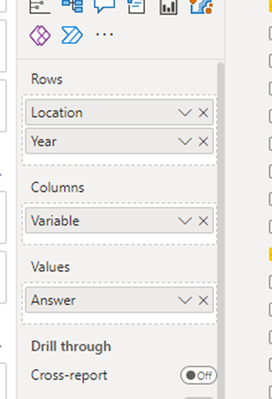
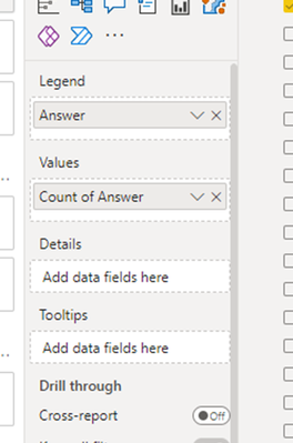
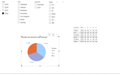
The current data I have in the visuals are like this.
Matrix visual: Pie chart visual:

Here is my dummy data:
https://drive.google.com/file/d/1iSj35n-rpWLWL4Raq0KZsbOxqKz14I-n/view?usp=sharing
Solved! Go to Solution.
- Mark as New
- Bookmark
- Subscribe
- Mute
- Subscribe to RSS Feed
- Permalink
- Report Inappropriate Content
Hi, there,
Filtering happens based on rows and the columns created in the visual matrix are actually rows in your data.
Here is the result, you have to duplicate your table in Power Query, select variable column and pivot it.
Then create a primary key between two tables using concatinate
Make the Cross filtering : Both.
Change the visual from Matrix to Table.
DID I ANSWER YOUR QUESTION? PLEASE MARK MY POST AS A SOLUTION! APPRECIATE YOUR KUDO/LIKE!
PROUD TO BE A SUPER USER!
Best Stories, Interesting Cases: PowerBI Storytime Newsletter
Linkedin Profile: Linkedin
YouTube Channel: PowerBI Storytime
Helpful resources

Microsoft Fabric Learn Together
Covering the world! 9:00-10:30 AM Sydney, 4:00-5:30 PM CET (Paris/Berlin), 7:00-8:30 PM Mexico City

Power BI Monthly Update - April 2024
Check out the April 2024 Power BI update to learn about new features.

| User | Count |
|---|---|
| 112 | |
| 100 | |
| 80 | |
| 64 | |
| 57 |
| User | Count |
|---|---|
| 146 | |
| 110 | |
| 93 | |
| 84 | |
| 67 |


