- Power BI forums
- Updates
- News & Announcements
- Get Help with Power BI
- Desktop
- Service
- Report Server
- Power Query
- Mobile Apps
- Developer
- DAX Commands and Tips
- Custom Visuals Development Discussion
- Health and Life Sciences
- Power BI Spanish forums
- Translated Spanish Desktop
- Power Platform Integration - Better Together!
- Power Platform Integrations (Read-only)
- Power Platform and Dynamics 365 Integrations (Read-only)
- Training and Consulting
- Instructor Led Training
- Dashboard in a Day for Women, by Women
- Galleries
- Community Connections & How-To Videos
- COVID-19 Data Stories Gallery
- Themes Gallery
- Data Stories Gallery
- R Script Showcase
- Webinars and Video Gallery
- Quick Measures Gallery
- 2021 MSBizAppsSummit Gallery
- 2020 MSBizAppsSummit Gallery
- 2019 MSBizAppsSummit Gallery
- Events
- Ideas
- Custom Visuals Ideas
- Issues
- Issues
- Events
- Upcoming Events
- Community Blog
- Power BI Community Blog
- Custom Visuals Community Blog
- Community Support
- Community Accounts & Registration
- Using the Community
- Community Feedback
Register now to learn Fabric in free live sessions led by the best Microsoft experts. From Apr 16 to May 9, in English and Spanish.
- Power BI forums
- Forums
- Get Help with Power BI
- Desktop
- Re: How to show the user selected drill down value...
- Subscribe to RSS Feed
- Mark Topic as New
- Mark Topic as Read
- Float this Topic for Current User
- Bookmark
- Subscribe
- Printer Friendly Page
- Mark as New
- Bookmark
- Subscribe
- Mute
- Subscribe to RSS Feed
- Permalink
- Report Inappropriate Content
How to show the user selected drill down values on label?
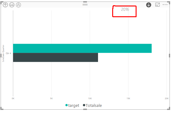
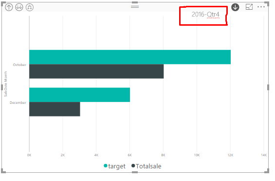
I have bar charts with date hierarchy like(Year, Month, Qtr, Week and Day). So when the user drill down on particular year, that the need to show the selected drill down year on label. below my screens.
The above screen is showing the drill down mode in 2016 when the user selected. and the Next screen would be
Now it is showing the Year with quarter on labe. Like that I need to do in Power BI Label when user select on particular drill down option. Please give me how to do this
Solved! Go to Solution.
- Mark as New
- Bookmark
- Subscribe
- Mute
- Subscribe to RSS Feed
- Permalink
- Report Inappropriate Content
Hi @Pitchaimuthu,
You can create a calculated column to get Year-Quarter using the formula, and use it as field in the bar visual. Then create Hierarchy. Year(first level)->Year-Quarter(second level).
Year-Quarter=Table[Year]&"-"&Table[Quarter]
Thanks,
Angelia
- Mark as New
- Bookmark
- Subscribe
- Mute
- Subscribe to RSS Feed
- Permalink
- Report Inappropriate Content
If you are in the Power BI service, this problem can also be solved by following the steps listed below:
1. Select the visualization.
2. Click Format in the visulizations pane.
3. Switch off the Concatenate Labels option under x-axis.
This seems to do the trick and shows the drill down value selected by the user as part of the x axis itself as a hierarchy and works for multiple drill down levels.
P.S. This might work with Power BI desktop as well but I haven't tried it.
Best Regards,
Satbir Minhas
- Mark as New
- Bookmark
- Subscribe
- Mute
- Subscribe to RSS Feed
- Permalink
- Report Inappropriate Content
If you are in the Power BI service, you can also solve this by following the steps listed below:
1. Select the visualization.
2. Click format in the visualizations pane
3. Switch off concatenate labels under x-axis.
This setting displays the drill down value selected by the user as part of the axis itself and works for multiple levels of drill down.
Best Regards,
Satbir Minhas
- Mark as New
- Bookmark
- Subscribe
- Mute
- Subscribe to RSS Feed
- Permalink
- Report Inappropriate Content
Hi @Pitchaimuthu,
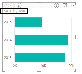
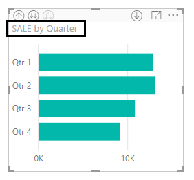
Even though you turn the title on, the defualt title is xx by xx. In the year level, it shows xx by year. In the quarter level, it shows xx by quarter. The tile can not dispaly the year value, and changed automatically according to different level. Please see the following screenshot.
Thanks,
Angelia
- Mark as New
- Bookmark
- Subscribe
- Mute
- Subscribe to RSS Feed
- Permalink
- Report Inappropriate Content
Thank you @v-huizhn-msft for the response. So I do not want to show the default label. But I need to show the year, like 2017-Q2 as like I need to show on chart. Please give me how to customize that one?
- Mark as New
- Bookmark
- Subscribe
- Mute
- Subscribe to RSS Feed
- Permalink
- Report Inappropriate Content
Hi @Pitchaimuthu,
You can create a calculated column to get Year-Quarter using the formula, and use it as field in the bar visual. Then create Hierarchy. Year(first level)->Year-Quarter(second level).
Year-Quarter=Table[Year]&"-"&Table[Quarter]
Thanks,
Angelia
- Mark as New
- Bookmark
- Subscribe
- Mute
- Subscribe to RSS Feed
- Permalink
- Report Inappropriate Content
Try turning on the visual's title and it should update with the level of the hierarchy with each drill down.
Helpful resources

Microsoft Fabric Learn Together
Covering the world! 9:00-10:30 AM Sydney, 4:00-5:30 PM CET (Paris/Berlin), 7:00-8:30 PM Mexico City

Power BI Monthly Update - April 2024
Check out the April 2024 Power BI update to learn about new features.

| User | Count |
|---|---|
| 110 | |
| 95 | |
| 76 | |
| 65 | |
| 51 |
| User | Count |
|---|---|
| 146 | |
| 109 | |
| 106 | |
| 88 | |
| 61 |


