- Power BI forums
- Updates
- News & Announcements
- Get Help with Power BI
- Desktop
- Service
- Report Server
- Power Query
- Mobile Apps
- Developer
- DAX Commands and Tips
- Custom Visuals Development Discussion
- Health and Life Sciences
- Power BI Spanish forums
- Translated Spanish Desktop
- Power Platform Integration - Better Together!
- Power Platform Integrations (Read-only)
- Power Platform and Dynamics 365 Integrations (Read-only)
- Training and Consulting
- Instructor Led Training
- Dashboard in a Day for Women, by Women
- Galleries
- Community Connections & How-To Videos
- COVID-19 Data Stories Gallery
- Themes Gallery
- Data Stories Gallery
- R Script Showcase
- Webinars and Video Gallery
- Quick Measures Gallery
- 2021 MSBizAppsSummit Gallery
- 2020 MSBizAppsSummit Gallery
- 2019 MSBizAppsSummit Gallery
- Events
- Ideas
- Custom Visuals Ideas
- Issues
- Issues
- Events
- Upcoming Events
- Community Blog
- Power BI Community Blog
- Custom Visuals Community Blog
- Community Support
- Community Accounts & Registration
- Using the Community
- Community Feedback
Register now to learn Fabric in free live sessions led by the best Microsoft experts. From Apr 16 to May 9, in English and Spanish.
- Power BI forums
- Forums
- Get Help with Power BI
- Desktop
- How to show the last one year sales in Tool Tip Ch...
- Subscribe to RSS Feed
- Mark Topic as New
- Mark Topic as Read
- Float this Topic for Current User
- Bookmark
- Subscribe
- Printer Friendly Page
- Mark as New
- Bookmark
- Subscribe
- Mute
- Subscribe to RSS Feed
- Permalink
- Report Inappropriate Content
How to show the last one year sales in Tool Tip Chart irrespective of the Date Range in Main Rpt
Hi,
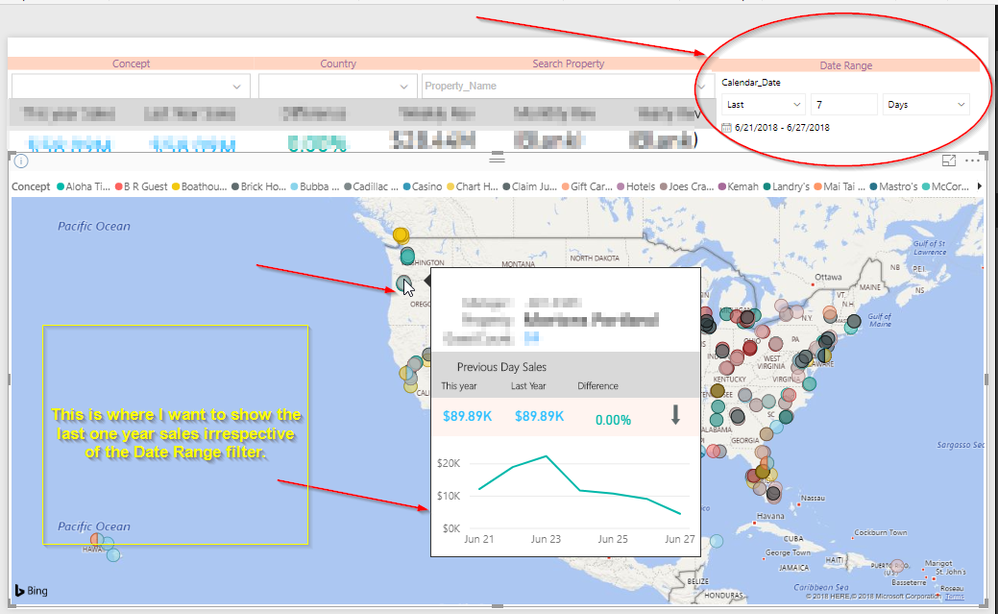
I developed a dashboard to show the sales of all the stores. I used Map visualization to show all my stores based on latitude and longitude.
My Question is, If I select a date range of 7 days, I am getting the sales for last 7 days and it is showing the values in the report and also in the tooltip.
Is there a way I can show the last one-year sales trend on the tooltip irrespective of what the date range in my main report is?
FYI...
Solved! Go to Solution.
- Mark as New
- Bookmark
- Subscribe
- Mute
- Subscribe to RSS Feed
- Permalink
- Report Inappropriate Content
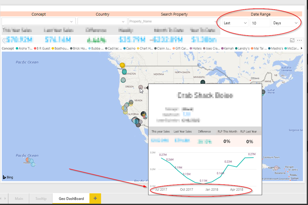
I was able to achieve this by creating another dataset with one full year sales for all the stores and use that to show that in my line chart
- Mark as New
- Bookmark
- Subscribe
- Mute
- Subscribe to RSS Feed
- Permalink
- Report Inappropriate Content
@reddy421,
I am unable to reproduce this issue when creating a tooltip page following the guide in this article and select slicer in main report page. The tooltip is not filtered by the slicer selection.
Do you use sync slicer feature is Power BI Desktop? This feature will make all visuals in different report pages filter by a single slicer.
Regards,
Lydia
If this post helps, then please consider Accept it as the solution to help the other members find it more quickly.
- Mark as New
- Bookmark
- Subscribe
- Mute
- Subscribe to RSS Feed
- Permalink
- Report Inappropriate Content
Below are the steps I did to achieve this.
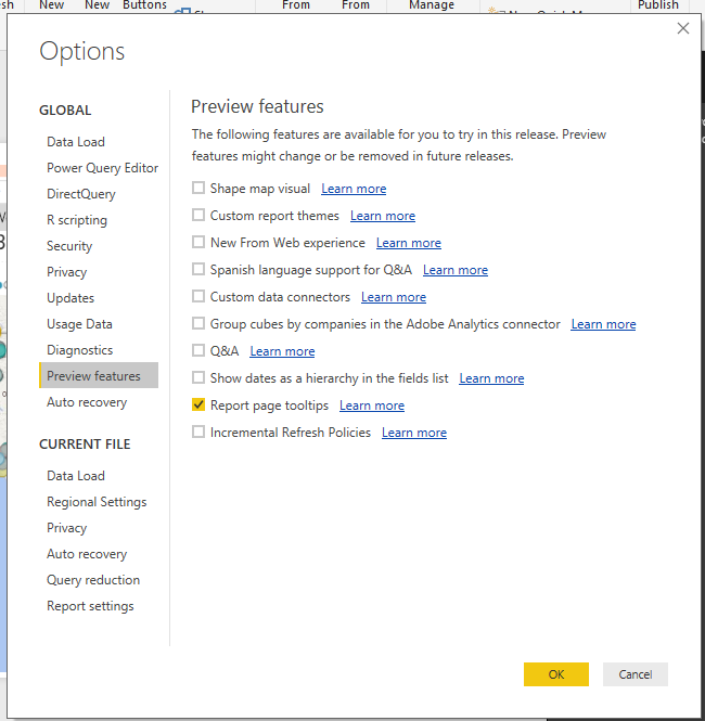
First I went to File->Options and Settings->Options and enabled the report page tooltips. ( shown below)
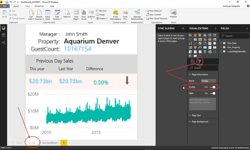
After my main page is done, I created one more page and created my tooltip visualization there. ( As shown below)
- Mark as New
- Bookmark
- Subscribe
- Mute
- Subscribe to RSS Feed
- Permalink
- Report Inappropriate Content
I was able to achieve this by creating another dataset with one full year sales for all the stores and use that to show that in my line chart

Helpful resources

Microsoft Fabric Learn Together
Covering the world! 9:00-10:30 AM Sydney, 4:00-5:30 PM CET (Paris/Berlin), 7:00-8:30 PM Mexico City

Power BI Monthly Update - April 2024
Check out the April 2024 Power BI update to learn about new features.

| User | Count |
|---|---|
| 114 | |
| 100 | |
| 81 | |
| 70 | |
| 62 |
| User | Count |
|---|---|
| 148 | |
| 116 | |
| 104 | |
| 90 | |
| 65 |
