- Power BI forums
- Updates
- News & Announcements
- Get Help with Power BI
- Desktop
- Service
- Report Server
- Power Query
- Mobile Apps
- Developer
- DAX Commands and Tips
- Custom Visuals Development Discussion
- Health and Life Sciences
- Power BI Spanish forums
- Translated Spanish Desktop
- Power Platform Integration - Better Together!
- Power Platform Integrations (Read-only)
- Power Platform and Dynamics 365 Integrations (Read-only)
- Training and Consulting
- Instructor Led Training
- Dashboard in a Day for Women, by Women
- Galleries
- Community Connections & How-To Videos
- COVID-19 Data Stories Gallery
- Themes Gallery
- Data Stories Gallery
- R Script Showcase
- Webinars and Video Gallery
- Quick Measures Gallery
- 2021 MSBizAppsSummit Gallery
- 2020 MSBizAppsSummit Gallery
- 2019 MSBizAppsSummit Gallery
- Events
- Ideas
- Custom Visuals Ideas
- Issues
- Issues
- Events
- Upcoming Events
- Community Blog
- Power BI Community Blog
- Custom Visuals Community Blog
- Community Support
- Community Accounts & Registration
- Using the Community
- Community Feedback
Register now to learn Fabric in free live sessions led by the best Microsoft experts. From Apr 16 to May 9, in English and Spanish.
- Power BI forums
- Forums
- Get Help with Power BI
- Desktop
- How to show only sum of data in Stacked chart lege...
- Subscribe to RSS Feed
- Mark Topic as New
- Mark Topic as Read
- Float this Topic for Current User
- Bookmark
- Subscribe
- Printer Friendly Page
- Mark as New
- Bookmark
- Subscribe
- Mute
- Subscribe to RSS Feed
- Permalink
- Report Inappropriate Content
How to show only sum of data in Stacked chart legend
Hi all,
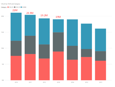
I have a table like that .
I want to show only sum of legend at the end of chart. As in the example below
Is it possible to do this ? I'll be happy if anyone can help me
Solved! Go to Solution.
- Mark as New
- Bookmark
- Subscribe
- Mute
- Subscribe to RSS Feed
- Permalink
- Report Inappropriate Content
Thank you for your valuable support.
The idea you found was quite logical and I made some changes on your line and stacked column chart.
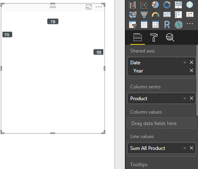
I created a duplicated of the chart. I unselected the Sum amount from new chart. Then it shows only sum of legends.
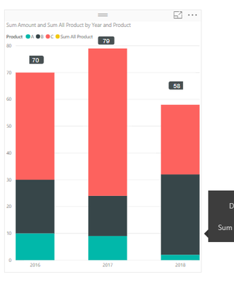
It looks like that.
Finally i superimposed two chart and hide legend, x-axis, y-axis and title from duplicated chart. Thats final state.
It's not a actual solution but for today it was fine for me 🙂
- Mark as New
- Bookmark
- Subscribe
- Mute
- Subscribe to RSS Feed
- Permalink
- Report Inappropriate Content
HI @Anonymous
That is the closest I could get to your query
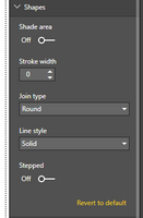
I used "Line and Stacked Column Chart" object. The column value is a regular sum. The line value is a sum ignoring the legend field. In here it is "Product" so the measure would be: SUM All Product = CALCULATE(SUM(Table1[Amount]),ALL(Table1[Product]) )
I have formated the line so it disappears: In Shape, have Stroke width = 0
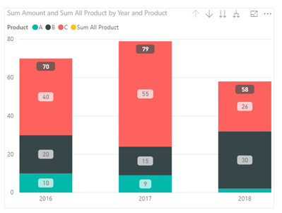
I also changed the formatting of the data label so your total stands out.
It would be a good idea to open/vote an improvement to PBI Desktop . You can normally remove data label for either the line or column (perfect in your case), but the legend on the column prevent that!
My pbix file here
https://1drv.ms/u/s!As5oZCclkGkWgSZRM1Lujl5Psioa
Hope it helps though!
- Mark as New
- Bookmark
- Subscribe
- Mute
- Subscribe to RSS Feed
- Permalink
- Report Inappropriate Content
Thank you for your valuable support.
The idea you found was quite logical and I made some changes on your line and stacked column chart.
I created a duplicated of the chart. I unselected the Sum amount from new chart. Then it shows only sum of legends.
It looks like that.
Finally i superimposed two chart and hide legend, x-axis, y-axis and title from duplicated chart. Thats final state.
It's not a actual solution but for today it was fine for me 🙂
Helpful resources

Microsoft Fabric Learn Together
Covering the world! 9:00-10:30 AM Sydney, 4:00-5:30 PM CET (Paris/Berlin), 7:00-8:30 PM Mexico City

Power BI Monthly Update - April 2024
Check out the April 2024 Power BI update to learn about new features.

| User | Count |
|---|---|
| 112 | |
| 100 | |
| 80 | |
| 64 | |
| 57 |
| User | Count |
|---|---|
| 146 | |
| 110 | |
| 93 | |
| 84 | |
| 67 |

