- Power BI forums
- Updates
- News & Announcements
- Get Help with Power BI
- Desktop
- Service
- Report Server
- Power Query
- Mobile Apps
- Developer
- DAX Commands and Tips
- Custom Visuals Development Discussion
- Health and Life Sciences
- Power BI Spanish forums
- Translated Spanish Desktop
- Power Platform Integration - Better Together!
- Power Platform Integrations (Read-only)
- Power Platform and Dynamics 365 Integrations (Read-only)
- Training and Consulting
- Instructor Led Training
- Dashboard in a Day for Women, by Women
- Galleries
- Community Connections & How-To Videos
- COVID-19 Data Stories Gallery
- Themes Gallery
- Data Stories Gallery
- R Script Showcase
- Webinars and Video Gallery
- Quick Measures Gallery
- 2021 MSBizAppsSummit Gallery
- 2020 MSBizAppsSummit Gallery
- 2019 MSBizAppsSummit Gallery
- Events
- Ideas
- Custom Visuals Ideas
- Issues
- Issues
- Events
- Upcoming Events
- Community Blog
- Power BI Community Blog
- Custom Visuals Community Blog
- Community Support
- Community Accounts & Registration
- Using the Community
- Community Feedback
Register now to learn Fabric in free live sessions led by the best Microsoft experts. From Apr 16 to May 9, in English and Spanish.
- Power BI forums
- Forums
- Get Help with Power BI
- Desktop
- How to show in one single bar of a chart the sum o...
- Subscribe to RSS Feed
- Mark Topic as New
- Mark Topic as Read
- Float this Topic for Current User
- Bookmark
- Subscribe
- Printer Friendly Page
- Mark as New
- Bookmark
- Subscribe
- Mute
- Subscribe to RSS Feed
- Permalink
- Report Inappropriate Content
How to show in one single bar of a chart the sum of values below of a certain value
Hello,
in a chart (for example istogram) I need to show in one single bar (customer) the sum of all sales incomes below of 1.000 USD (label "other customers < 1.000 USD"). I cannot use grouping way because the sum should be dynamic if other filters are applied and in case of data updating.
Thank you in advance for your help.
- Mark as New
- Bookmark
- Subscribe
- Mute
- Subscribe to RSS Feed
- Permalink
- Report Inappropriate Content
Hi @giulianam,
From your description, I could not figure out what filters you want to apply in the data and the relationship between them and I could not understand the sentence “for example istogram” stands for which visual, I guess the Clustered column chart, right? If you want to show in this chart with a customer bar by the sum of all sales incomes below of 1.000 USD and filtered by a column, you could refer to below steps:
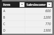
1.I have entered some sample data like the picture below:
2.Create a calculated column
Column = IF([SalesIncome]>1000,[Item],"Other group")
3.Create a Clustered column chart and add the related field.
4. Create a Slicer and add the [Item] field, now you can use the slicers to show the value.
If I misunderstood you, could you please offer me more information about your data structure and the type of visual or share your pbix file if possible?
You can also download the PBIX file to have a view.
Regards,
Daniel He
If this post helps, then please consider Accept it as the solution to help the other members find it more quickly.
- Mark as New
- Bookmark
- Subscribe
- Mute
- Subscribe to RSS Feed
- Permalink
- Report Inappropriate Content
Hi Daniel,
thank you very much for your help.
First of all I confirm the type of chart I meaned is Clustered column chart.
Your explanation is perfect, but I'm looking for a solution in case of data as follows:
Item B and C are grouped in one single bar because the sum of incomes of each Item is lower than 1.000 USD, but if I add another row for item B so that the total incomes of this item are more than 1.000 USD, it should be showed in another column B and the group "< 1000 USD" should includ only item C.
I hope it is clear now.
Thank you!
Helpful resources

Microsoft Fabric Learn Together
Covering the world! 9:00-10:30 AM Sydney, 4:00-5:30 PM CET (Paris/Berlin), 7:00-8:30 PM Mexico City

Power BI Monthly Update - April 2024
Check out the April 2024 Power BI update to learn about new features.

| User | Count |
|---|---|
| 112 | |
| 100 | |
| 80 | |
| 64 | |
| 57 |
| User | Count |
|---|---|
| 145 | |
| 111 | |
| 92 | |
| 84 | |
| 66 |


