- Power BI forums
- Updates
- News & Announcements
- Get Help with Power BI
- Desktop
- Service
- Report Server
- Power Query
- Mobile Apps
- Developer
- DAX Commands and Tips
- Custom Visuals Development Discussion
- Health and Life Sciences
- Power BI Spanish forums
- Translated Spanish Desktop
- Power Platform Integration - Better Together!
- Power Platform Integrations (Read-only)
- Power Platform and Dynamics 365 Integrations (Read-only)
- Training and Consulting
- Instructor Led Training
- Dashboard in a Day for Women, by Women
- Galleries
- Community Connections & How-To Videos
- COVID-19 Data Stories Gallery
- Themes Gallery
- Data Stories Gallery
- R Script Showcase
- Webinars and Video Gallery
- Quick Measures Gallery
- 2021 MSBizAppsSummit Gallery
- 2020 MSBizAppsSummit Gallery
- 2019 MSBizAppsSummit Gallery
- Events
- Ideas
- Custom Visuals Ideas
- Issues
- Issues
- Events
- Upcoming Events
- Community Blog
- Power BI Community Blog
- Custom Visuals Community Blog
- Community Support
- Community Accounts & Registration
- Using the Community
- Community Feedback
Register now to learn Fabric in free live sessions led by the best Microsoft experts. From Apr 16 to May 9, in English and Spanish.
- Power BI forums
- Forums
- Get Help with Power BI
- Desktop
- How to show in a pie chart a percentage from two c...
- Subscribe to RSS Feed
- Mark Topic as New
- Mark Topic as Read
- Float this Topic for Current User
- Bookmark
- Subscribe
- Printer Friendly Page
- Mark as New
- Bookmark
- Subscribe
- Mute
- Subscribe to RSS Feed
- Permalink
- Report Inappropriate Content
How to show in a pie chart a percentage from two column values
Hi - Can someone help me with this concern?
I have columns. One is Total Employees and the other is Total Responses.
I want to be able to show a chart that will show me the percentage of Total Responses / Total Employees and not adding a column in the data source anymore.
Illustration:
Total Employees Total Responses
1000 900
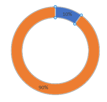
I wanted to use a pie chart which should look like this.
Thanks
Solved! Go to Solution.
- Mark as New
- Bookmark
- Subscribe
- Mute
- Subscribe to RSS Feed
- Permalink
- Report Inappropriate Content
Hi @Orcorcorco ,
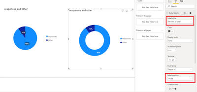
Based on your description, you can create two measures and put them in the values field in Dount chart.
responses = SUM('Table'[Total Responses]) / SUM('Table'[Total Employees]) other = (SUM('Table'[Total Employees]) - SUM('Table'[Total Responses])) / SUM('Table'[Total Employees])Set the Label style as 'Percent of Total' and Label position as 'Inside' under Detail labels menu, you will get your expected result:
Best Regards,
Yingjie Li
If this post helps then please consider Accept it as the solution to help the other members find it more quickly.
- Mark as New
- Bookmark
- Subscribe
- Mute
- Subscribe to RSS Feed
- Permalink
- Report Inappropriate Content
Hi @Orcorcorco ,
Based on your description, you can create two measures and put them in the values field in Dount chart.
responses = SUM('Table'[Total Responses]) / SUM('Table'[Total Employees]) other = (SUM('Table'[Total Employees]) - SUM('Table'[Total Responses])) / SUM('Table'[Total Employees])Set the Label style as 'Percent of Total' and Label position as 'Inside' under Detail labels menu, you will get your expected result:

Best Regards,
Yingjie Li
If this post helps then please consider Accept it as the solution to help the other members find it more quickly.
- Mark as New
- Bookmark
- Subscribe
- Mute
- Subscribe to RSS Feed
- Permalink
- Report Inappropriate Content
@Orcorcorco , In pie visual you have option Label Style, You can choose Percent of Total and position inside.
do not drag any legend or details. only use measures under "values".
You can refer
https://www.goskills.com/Microsoft-Office/Articles/Power-BI-pie-chart
Microsoft Power BI Learning Resources, 2023 !!
Learn Power BI - Full Course with Dec-2022, with Window, Index, Offset, 100+ Topics !!
Did I answer your question? Mark my post as a solution! Appreciate your Kudos !! Proud to be a Super User! !!
- Mark as New
- Bookmark
- Subscribe
- Mute
- Subscribe to RSS Feed
- Permalink
- Report Inappropriate Content
Hi @Orcorcorco,
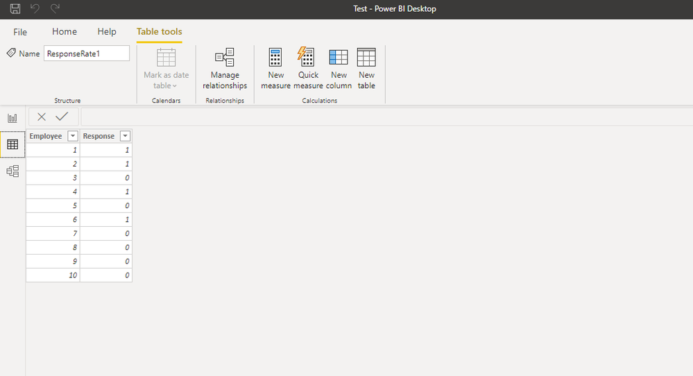
If a dataset like the following is your case
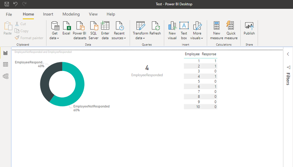
You could use this measure:
EmployeeResponded =
CALCULATE( COUNT(ResponseRate1[Response]), ResponseRate1[Response] = 1)
And another for negative responses, and you would get something like this:
Hope it helps.
Regards,
Fernando
Helpful resources

Microsoft Fabric Learn Together
Covering the world! 9:00-10:30 AM Sydney, 4:00-5:30 PM CET (Paris/Berlin), 7:00-8:30 PM Mexico City

Power BI Monthly Update - April 2024
Check out the April 2024 Power BI update to learn about new features.

| User | Count |
|---|---|
| 114 | |
| 99 | |
| 82 | |
| 70 | |
| 60 |
| User | Count |
|---|---|
| 149 | |
| 114 | |
| 107 | |
| 89 | |
| 67 |
