- Power BI forums
- Updates
- News & Announcements
- Get Help with Power BI
- Desktop
- Service
- Report Server
- Power Query
- Mobile Apps
- Developer
- DAX Commands and Tips
- Custom Visuals Development Discussion
- Health and Life Sciences
- Power BI Spanish forums
- Translated Spanish Desktop
- Power Platform Integration - Better Together!
- Power Platform Integrations (Read-only)
- Power Platform and Dynamics 365 Integrations (Read-only)
- Training and Consulting
- Instructor Led Training
- Dashboard in a Day for Women, by Women
- Galleries
- Community Connections & How-To Videos
- COVID-19 Data Stories Gallery
- Themes Gallery
- Data Stories Gallery
- R Script Showcase
- Webinars and Video Gallery
- Quick Measures Gallery
- 2021 MSBizAppsSummit Gallery
- 2020 MSBizAppsSummit Gallery
- 2019 MSBizAppsSummit Gallery
- Events
- Ideas
- Custom Visuals Ideas
- Issues
- Issues
- Events
- Upcoming Events
- Community Blog
- Power BI Community Blog
- Custom Visuals Community Blog
- Community Support
- Community Accounts & Registration
- Using the Community
- Community Feedback
Register now to learn Fabric in free live sessions led by the best Microsoft experts. From Apr 16 to May 9, in English and Spanish.
- Power BI forums
- Forums
- Get Help with Power BI
- Desktop
- Re: How to show hierarchical data in clustered bar...
- Subscribe to RSS Feed
- Mark Topic as New
- Mark Topic as Read
- Float this Topic for Current User
- Bookmark
- Subscribe
- Printer Friendly Page
- Mark as New
- Bookmark
- Subscribe
- Mute
- Subscribe to RSS Feed
- Permalink
- Report Inappropriate Content
How to show hierarchical data in clustered bar graphs
Hi All,
My data is in below format. How do I show a hierarchy of Cars with subvalues swift and bmw IN Clustered bar graph. I need to show bar graphs for bus, cars, swift and BMW all in one bar graph (Drilldown is not an option for me)
| Category | Sales |
| Bus | 1000 (Imagine Bar Graph) |
| Cars | 2000 (Imagine Bar Graph) |
| 1) Swift 2) BMW | 1000 (Imagine Bar Graph) 1000 (Imagine Bar Graph) |
Please suggest a way or any custom visual that can give this way.
Thanks,
Radhika
Solved! Go to Solution.
- Mark as New
- Bookmark
- Subscribe
- Mute
- Subscribe to RSS Feed
- Permalink
- Report Inappropriate Content
Thanks Liu, this is a good solution. But my requirement was to show total and the split of subvalues for the total in this case, cars as total and also split of cars as bmw, honda and swift just below cars total.
I have achieved by duplicating the clustered bar charts and placing it just below main category one. Not a perfect fix, but it solved the problem
Thanks again for the effort !
- Mark as New
- Bookmark
- Subscribe
- Mute
- Subscribe to RSS Feed
- Permalink
- Report Inappropriate Content
Hi @Anonymous ,
Your idea, power bi cannot support it temporarily
But you can see if this method works
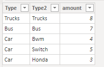
Created some data:
Here are the steps you can follow:
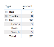
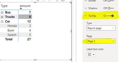
1. Create a matrix visual object in Page1
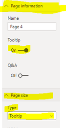
2. Page2, select Type-Tooltip of Page Size. and Tooltip of Page information to ON.
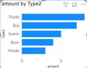
3. Select the Stack bar chart to form the visual object
4. Select the matrix of Page1, set its Tooltip to ON, and set Page – Page2
5. Result.
The thumbnail of Page2 will be formed in the matrix. Which row is selected will display the Stack bar chart of the corresponding row.
Best Regards,
Liu Yang
If this post helps, then please consider Accept it as the solution to help the other members find it more quickly.
- Mark as New
- Bookmark
- Subscribe
- Mute
- Subscribe to RSS Feed
- Permalink
- Report Inappropriate Content
Thanks Liu, this is a good solution. But my requirement was to show total and the split of subvalues for the total in this case, cars as total and also split of cars as bmw, honda and swift just below cars total.
I have achieved by duplicating the clustered bar charts and placing it just below main category one. Not a perfect fix, but it solved the problem
Thanks again for the effort !
- Mark as New
- Bookmark
- Subscribe
- Mute
- Subscribe to RSS Feed
- Permalink
- Report Inappropriate Content
@Anonymous , Not very clear. But I think two columns(sort on both) and axis and concatenate label: off can help
refer to my video: check power bi part: https://www.youtube.com/watch?v=2P5BBRN853c
Microsoft Power BI Learning Resources, 2023 !!
Learn Power BI - Full Course with Dec-2022, with Window, Index, Offset, 100+ Topics !!
Did I answer your question? Mark my post as a solution! Appreciate your Kudos !! Proud to be a Super User! !!
- Mark as New
- Bookmark
- Subscribe
- Mute
- Subscribe to RSS Feed
- Permalink
- Report Inappropriate Content
Hi Amit
Thanks for replying but this how I want the visual to look like
Cars is a hierarchy I made in power BI, with clustered bar chart it is showing either on lowest level with drill down or the top level i.e Buses, Trucks and Cars. I want to show it in the above way. Bar graphs represent Sales numbers for Actuals, Budget and Prior Year
Please suggest a way to get above visual in Power BI
Helpful resources

Microsoft Fabric Learn Together
Covering the world! 9:00-10:30 AM Sydney, 4:00-5:30 PM CET (Paris/Berlin), 7:00-8:30 PM Mexico City

Power BI Monthly Update - April 2024
Check out the April 2024 Power BI update to learn about new features.

| User | Count |
|---|---|
| 109 | |
| 99 | |
| 77 | |
| 66 | |
| 54 |
| User | Count |
|---|---|
| 144 | |
| 104 | |
| 102 | |
| 87 | |
| 64 |
