- Power BI forums
- Updates
- News & Announcements
- Get Help with Power BI
- Desktop
- Service
- Report Server
- Power Query
- Mobile Apps
- Developer
- DAX Commands and Tips
- Custom Visuals Development Discussion
- Health and Life Sciences
- Power BI Spanish forums
- Translated Spanish Desktop
- Power Platform Integration - Better Together!
- Power Platform Integrations (Read-only)
- Power Platform and Dynamics 365 Integrations (Read-only)
- Training and Consulting
- Instructor Led Training
- Dashboard in a Day for Women, by Women
- Galleries
- Community Connections & How-To Videos
- COVID-19 Data Stories Gallery
- Themes Gallery
- Data Stories Gallery
- R Script Showcase
- Webinars and Video Gallery
- Quick Measures Gallery
- 2021 MSBizAppsSummit Gallery
- 2020 MSBizAppsSummit Gallery
- 2019 MSBizAppsSummit Gallery
- Events
- Ideas
- Custom Visuals Ideas
- Issues
- Issues
- Events
- Upcoming Events
- Community Blog
- Power BI Community Blog
- Custom Visuals Community Blog
- Community Support
- Community Accounts & Registration
- Using the Community
- Community Feedback
Register now to learn Fabric in free live sessions led by the best Microsoft experts. From Apr 16 to May 9, in English and Spanish.
- Power BI forums
- Forums
- Get Help with Power BI
- Desktop
- Re: How to show a different colour for column A
- Subscribe to RSS Feed
- Mark Topic as New
- Mark Topic as Read
- Float this Topic for Current User
- Bookmark
- Subscribe
- Printer Friendly Page
- Mark as New
- Bookmark
- Subscribe
- Mute
- Subscribe to RSS Feed
- Permalink
- Report Inappropriate Content
How to show a different colour for column A
Hi,
I have a bar chart and I would like to display column A in red if the value is below column C and green if the value is above column C. How can I achieve that as the colour settings only show 1 option?
Solved! Go to Solution.
- Mark as New
- Bookmark
- Subscribe
- Mute
- Subscribe to RSS Feed
- Permalink
- Report Inappropriate Content
Hi @jacquelineq ,
Please new a measure:
Color =
VAR _a =
    CALCULATE ( SUM ( 'Table'[Score] ), 'Table'[Scope] = "A" )
VAR _c =
    CALCULATE ( SUM ( 'Table'[Score] ), 'Table'[Scope] = "C" )
RETURN
    IF ( MAX ( 'Table'[Scope] ) = "A", IF ( _a < _c, "Red", "Green" ) )
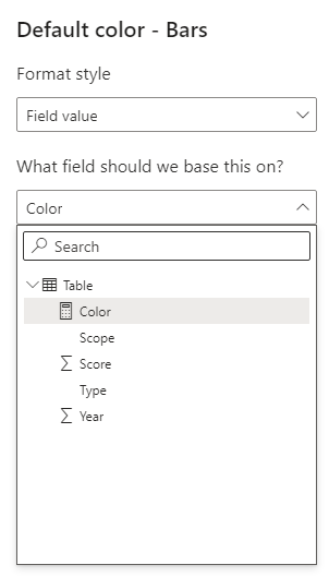
Use it as a conditional format for the bar color.
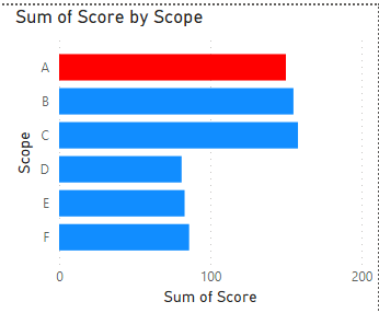
result:
Attached PBIX file for reference.
Best Regards,
Gao
Community Support Team
If there is any post helps, then please consider Accept it as the solution to help the other members find it more quickly. If I misunderstand your needs or you still have problems on it, please feel free to let us know. Thanks a lot!
How to get your questions answered quickly -- How to provide sample data
- Mark as New
- Bookmark
- Subscribe
- Mute
- Subscribe to RSS Feed
- Permalink
- Report Inappropriate Content
@jacquelineq , if you are using legend , you can not. Use both axis and legend in the axis, and expand. Then Sort on axis and concatenate the label off. Post that you can do conditional formatting
refer with conditional formatting code:Concatenate Label off : https://youtu.be/QgI0vIGIOOk
How to do conditional formatting by measure and apply it on pie?
https://www.youtube.com/watch?v=RqBb5eBf_I4&list=PLPaNVDMhUXGYo50Ajmr4SgSV9HIQLxc8L
https://community.powerbi.com/t5/Community-Blog/Power-BI-Conditional-formatting-the-Pie-Visual/ba-p/...
https://amitchandak.medium.com/power-bi-where-is-the-conditional-formatting-option-in-new-format-pan...
Microsoft Power BI Learning Resources, 2023 !!
Learn Power BI - Full Course with Dec-2022, with Window, Index, Offset, 100+ Topics !!
Did I answer your question? Mark my post as a solution! Appreciate your Kudos !! Proud to be a Super User! !!
- Mark as New
- Bookmark
- Subscribe
- Mute
- Subscribe to RSS Feed
- Permalink
- Report Inappropriate Content
@amitchandak Thanks for your reply!
May I know how should I code my measure to compare the values? This is my table:
| Year | Scope | Type | Score |
| 2021 | A | Type1 | 80 |
| 2021 | B | Type1 | 82 |
| 2021 | C | Type1 | 84 |
| 2021 | A | Type2 | 70 |
| 2021 | B | Type2 | 73 |
| 2021 | C | Type2 | 74 |
| 2021 | D | Type1 | 81 |
| 2021 | E | Type1 | 83 |
| 2021 | F | Type1 | 86 |
- Mark as New
- Bookmark
- Subscribe
- Mute
- Subscribe to RSS Feed
- Permalink
- Report Inappropriate Content
Hi @jacquelineq ,
Please new a measure:
Color =
VAR _a =
    CALCULATE ( SUM ( 'Table'[Score] ), 'Table'[Scope] = "A" )
VAR _c =
    CALCULATE ( SUM ( 'Table'[Score] ), 'Table'[Scope] = "C" )
RETURN
    IF ( MAX ( 'Table'[Scope] ) = "A", IF ( _a < _c, "Red", "Green" ) )
Use it as a conditional format for the bar color.
result:
Attached PBIX file for reference.
Best Regards,
Gao
Community Support Team
If there is any post helps, then please consider Accept it as the solution to help the other members find it more quickly. If I misunderstand your needs or you still have problems on it, please feel free to let us know. Thanks a lot!
How to get your questions answered quickly -- How to provide sample data
Helpful resources

Microsoft Fabric Learn Together
Covering the world! 9:00-10:30 AM Sydney, 4:00-5:30 PM CET (Paris/Berlin), 7:00-8:30 PM Mexico City

Power BI Monthly Update - April 2024
Check out the April 2024 Power BI update to learn about new features.

| User | Count |
|---|---|
| 117 | |
| 107 | |
| 70 | |
| 70 | |
| 43 |
| User | Count |
|---|---|
| 148 | |
| 106 | |
| 104 | |
| 89 | |
| 65 |


