- Power BI forums
- Updates
- News & Announcements
- Get Help with Power BI
- Desktop
- Service
- Report Server
- Power Query
- Mobile Apps
- Developer
- DAX Commands and Tips
- Custom Visuals Development Discussion
- Health and Life Sciences
- Power BI Spanish forums
- Translated Spanish Desktop
- Power Platform Integration - Better Together!
- Power Platform Integrations (Read-only)
- Power Platform and Dynamics 365 Integrations (Read-only)
- Training and Consulting
- Instructor Led Training
- Dashboard in a Day for Women, by Women
- Galleries
- Community Connections & How-To Videos
- COVID-19 Data Stories Gallery
- Themes Gallery
- Data Stories Gallery
- R Script Showcase
- Webinars and Video Gallery
- Quick Measures Gallery
- 2021 MSBizAppsSummit Gallery
- 2020 MSBizAppsSummit Gallery
- 2019 MSBizAppsSummit Gallery
- Events
- Ideas
- Custom Visuals Ideas
- Issues
- Issues
- Events
- Upcoming Events
- Community Blog
- Power BI Community Blog
- Custom Visuals Community Blog
- Community Support
- Community Accounts & Registration
- Using the Community
- Community Feedback
Register now to learn Fabric in free live sessions led by the best Microsoft experts. From Apr 16 to May 9, in English and Spanish.
- Power BI forums
- Forums
- Get Help with Power BI
- Desktop
- Re: How to shift the line chart to start at the sa...
- Subscribe to RSS Feed
- Mark Topic as New
- Mark Topic as Read
- Float this Topic for Current User
- Bookmark
- Subscribe
- Printer Friendly Page
- Mark as New
- Bookmark
- Subscribe
- Mute
- Subscribe to RSS Feed
- Permalink
- Report Inappropriate Content
How to shift the line chart to start at the same position?
Hello,
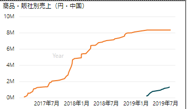
I have created the line chart which compares the accumulated 2 years of sales on 2 products.
Anyway, the user would like to compare from the starting date which I need to shift the blue line to have the same starting point as green one. Please refer to the chart below,
Anybody knows how to do this with the chart configuration, I tried to do this once by creating the customized calendar table which is refer to the start date and + 30 days for the next period but it didn't go well as the this will refer to the normal calendar date.
I need to present the data like number of months after the start date.
Thank you in advance
Please refer to my previous post as follows,
Solved! Go to Solution.
- Mark as New
- Bookmark
- Subscribe
- Mute
- Subscribe to RSS Feed
- Permalink
- Report Inappropriate Content
Hello @Anonymous ,
I think I managed it but I need to admit that am not satisfied with the solution. Im sure it could be better but It works
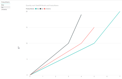
What have I done -> I calculated a table with sales/product launch data. So that i have a "sales row" which is actually the product launch without a quantity. You can download my file here
If this post was helpful please like&mark it as solution.
Have a nice day @Anonymous
BR,
Josef
- Mark as New
- Bookmark
- Subscribe
- Mute
- Subscribe to RSS Feed
- Permalink
- Report Inappropriate Content
Hi @Anonymous ,
We can create a measure as below.
Measure =
VAR a =
    CALCULATE ( SUM ( 'Table'[value] ) )
VAR mind =
    CALCULATE ( MIN('Table'[date]),ALL('Table'))
VAR b =
    CALCULATE (
        SUM ( 'Table'[value] ),
        FILTER ( ALL ( 'Table' ), 'Table'[date] = mind )
    )
RETURN
    IF ( a = BLANK (), b, a )
If this post helps, then please consider Accept it as the solution to help the others find it more quickly.
- Mark as New
- Bookmark
- Subscribe
- Mute
- Subscribe to RSS Feed
- Permalink
- Report Inappropriate Content
Thank you for the solution. I tried your code but it seems like the not the accumulated figure over so I changed the code of each line graph as follows.
Accumulated Sales from Launch Same Point =
VAR a =
    CALCULATE ( SUM('Table'[Amount]),
	FILTER(
		ALLSELECTED('Table'[ShippingDay]),
		ISONORAFTER('Table'[ShippingDay], MAX('Table'[ShippingDay]), DESC)
	) )
VAR mind =
CALCULATE ( MIN('Table'[ShippingDay]), ALLSELECTED('Table'))
VAR b =
    CALCULATE (
        SUM('Table'[Amount]),
	FILTER(
		ALLSELECTED('Table'[ShippingDay]),
		ISONORAFTER('Table'[ShippingDay] = mind, MAX('Table'[ShippingDay]), DESC )
    ))
RETURN
    IF ( a = BLANK (), b, a )
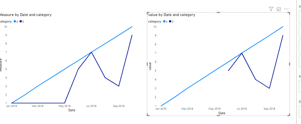
Anyway, I think the code just make the b line to be at 0 by referring the minimum date of a, I want to shift the b to the right to start at Jan 2018 as with a. (from your sample data, the b = 5 should at the point of Jan 2018).
Thank you for your help and have a nice day.
- Mark as New
- Bookmark
- Subscribe
- Mute
- Subscribe to RSS Feed
- Permalink
- Report Inappropriate Content
I see your post now - later this day I try to build an example file if no one has the answer in the meantime
- Mark as New
- Bookmark
- Subscribe
- Mute
- Subscribe to RSS Feed
- Permalink
- Report Inappropriate Content
Hello Tamrek,
I'm rephrasing your question so you can check if I understood it right.
You have products that have a different product launch. Your task is to display the product launch on an X/Y coordinate system as X=0, so that your users get an understanding of how the respective product ran since product launch?
Now we come to the problem - If you want to display a typical calendar on your X axis -> You will either have to manipulate the start date. (So harmonize the start date to 01.XX.20XX or you will have to do without the calendar.
By "to do without the calendar" I mean that you need to calculate the number of months since product launch and put that number on your X axis.
And for the latter procedure you have already received an answer in your thread.
Now I honestly don't know what you actually want.
Please give us some more guidance so that we can support you 🙂
Thank you and have a nice day,
Josef
- Mark as New
- Bookmark
- Subscribe
- Mute
- Subscribe to RSS Feed
- Permalink
- Report Inappropriate Content
I replied to you comment there once, but not sure why it disappeared. But it's like what you mentioned.
- Mark as New
- Bookmark
- Subscribe
- Mute
- Subscribe to RSS Feed
- Permalink
- Report Inappropriate Content
Hello Tamrek,
I need a bit more Info. So what do you want exactly?
- Fake the start date and therefor have a date time axis
- Display the duration since the product launch -> by having the monthcount on the axis.
BR,
Josef
- Mark as New
- Bookmark
- Subscribe
- Mute
- Subscribe to RSS Feed
- Permalink
- Report Inappropriate Content
Hello @JosefPrakljacic
Thank you for your reply and help. Let me respond to your comment here,
You have products that have a different product launch. Your task is to display the product launch on an X/Y coordinate system as X=0, so that your users get an understanding of how the respective product ran since product launch?
-- > Correct
Now we come to the problem - If you want to display a typical calendar on your X axis -> You will either have to manipulate the start date. (So harmonize the start date to 01.XX.20XX or you will have to do without the calendar.
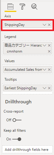
Yes, I want to display the comparison of selected products from their launch dates (like 1,2,3,4 months after). What I did now is to calculate running accumulated total of entire date range, the X Axis is used the ShippingDay data as the following figure
which if use the ShippingDay on X Axis, the second line will shift to the right according to its launch date.
By "to do without the calendar" I mean that you need to calculate the number of months since product launch and put that number on your X axis.
I also created the column which is like +1 month after the launch date, which I think I can do a calculated sales amount table or measure referred from that 2 dates (interval = 1month after launch - launch date) as the code below
1stmonthsales = CALCULATE (
SUM ( 'Table'[Amount]),
FILTER (
datefromlaunch_REF_CALENDAR,
datefromlaunch_REF_CALENDAR[Launchdate]
&& datefromlaunch_REF_CALENDAR[Launchdate] <= datefromlaunch_REF_CALENDAR[1stmonthafter_date] )
)
Anyway, it seems like calculate all products accumulated sum not by per product, and I think adding the calculated columns/table from the original table won't be memory effective solution (the data is like 18,000,000 of rows).
Thank you in advance for your contribution and have a nice day.
Helpful resources

Microsoft Fabric Learn Together
Covering the world! 9:00-10:30 AM Sydney, 4:00-5:30 PM CET (Paris/Berlin), 7:00-8:30 PM Mexico City

Power BI Monthly Update - April 2024
Check out the April 2024 Power BI update to learn about new features.

| User | Count |
|---|---|
| 112 | |
| 97 | |
| 83 | |
| 67 | |
| 61 |
| User | Count |
|---|---|
| 150 | |
| 120 | |
| 99 | |
| 87 | |
| 68 |


