- Power BI forums
- Updates
- News & Announcements
- Get Help with Power BI
- Desktop
- Service
- Report Server
- Power Query
- Mobile Apps
- Developer
- DAX Commands and Tips
- Custom Visuals Development Discussion
- Health and Life Sciences
- Power BI Spanish forums
- Translated Spanish Desktop
- Power Platform Integration - Better Together!
- Power Platform Integrations (Read-only)
- Power Platform and Dynamics 365 Integrations (Read-only)
- Training and Consulting
- Instructor Led Training
- Dashboard in a Day for Women, by Women
- Galleries
- Community Connections & How-To Videos
- COVID-19 Data Stories Gallery
- Themes Gallery
- Data Stories Gallery
- R Script Showcase
- Webinars and Video Gallery
- Quick Measures Gallery
- 2021 MSBizAppsSummit Gallery
- 2020 MSBizAppsSummit Gallery
- 2019 MSBizAppsSummit Gallery
- Events
- Ideas
- Custom Visuals Ideas
- Issues
- Issues
- Events
- Upcoming Events
- Community Blog
- Power BI Community Blog
- Custom Visuals Community Blog
- Community Support
- Community Accounts & Registration
- Using the Community
- Community Feedback
Register now to learn Fabric in free live sessions led by the best Microsoft experts. From Apr 16 to May 9, in English and Spanish.
- Power BI forums
- Forums
- Get Help with Power BI
- Desktop
- Re: How to remove the blank values from a clustere...
- Subscribe to RSS Feed
- Mark Topic as New
- Mark Topic as Read
- Float this Topic for Current User
- Bookmark
- Subscribe
- Printer Friendly Page
- Mark as New
- Bookmark
- Subscribe
- Mute
- Subscribe to RSS Feed
- Permalink
- Report Inappropriate Content
How to remove the blank values from a clustered column chart?
Hi,
I have a clustered column chart with values displaying per quarter. There are few blank values and the bars are shown up even for the blank values like empty spaces. I tried all the ways to get rid of the blank values like setting the visual level filters set not to be blank, through DAX ( if(value=blank(),0,value). But none of the ways are working. Still I am not able to get rid of blank spaces.
Is there anyone who has seen such issue and able to remove the blank spaces between the bars? If so, please help me with the solution>
Thanks
Lakshmi Koduri
- Mark as New
- Bookmark
- Subscribe
- Mute
- Subscribe to RSS Feed
- Permalink
- Report Inappropriate Content
I'm trying to help someone else who has the same problem, you can try this solution...
- Mark as New
- Bookmark
- Subscribe
- Mute
- Subscribe to RSS Feed
- Permalink
- Report Inappropriate Content
But Zoe's solution should help in that case.
Please @mention me in your reply if you want a response.
Copying DAX from this post? Click here for a hack to quickly replace it with your own table names
Has this post solved your problem? Please Accept as Solution so that others can find it quickly and to let the community know your problem has been solved.
If you found this post helpful, please give Kudos C
I work as a Microsoft trainer and consultant, specialising in Power BI and Power Query.
www.excelwithallison.com
- Mark as New
- Bookmark
- Subscribe
- Mute
- Subscribe to RSS Feed
- Permalink
- Report Inappropriate Content
If that doesn't work, you may also need to clean up your data.
A picture really would help us troubleshoot this for you faster. Are the blank values showing up on the axis or in the bar value?
If they show up on the axis see if this post and these suggestions might help:
https://excelwithallison.blogspot.com/2020/07/what-does-this-blank-mean.html
Is it possible there are mismatch rows between your date and fact tables? Or white spaces in your data?
Please @mention me in your reply if you want a response.
Copying DAX from this post? Click here for a hack to quickly replace it with your own table names
Has this post solved your problem? Please Accept as Solution so that others can find it quickly and to let the community know your problem has been solved.
If you found this post helpful, please give Kudos C
I work as a Microsoft trainer and consultant, specialising in Power BI and Power Query.
www.excelwithallison.com
- Mark as New
- Bookmark
- Subscribe
- Mute
- Subscribe to RSS Feed
- Permalink
- Report Inappropriate Content
Based on what you said, I would first check these things:
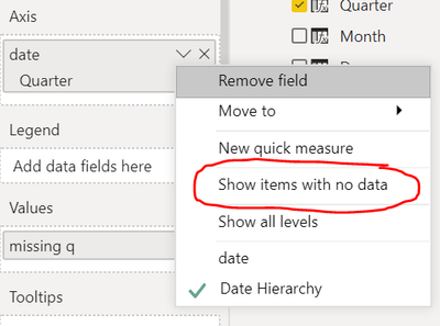
1. If you click the drop down menu by quarter, make sure the "Show items with no data" is un-checked.
2. Make sure axis is categorical not continuous.
3. That measure would actually make it show. 🙂 The measure would want to be blank() for the chart to skip that quarter, not 0.
Respectfully,
Zoe Douglas (DataZoe)
Follow me on LinkedIn at https://www.linkedin.com/in/zoedouglas-data
See my reports and blog at https://www.datazoepowerbi.com/
- Mark as New
- Bookmark
- Subscribe
- Mute
- Subscribe to RSS Feed
- Permalink
- Report Inappropriate Content
Hi,
So based on your approach, I made sure that the "Show items with no data" is unchecked, x-axis is categorial and changed my measure to be blank() and then applied a visual level filter for my values as "Is not blank". Still I could see the blank spaces for the bar with no data. I could not identify for what reason blank() condition is not getting applied to the measure values and why I am not able to filter out those values in the graph. A ref pic is below:
- Mark as New
- Bookmark
- Subscribe
- Mute
- Subscribe to RSS Feed
- Permalink
- Report Inappropriate Content
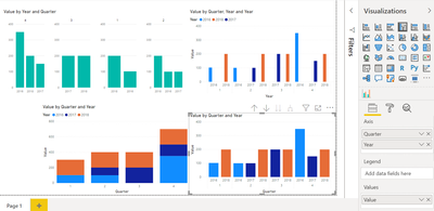
@Lakshmi_Koduri Thanks for the picture - it helps a lot to see the problem.
Because you have put Year in the Legend field, it will keep the blank spaces for consistency.
Do you like any of the alternative options below?
Top left is using custom marketplace visual by Akvelon with "Column by" Quarter and under Format: "X-Axis > Axis Range Type" set to "Separate". Bottom left changes chart type to stacked column. Bottom right puts both quarter and year in Axis, expands down a level and under Format > Data Colors > Show All > On and customize the colors as you want.
None of them are exactly what you're looking for, but hopefully helps a bit?
Please @mention me in your reply if you want a response.
Copying DAX from this post? Click here for a hack to quickly replace it with your own table names
Has this post solved your problem? Please Accept as Solution so that others can find it quickly and to let the community know your problem has been solved.
If you found this post helpful, please give Kudos C
I work as a Microsoft trainer and consultant, specialising in Power BI and Power Query.
www.excelwithallison.com
- Mark as New
- Bookmark
- Subscribe
- Mute
- Subscribe to RSS Feed
- Permalink
- Report Inappropriate Content
Helpful resources

Microsoft Fabric Learn Together
Covering the world! 9:00-10:30 AM Sydney, 4:00-5:30 PM CET (Paris/Berlin), 7:00-8:30 PM Mexico City

Power BI Monthly Update - April 2024
Check out the April 2024 Power BI update to learn about new features.

| User | Count |
|---|---|
| 109 | |
| 98 | |
| 77 | |
| 66 | |
| 54 |
| User | Count |
|---|---|
| 144 | |
| 104 | |
| 101 | |
| 86 | |
| 64 |


