- Power BI forums
- Updates
- News & Announcements
- Get Help with Power BI
- Desktop
- Service
- Report Server
- Power Query
- Mobile Apps
- Developer
- DAX Commands and Tips
- Custom Visuals Development Discussion
- Health and Life Sciences
- Power BI Spanish forums
- Translated Spanish Desktop
- Power Platform Integration - Better Together!
- Power Platform Integrations (Read-only)
- Power Platform and Dynamics 365 Integrations (Read-only)
- Training and Consulting
- Instructor Led Training
- Dashboard in a Day for Women, by Women
- Galleries
- Community Connections & How-To Videos
- COVID-19 Data Stories Gallery
- Themes Gallery
- Data Stories Gallery
- R Script Showcase
- Webinars and Video Gallery
- Quick Measures Gallery
- 2021 MSBizAppsSummit Gallery
- 2020 MSBizAppsSummit Gallery
- 2019 MSBizAppsSummit Gallery
- Events
- Ideas
- Custom Visuals Ideas
- Issues
- Issues
- Events
- Upcoming Events
- Community Blog
- Power BI Community Blog
- Custom Visuals Community Blog
- Community Support
- Community Accounts & Registration
- Using the Community
- Community Feedback
Register now to learn Fabric in free live sessions led by the best Microsoft experts. From Apr 16 to May 9, in English and Spanish.
- Power BI forums
- Forums
- Get Help with Power BI
- Desktop
- Re: How to prepare data when there are multiple it...
- Subscribe to RSS Feed
- Mark Topic as New
- Mark Topic as Read
- Float this Topic for Current User
- Bookmark
- Subscribe
- Printer Friendly Page
- Mark as New
- Bookmark
- Subscribe
- Mute
- Subscribe to RSS Feed
- Permalink
- Report Inappropriate Content
How to prepare data when there are multiple items in 1 field
Hi. I need to create a stacked bar chart of items sold per month; however, the data presented to me came with all the data in a single field. Any advice on how to get this into the correct format?
ex.
Date Order # / Item
2018-01-01 / 1 / Hamburger, Fries, Soda
2018-01-01 / 2 / Fries, Shake
2018-01-02 / 3 / Hamburger, Soda
2018-01-02 / 4 / Hamburger
On my report, I need to show that on
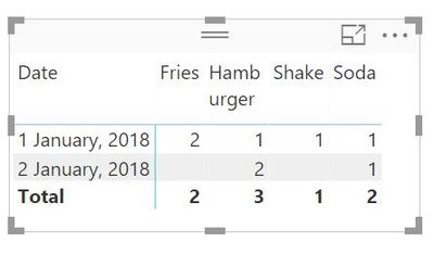
Jan 01, I sold 1 Hamburger, 2 Friest, 1 Soda, 1 Shake
Jan 02, I sold 2 Hamburgers, 1 Soda
Thanks!
Solved! Go to Solution.
- Mark as New
- Bookmark
- Subscribe
- Mute
- Subscribe to RSS Feed
- Permalink
- Report Inappropriate Content
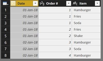
You want your SalesTable look like this:
1. Use Query Editor to re-format your source data. Steps:
- Split Colums by Delimiter /
- Split Columns by Delimiter ,
- Unpivot the last 3 columns (with Items)
- Adjust Data Type, etc
2. Add a measure
Count Items = COUNTROWS(SalesTable)
3. Visualize with Matrix or other chart
- Mark as New
- Bookmark
- Subscribe
- Mute
- Subscribe to RSS Feed
- Permalink
- Report Inappropriate Content
@Anonymous,
By the way, you may select Split into Rows directly.
If this post helps, then please consider Accept it as the solution to help the other members find it more quickly.
- Mark as New
- Bookmark
- Subscribe
- Mute
- Subscribe to RSS Feed
- Permalink
- Report Inappropriate Content
@Anonymous,
By the way, you may select Split into Rows directly.
If this post helps, then please consider Accept it as the solution to help the other members find it more quickly.
- Mark as New
- Bookmark
- Subscribe
- Mute
- Subscribe to RSS Feed
- Permalink
- Report Inappropriate Content
I've created the extra columns and it works...to a degree. I can't build charts that show % of Grand Total (because each column has it's own Grand Total). I tried creating a Grand Total of all items sold; however, I can't seem to get a % of Grand Total view still (could be a simple calc that I'm missing). My example was very simple. What if instead of months, it was a unique reference number (order #)? e.g. 10001, 10002, 10003 and the item sold had various items in the one field? And there millions of orders generated monthly? Thanks!
- Mark as New
- Bookmark
- Subscribe
- Mute
- Subscribe to RSS Feed
- Permalink
- Report Inappropriate Content
You want your SalesTable look like this:
1. Use Query Editor to re-format your source data. Steps:
- Split Colums by Delimiter /
- Split Columns by Delimiter ,
- Unpivot the last 3 columns (with Items)
- Adjust Data Type, etc
2. Add a measure
Count Items = COUNTROWS(SalesTable)
3. Visualize with Matrix or other chart
- Mark as New
- Bookmark
- Subscribe
- Mute
- Subscribe to RSS Feed
- Permalink
- Report Inappropriate Content
Helpful resources

Microsoft Fabric Learn Together
Covering the world! 9:00-10:30 AM Sydney, 4:00-5:30 PM CET (Paris/Berlin), 7:00-8:30 PM Mexico City

Power BI Monthly Update - April 2024
Check out the April 2024 Power BI update to learn about new features.

| User | Count |
|---|---|
| 106 | |
| 93 | |
| 75 | |
| 62 | |
| 50 |
| User | Count |
|---|---|
| 147 | |
| 107 | |
| 105 | |
| 87 | |
| 61 |


