- Power BI forums
- Updates
- News & Announcements
- Get Help with Power BI
- Desktop
- Service
- Report Server
- Power Query
- Mobile Apps
- Developer
- DAX Commands and Tips
- Custom Visuals Development Discussion
- Health and Life Sciences
- Power BI Spanish forums
- Translated Spanish Desktop
- Power Platform Integration - Better Together!
- Power Platform Integrations (Read-only)
- Power Platform and Dynamics 365 Integrations (Read-only)
- Training and Consulting
- Instructor Led Training
- Dashboard in a Day for Women, by Women
- Galleries
- Community Connections & How-To Videos
- COVID-19 Data Stories Gallery
- Themes Gallery
- Data Stories Gallery
- R Script Showcase
- Webinars and Video Gallery
- Quick Measures Gallery
- 2021 MSBizAppsSummit Gallery
- 2020 MSBizAppsSummit Gallery
- 2019 MSBizAppsSummit Gallery
- Events
- Ideas
- Custom Visuals Ideas
- Issues
- Issues
- Events
- Upcoming Events
- Community Blog
- Power BI Community Blog
- Custom Visuals Community Blog
- Community Support
- Community Accounts & Registration
- Using the Community
- Community Feedback
Register now to learn Fabric in free live sessions led by the best Microsoft experts. From Apr 16 to May 9, in English and Spanish.
- Power BI forums
- Forums
- Get Help with Power BI
- Desktop
- Re: How to plot multiple ratios on the same chart
- Subscribe to RSS Feed
- Mark Topic as New
- Mark Topic as Read
- Float this Topic for Current User
- Bookmark
- Subscribe
- Printer Friendly Page
- Mark as New
- Bookmark
- Subscribe
- Mute
- Subscribe to RSS Feed
- Permalink
- Report Inappropriate Content
How to plot multiple ratios on the same chart
Hi,
I am trying to plot on the same chart multiple ratios (metrics) without having an axis of categories.
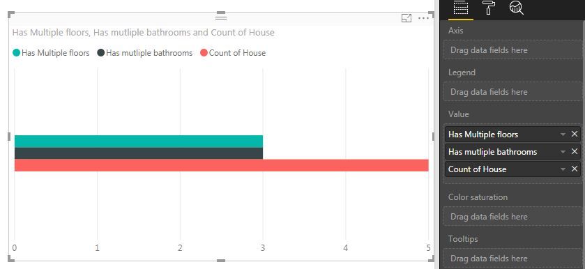
For example, here I'd want to show the number of houses having multiple bathrooms out of the total number of houses, and below it a bar showing the number of houses having multiple floors out of the same total.
How would you go around doing that?
I can for example do this for one bar, where the Legend is the metric and the Value is the total data set. But this only works with one metric. I want to have a second bar right under it in that same chart.
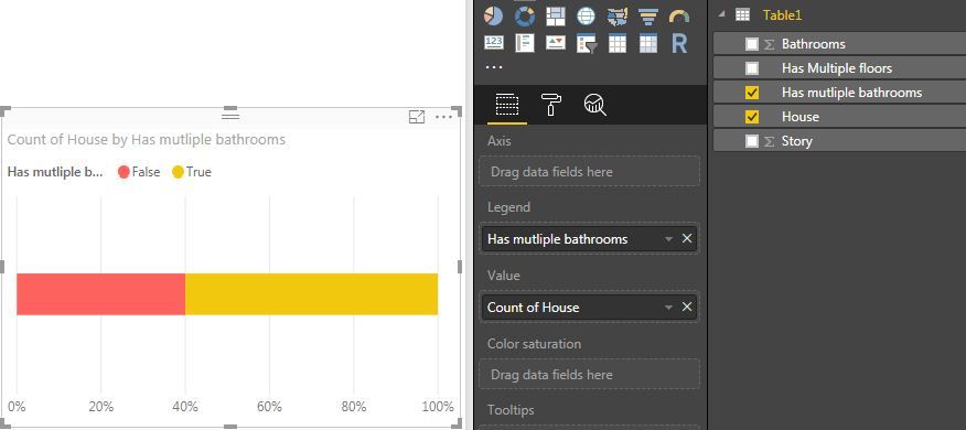
I can also convert the true/false to 0/1 whole numbers, to be able to sum and plot them on a clustered bar chart, but this does not show the ratios explicitely.
Thanks.
- Mark as New
- Bookmark
- Subscribe
- Mute
- Subscribe to RSS Feed
- Permalink
- Report Inappropriate Content
@SamerB,
Please check the measures in the PBIX file below.
https://1drv.ms/u/s!AhsotbnGu1Nokz-iFj6hTkQDHxGz
Regards,
Lydia
If this post helps, then please consider Accept it as the solution to help the other members find it more quickly.
- Mark as New
- Bookmark
- Subscribe
- Mute
- Subscribe to RSS Feed
- Permalink
- Report Inappropriate Content
Thanks @v-yuezhe-msft for your time to recreate the example and the quick response.
What you send me is useful in terms of being able to plot True/False measures, instead of having to convert my values to 0/1 numbers as I was doing to be able to sum.
It still does not show ratios however (i.e. 2 houses out of 5), and plotting another bar for the total number of houses information isn't suitable.
I see it a very bothersome limitation for when the data doesn't have an axis or categories such as in my example.
Best,
Samer.
- Mark as New
- Bookmark
- Subscribe
- Mute
- Subscribe to RSS Feed
- Permalink
- Report Inappropriate Content
@SamerB,
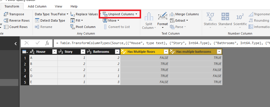
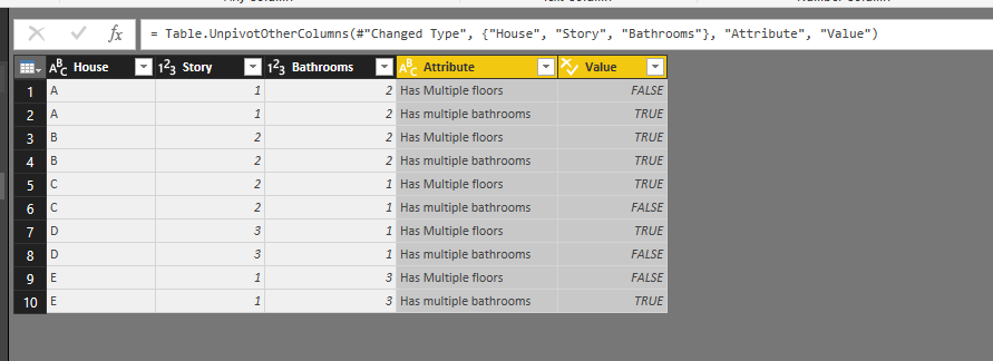
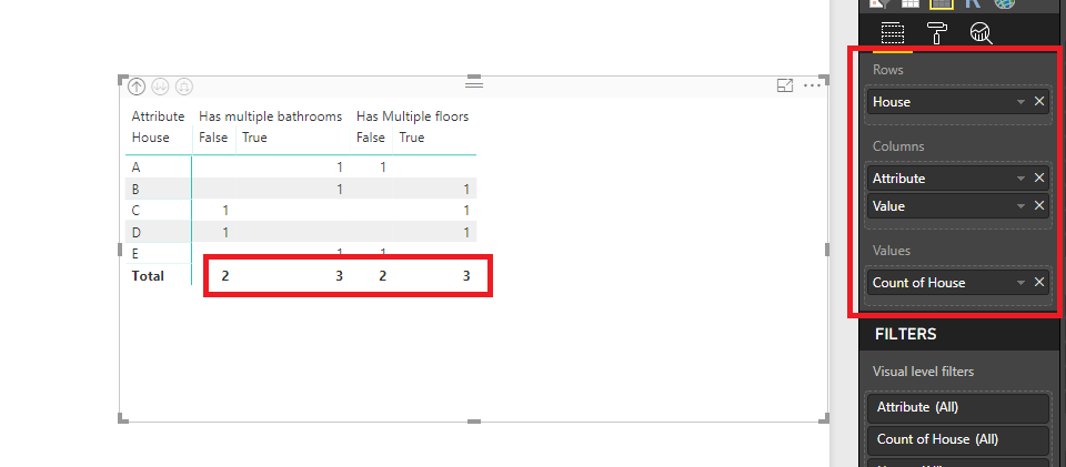
I would recommend you unpivot columns in your table, then create a Matrix visual.
Or you can create a column chart as shown in the video below.
https://1drv.ms/v/s!AhsotbnGu1Nok0bIYnrjrgI3vSS6
Regards,
Lydia
If this post helps, then please consider Accept it as the solution to help the other members find it more quickly.
Helpful resources

Microsoft Fabric Learn Together
Covering the world! 9:00-10:30 AM Sydney, 4:00-5:30 PM CET (Paris/Berlin), 7:00-8:30 PM Mexico City

Power BI Monthly Update - April 2024
Check out the April 2024 Power BI update to learn about new features.

| User | Count |
|---|---|
| 109 | |
| 98 | |
| 77 | |
| 66 | |
| 54 |
| User | Count |
|---|---|
| 144 | |
| 104 | |
| 100 | |
| 86 | |
| 64 |

