- Power BI forums
- Updates
- News & Announcements
- Get Help with Power BI
- Desktop
- Service
- Report Server
- Power Query
- Mobile Apps
- Developer
- DAX Commands and Tips
- Custom Visuals Development Discussion
- Health and Life Sciences
- Power BI Spanish forums
- Translated Spanish Desktop
- Power Platform Integration - Better Together!
- Power Platform Integrations (Read-only)
- Power Platform and Dynamics 365 Integrations (Read-only)
- Training and Consulting
- Instructor Led Training
- Dashboard in a Day for Women, by Women
- Galleries
- Community Connections & How-To Videos
- COVID-19 Data Stories Gallery
- Themes Gallery
- Data Stories Gallery
- R Script Showcase
- Webinars and Video Gallery
- Quick Measures Gallery
- 2021 MSBizAppsSummit Gallery
- 2020 MSBizAppsSummit Gallery
- 2019 MSBizAppsSummit Gallery
- Events
- Ideas
- Custom Visuals Ideas
- Issues
- Issues
- Events
- Upcoming Events
- Community Blog
- Power BI Community Blog
- Custom Visuals Community Blog
- Community Support
- Community Accounts & Registration
- Using the Community
- Community Feedback
Register now to learn Fabric in free live sessions led by the best Microsoft experts. From Apr 16 to May 9, in English and Spanish.
- Power BI forums
- Forums
- Get Help with Power BI
- Desktop
- Re: How to plot monthly average of number of days ...
- Subscribe to RSS Feed
- Mark Topic as New
- Mark Topic as Read
- Float this Topic for Current User
- Bookmark
- Subscribe
- Printer Friendly Page
- Mark as New
- Bookmark
- Subscribe
- Mute
- Subscribe to RSS Feed
- Permalink
- Report Inappropriate Content
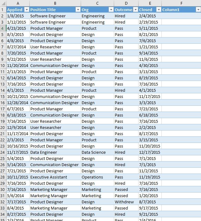
How to plot monthly average of number of days from calculated distance between two dates?

Solved! Go to Solution.
- Mark as New
- Bookmark
- Subscribe
- Mute
- Subscribe to RSS Feed
- Permalink
- Report Inappropriate Content
@another1here - So, I created the following columns:
DaysToClose = DATEDIFF([Applied],[Closed],DAY)

MonthClosedSort = MONTH([Closed])

MonthClosed = FORMAT([Closed],"mmmm")
And then the following measure:
AverageToClose = AVERAGE([DaysToClose])
I set MonthClosed to have a Sort By of MonthClosedSort.
I created a visual with MonthClosed as the Axis and AverageToClose for Values. Then, you could choose either your Org or your Outcome as a Legend and have the other one as a slicer for example.
@ me in replies or I'll lose your thread!!!
Instead of a Kudo, please vote for this idea
Become an expert!: Enterprise DNA
External Tools: MSHGQM
YouTube Channel!: Microsoft Hates Greg
Latest book!: The Definitive Guide to Power Query (M)
DAX is easy, CALCULATE makes DAX hard...
- Mark as New
- Bookmark
- Subscribe
- Mute
- Subscribe to RSS Feed
- Permalink
- Report Inappropriate Content
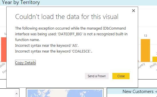
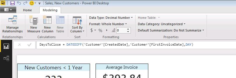
This makes sense, and I have very similar data. I am looking for a count (and average) of the total days between the date a customer was setup and when they had thier first invoice. I am getting an odd error message. I would appreciate any help, as I dont appear to have datediff_big in my formula? I am wondering if I have my columns or my data classified incorrectly?
Thank you.
- Mark as New
- Bookmark
- Subscribe
- Mute
- Subscribe to RSS Feed
- Permalink
- Report Inappropriate Content
@Greg_Deckler This is fantastic. Thank you so much!
Question for you - this shows months in order from January to December, regardless of year. If I have data that spans different years (for instance, previous 6 months from today's date, which would include both 2015 and 2016), how can I show it it chronological order? I'd want the visual to show 2015 October first (as the first date) and so on, with March 2016 at the end of the axis (for today).
I realize this is probably a simple question, I figure I'm probably not thinking about something basic :).
Thanks in advance for your help!
- Mark as New
- Bookmark
- Subscribe
- Mute
- Subscribe to RSS Feed
- Permalink
- Report Inappropriate Content
@another1here - Just change MonthCloseSort to something like:
MonthClosedSort = CONCATENATE(YEAR([Closed]),MONTH([Closed]))
@ me in replies or I'll lose your thread!!!
Instead of a Kudo, please vote for this idea
Become an expert!: Enterprise DNA
External Tools: MSHGQM
YouTube Channel!: Microsoft Hates Greg
Latest book!: The Definitive Guide to Power Query (M)
DAX is easy, CALCULATE makes DAX hard...
- Mark as New
- Bookmark
- Subscribe
- Mute
- Subscribe to RSS Feed
- Permalink
- Report Inappropriate Content
Awesome. Thank you again! You have been super helpful. I really appreciate the assistance!
- Mark as New
- Bookmark
- Subscribe
- Mute
- Subscribe to RSS Feed
- Permalink
- Report Inappropriate Content
One more thing I'll add for the benefit of the community if this helps anyone else-
I ended up with a single digit month for months 1 through 9, which threw it out of order. So to create two-digit months, I created another new column
MonthTwoDigit = FORMAT(table_name[Closed],"mm")
and then changed MonthClosedSort to
MonthClosedSort = CONCATENATE(YEAR([Closed]),table_name[MonthTwoDigit])
That did the trick for me. Although maybe there was a better/easier way to do it... but this worked.
- Mark as New
- Bookmark
- Subscribe
- Mute
- Subscribe to RSS Feed
- Permalink
- Report Inappropriate Content
I would do just what you say, calculate the elapsed number of days for each column, and then create a measure to calculate average the number of days. I think you will also need a Month column for the chart's axis.
Follow me on Twitter: https://twitter.com/AdolfoSocorro
Helpful resources

Microsoft Fabric Learn Together
Covering the world! 9:00-10:30 AM Sydney, 4:00-5:30 PM CET (Paris/Berlin), 7:00-8:30 PM Mexico City

Power BI Monthly Update - April 2024
Check out the April 2024 Power BI update to learn about new features.

| User | Count |
|---|---|
| 109 | |
| 98 | |
| 77 | |
| 66 | |
| 54 |
| User | Count |
|---|---|
| 144 | |
| 104 | |
| 100 | |
| 86 | |
| 64 |


