- Power BI forums
- Updates
- News & Announcements
- Get Help with Power BI
- Desktop
- Service
- Report Server
- Power Query
- Mobile Apps
- Developer
- DAX Commands and Tips
- Custom Visuals Development Discussion
- Health and Life Sciences
- Power BI Spanish forums
- Translated Spanish Desktop
- Power Platform Integration - Better Together!
- Power Platform Integrations (Read-only)
- Power Platform and Dynamics 365 Integrations (Read-only)
- Training and Consulting
- Instructor Led Training
- Dashboard in a Day for Women, by Women
- Galleries
- Community Connections & How-To Videos
- COVID-19 Data Stories Gallery
- Themes Gallery
- Data Stories Gallery
- R Script Showcase
- Webinars and Video Gallery
- Quick Measures Gallery
- 2021 MSBizAppsSummit Gallery
- 2020 MSBizAppsSummit Gallery
- 2019 MSBizAppsSummit Gallery
- Events
- Ideas
- Custom Visuals Ideas
- Issues
- Issues
- Events
- Upcoming Events
- Community Blog
- Power BI Community Blog
- Custom Visuals Community Blog
- Community Support
- Community Accounts & Registration
- Using the Community
- Community Feedback
Register now to learn Fabric in free live sessions led by the best Microsoft experts. From Apr 16 to May 9, in English and Spanish.
- Power BI forums
- Forums
- Get Help with Power BI
- Desktop
- How to plot YTD months on a bar chart
- Subscribe to RSS Feed
- Mark Topic as New
- Mark Topic as Read
- Float this Topic for Current User
- Bookmark
- Subscribe
- Printer Friendly Page
- Mark as New
- Bookmark
- Subscribe
- Mute
- Subscribe to RSS Feed
- Permalink
- Report Inappropriate Content
How to plot YTD months on a bar chart
So, I have this month filter slicer in my report. I have another visual in a report - a bar chart. The chart plots a measure on the Y axis and Fiscal month on the X axis. The month on Y axis changes as per the month filter selection as expected.
Now, I need a functionality where instead of plotting the single month which is selected in my filter, I want to plot all YTD months for that year. For example, considering the calendar is default January to December, if I select 'March-2017' in my filter, I want the chart to plot 'Jan-2017', 'Feb-2017' and 'Mar-2017' on my X axis. If I filter on 'April-2017', I want the chart to plot 'Jan-2017', 'Feb-2017', 'Mar-2017' and 'Apr-2017' on my X axis. Let me know if you need more details to help help my situation 🙂
P.S - I have a date table in my model with a date column in it.
Solved! Go to Solution.
- Mark as New
- Bookmark
- Subscribe
- Mute
- Subscribe to RSS Feed
- Permalink
- Report Inappropriate Content
Hi @amitchandra,
My apporach in this situation would be to create a disconnected table (one that doesn't have any relationships with other tables) and use a helper column.
I would create calculated column in Date table called Rolling Months.
Rolling Months =
VAR MAX_DATE_ =
    CALCULATE ( MAX ( 'Date'[Date] ), ALL ( 'Date' ) ) //calculates  the max date of the table, will not be affected by on-page slicers and cross filters
RETURN
    DATEDIFF ( 'Date'[Date], MAX_DATE_, MONTH )
//calculates the difference in months from max date, the latest month will return zero
I would create a calculated table based of my existing Date table.
Month Table =
ALL ( 'Date'[Month], 'Date'[Rolling Months] )
Then I would create a measure that gets filtered based on the selection from the disconnected table and use this measure in the visuals.
MeasureYTD =
CALCULATE (
    SUM ( 'Fact'[Measure] ),
    FILTER ( 'Date', 'Date'[Rolling Months] >= [Rolling Month Selected] )
)
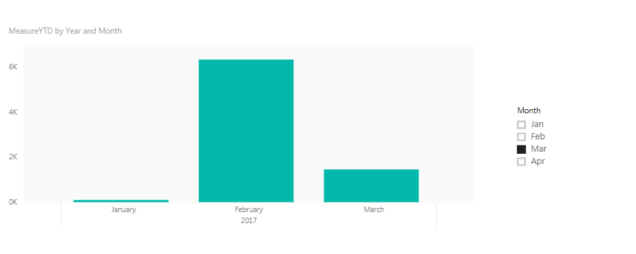
These would result to something like this:
For the PBIX, refer to this link https://drive.google.com/file/d/1TBd7w3_bcV4E0oydgrB_ZANL60srZUBg/view?usp=sharing
Did I answer your question? Mark my post as a solution!
Proud to be a Super User!
"Tell me and I’ll forget; show me and I may remember; involve me and I’ll understand."
Need Power BI consultation, get in touch with me on LinkedIn or hire me on UpWork.
Learn with me on YouTube @DAXJutsu or follow my page on Facebook @DAXJutsuPBI.
- Mark as New
- Bookmark
- Subscribe
- Mute
- Subscribe to RSS Feed
- Permalink
- Report Inappropriate Content
Would you mind posting a sample data?
Did I answer your question? Mark my post as a solution!
Proud to be a Super User!
"Tell me and I’ll forget; show me and I may remember; involve me and I’ll understand."
Need Power BI consultation, get in touch with me on LinkedIn or hire me on UpWork.
Learn with me on YouTube @DAXJutsu or follow my page on Facebook @DAXJutsuPBI.
- Mark as New
- Bookmark
- Subscribe
- Mute
- Subscribe to RSS Feed
- Permalink
- Report Inappropriate Content
Can't post the actual data but below should give an idea -
Fact Table -
| DateID | Measure |
| 20170102 | 34 |
| 20170130 | 63 |
| 20170214 | 6345 |
| 20170325 | 635 |
| 20170316 | 824 |
| 20170421 | 524 |
Date Table -
| DateID | Date | Month |
| 20170102 | 2/01/2017 | Jan |
| 20170130 | 30/01/2017 | Jan |
| 20170214 | 14/02/2017 | Feb |
| 20170325 | 25/03/2017 | Mar |
| 20170316 | 16/03/2017 | Mar |
| 20170421 | 21/04/2017 | Apr |
Relation b/w them 'Date Table'[DateID] -> 'Fact Table'[Date[ID]
I am dragging 'Fact Table'[Measure] on the Values, and 'Date Table'[Month] on the Axis.
- Mark as New
- Bookmark
- Subscribe
- Mute
- Subscribe to RSS Feed
- Permalink
- Report Inappropriate Content
Hi @amitchandra,
My apporach in this situation would be to create a disconnected table (one that doesn't have any relationships with other tables) and use a helper column.
I would create calculated column in Date table called Rolling Months.
Rolling Months =
VAR MAX_DATE_ =
    CALCULATE ( MAX ( 'Date'[Date] ), ALL ( 'Date' ) ) //calculates  the max date of the table, will not be affected by on-page slicers and cross filters
RETURN
    DATEDIFF ( 'Date'[Date], MAX_DATE_, MONTH )
//calculates the difference in months from max date, the latest month will return zero
I would create a calculated table based of my existing Date table.
Month Table =
ALL ( 'Date'[Month], 'Date'[Rolling Months] )
Then I would create a measure that gets filtered based on the selection from the disconnected table and use this measure in the visuals.
MeasureYTD =
CALCULATE (
    SUM ( 'Fact'[Measure] ),
    FILTER ( 'Date', 'Date'[Rolling Months] >= [Rolling Month Selected] )
)
These would result to something like this:
For the PBIX, refer to this link https://drive.google.com/file/d/1TBd7w3_bcV4E0oydgrB_ZANL60srZUBg/view?usp=sharing
Did I answer your question? Mark my post as a solution!
Proud to be a Super User!
"Tell me and I’ll forget; show me and I may remember; involve me and I’ll understand."
Need Power BI consultation, get in touch with me on LinkedIn or hire me on UpWork.
Learn with me on YouTube @DAXJutsu or follow my page on Facebook @DAXJutsuPBI.
- Mark as New
- Bookmark
- Subscribe
- Mute
- Subscribe to RSS Feed
- Permalink
- Report Inappropriate Content
Hi,
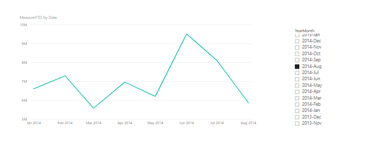
I want to make a follow up to danextian great solution for plotting YTD chart. The solution is great but if you need to
filter YTD through different months and years it doesn't work.
You have to add these things:
1) I would create three calculated columns in Date table called Rolling Years, Rolling Months and Year Month.
Rolling Years =
VAR MAX_DATE_ =
    CALCULATE ( MAX ( 'Date'[Date] ), ALL ( 'Date' ) )
RETURN
    DATEDIFF ( 'Date'[Date], MAX_DATE_, YEAR )
Rolling Months =
VAR MAX_DATE_ =
    CALCULATE ( MAX ( 'DimDate'[Date] ), ALL ( 'DimDate' ) )
RETURN
    DATEDIFF ( 'DimDate'[Date], MAX_DATE_, MONTH )
YearMonth = FORMAT(DimDate[Date],"yyyy-mmm")
2) I would create a calculated table based on my existing DimDate table.
Date = ALL ( 'DimDate'[Rolling Months],DimDate[Rolling Year],DimDate[YearMonth] )
Rolling Year Selected = MIN('Month'[Rolling Year])Rolling Month Selected = MIN('Month'[Rolling Months])4) Finally, I would create a measure that gets filtered based on the selection from the disconnected table and use this measure in the visuals.
MeasureYTD =
CALCULATE (
    SUM ( financials[ Sales] ),
    FILTER ( 'DimDate', 'DimDate'[Rolling Months] >= [Rolling Month Selected] ),FILTER(DimDate,DimDate[Rolling Year] = [Rolling Year Selected])
)
- Mark as New
- Bookmark
- Subscribe
- Mute
- Subscribe to RSS Feed
- Permalink
- Report Inappropriate Content
Thanks Dan, I will get to this a little later than expected. Keep you posted on how I go. Thanks much 🙂
Helpful resources

Microsoft Fabric Learn Together
Covering the world! 9:00-10:30 AM Sydney, 4:00-5:30 PM CET (Paris/Berlin), 7:00-8:30 PM Mexico City

Power BI Monthly Update - April 2024
Check out the April 2024 Power BI update to learn about new features.

| User | Count |
|---|---|
| 112 | |
| 100 | |
| 76 | |
| 74 | |
| 49 |
| User | Count |
|---|---|
| 145 | |
| 108 | |
| 107 | |
| 89 | |
| 61 |


