- Power BI forums
- Updates
- News & Announcements
- Get Help with Power BI
- Desktop
- Service
- Report Server
- Power Query
- Mobile Apps
- Developer
- DAX Commands and Tips
- Custom Visuals Development Discussion
- Health and Life Sciences
- Power BI Spanish forums
- Translated Spanish Desktop
- Power Platform Integration - Better Together!
- Power Platform Integrations (Read-only)
- Power Platform and Dynamics 365 Integrations (Read-only)
- Training and Consulting
- Instructor Led Training
- Dashboard in a Day for Women, by Women
- Galleries
- Community Connections & How-To Videos
- COVID-19 Data Stories Gallery
- Themes Gallery
- Data Stories Gallery
- R Script Showcase
- Webinars and Video Gallery
- Quick Measures Gallery
- 2021 MSBizAppsSummit Gallery
- 2020 MSBizAppsSummit Gallery
- 2019 MSBizAppsSummit Gallery
- Events
- Ideas
- Custom Visuals Ideas
- Issues
- Issues
- Events
- Upcoming Events
- Community Blog
- Power BI Community Blog
- Custom Visuals Community Blog
- Community Support
- Community Accounts & Registration
- Using the Community
- Community Feedback
Register now to learn Fabric in free live sessions led by the best Microsoft experts. From Apr 16 to May 9, in English and Spanish.
- Power BI forums
- Forums
- Get Help with Power BI
- Desktop
- How to plot Bar chart with Y axis left for amount ...
- Subscribe to RSS Feed
- Mark Topic as New
- Mark Topic as Read
- Float this Topic for Current User
- Bookmark
- Subscribe
- Printer Friendly Page
- Mark as New
- Bookmark
- Subscribe
- Mute
- Subscribe to RSS Feed
- Permalink
- Report Inappropriate Content
How to plot Bar chart with Y axis left for amount and right for Count ?
Hi All
Due deal Amount very large and count of deal very small , now both put on left axis , end up unable to see the different.
May i know how to set Amount on left , Count on right ?
Paul.
Solved! Go to Solution.
- Mark as New
- Bookmark
- Subscribe
- Mute
- Subscribe to RSS Feed
- Permalink
- Report Inappropriate Content
Hello @admin11,
I would suggest using count as line as comparing tow bars one with values in millions and one in tens/hundreds will not give correct impression and might confuse end users.
As @PhilipTreacy mentioned secondary axis is for line. You can enable it from y axis - Show secondary option present in formating option.
You can also try option of allign zero too after enabling secondary axis for line.
Thanks!
Shishir
- Mark as New
- Bookmark
- Subscribe
- Mute
- Subscribe to RSS Feed
- Permalink
- Report Inappropriate Content
Hi @admin11 ,
According to your needs, display its quantity for the created measure. You can refer to the following operations:
Get the final result:
If the problem is still not resolved, please provide detailed error information and let me know immediately. Looking forward to your reply.
Best Regards,
Henry
If this post helps, then please consider Accept it as the solution to help the other members find it more quickly.
- Mark as New
- Bookmark
- Subscribe
- Mute
- Subscribe to RSS Feed
- Permalink
- Report Inappropriate Content
Hi Paul,
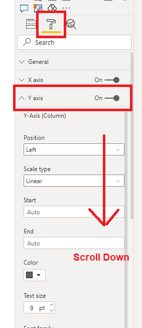
To turn on the Secondary Y axis, go to Format, find Y Axis and open it, then scroll down
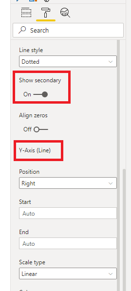
Until you see Show secondary and turn that on. You don't need to set the Secondary axis for the Line, that is already done automatically.
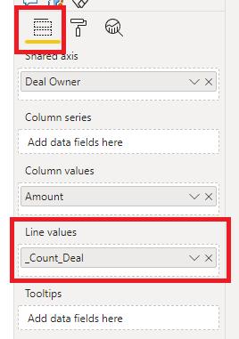
But you do need to provide some data for the Line value
But _Count_Deal is 0 so there's nothing to show. You'll just get a horizontal line at 0.
Regards
Phil
Did I answer your question? Then please mark my post as the solution.
If I helped you, click on the Thumbs Up to give Kudos.
Blog :: YouTube Channel :: Connect on Linkedin
Proud to be a Super User!
- Mark as New
- Bookmark
- Subscribe
- Mute
- Subscribe to RSS Feed
- Permalink
- Report Inappropriate Content
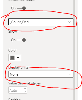
Thank you for providing me very detail instruction.
Actually the _Count_Deal is not zero. Now get zero is because the unit in million.
The reason i need count to be at right axis is from the chart , number deal is not impt , impt is amount of value of deal.
Hope you can show me how to change the scale of the _Count Deal not in million.
Paul
- Mark as New
- Bookmark
- Subscribe
- Mute
- Subscribe to RSS Feed
- Permalink
- Report Inappropriate Content
Hello @admin11,
I would suggest using count as line as comparing tow bars one with values in millions and one in tens/hundreds will not give correct impression and might confuse end users.
As @PhilipTreacy mentioned secondary axis is for line. You can enable it from y axis - Show secondary option present in formating option.
You can also try option of allign zero too after enabling secondary axis for line.
Thanks!
Shishir
- Mark as New
- Bookmark
- Subscribe
- Mute
- Subscribe to RSS Feed
- Permalink
- Report Inappropriate Content
@Shishir22 Thank you for sharing , can you pls share with me where to turn on show second axis ? i cannot find it. also how to set second axis for line ? instead of bar ?
Paul Yeo
- Mark as New
- Bookmark
- Subscribe
- Mute
- Subscribe to RSS Feed
- Permalink
- Report Inappropriate Content
Hi Paul,
The Secandary axis on that chart is for the line,not the column values.
But your Count is 0 anyway, so even if it was on another secondary axis it would still be 0?
Regards
Phil
Did I answer your question? Then please mark my post as the solution.
If I helped you, click on the Thumbs Up to give Kudos.
Blog :: YouTube Channel :: Connect on Linkedin
Proud to be a Super User!
Helpful resources

Microsoft Fabric Learn Together
Covering the world! 9:00-10:30 AM Sydney, 4:00-5:30 PM CET (Paris/Berlin), 7:00-8:30 PM Mexico City

Power BI Monthly Update - April 2024
Check out the April 2024 Power BI update to learn about new features.

| User | Count |
|---|---|
| 108 | |
| 100 | |
| 78 | |
| 64 | |
| 58 |
| User | Count |
|---|---|
| 148 | |
| 111 | |
| 94 | |
| 84 | |
| 67 |


