- Power BI forums
- Updates
- News & Announcements
- Get Help with Power BI
- Desktop
- Service
- Report Server
- Power Query
- Mobile Apps
- Developer
- DAX Commands and Tips
- Custom Visuals Development Discussion
- Health and Life Sciences
- Power BI Spanish forums
- Translated Spanish Desktop
- Power Platform Integration - Better Together!
- Power Platform Integrations (Read-only)
- Power Platform and Dynamics 365 Integrations (Read-only)
- Training and Consulting
- Instructor Led Training
- Dashboard in a Day for Women, by Women
- Galleries
- Community Connections & How-To Videos
- COVID-19 Data Stories Gallery
- Themes Gallery
- Data Stories Gallery
- R Script Showcase
- Webinars and Video Gallery
- Quick Measures Gallery
- 2021 MSBizAppsSummit Gallery
- 2020 MSBizAppsSummit Gallery
- 2019 MSBizAppsSummit Gallery
- Events
- Ideas
- Custom Visuals Ideas
- Issues
- Issues
- Events
- Upcoming Events
- Community Blog
- Power BI Community Blog
- Custom Visuals Community Blog
- Community Support
- Community Accounts & Registration
- Using the Community
- Community Feedback
Register now to learn Fabric in free live sessions led by the best Microsoft experts. From Apr 16 to May 9, in English and Spanish.
- Power BI forums
- Forums
- Get Help with Power BI
- Desktop
- How to order dates chronologically on graph x-axis
- Subscribe to RSS Feed
- Mark Topic as New
- Mark Topic as Read
- Float this Topic for Current User
- Bookmark
- Subscribe
- Printer Friendly Page
- Mark as New
- Bookmark
- Subscribe
- Mute
- Subscribe to RSS Feed
- Permalink
- Report Inappropriate Content
How to order dates chronologically on graph x-axis
Hi,
I have a Power BI report connected live to an azure analysis services cube. In the cube I have a column for email 'sentdate' (which is a complete date and timestamp), 'daysent' (1-31), 'monthsent' (index from 1-12) and 'yearsent' (2017, 2018).
I want to create a graph of average email open rate by month (using the 'monthsent' column). This works fine when I keep the date range within the same year, however if I want to look at say November 2017 - June 2018, the graph doesn't follow chronologically as the axis is by index so it puts 11,12 at the far right when what I actually want is to to go from Nov-17, Dec-17, Jan-18 etc.
Is there a way to do achieve what I want using the columns I already have? The live connection limits a lot of the easy solutions.
Thanks
Connor
Solved! Go to Solution.
- Mark as New
- Bookmark
- Subscribe
- Mute
- Subscribe to RSS Feed
- Permalink
- Report Inappropriate Content
Hi @cmccarra,
Based on my test, you can refer to below steps:
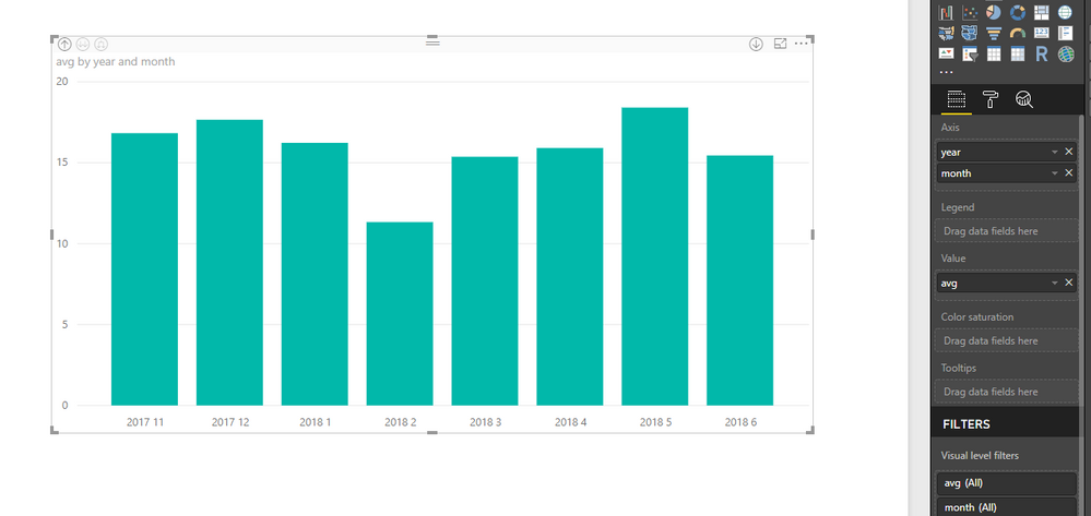
1.Create a Clustered column chart and add the [month] and [avg] fields.
2.Put the [year] field before the [month] and use the “Expand all down one level in the hierarchy” function in the visual. Now you can see the correct result.
Regards,
Daniel He
If this post helps, then please consider Accept it as the solution to help the other members find it more quickly.
- Mark as New
- Bookmark
- Subscribe
- Mute
- Subscribe to RSS Feed
- Permalink
- Report Inappropriate Content
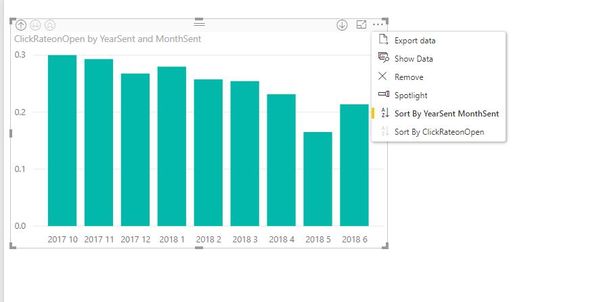
Hi @v-danhe-msft, thanks for your reply. I tried what you described before but I still ended up with the graph starting at Jan-2018. I followed your guide and this happended again but I then clicked on the 'Sort By YearSent MonthSent' option from the visual dropdown menu twice and got the desired results. The sort by option seems a bit temperamental, it took a few clicks on some graphs to get it sort correctly.
Thanks for your help!
Helpful resources

Microsoft Fabric Learn Together
Covering the world! 9:00-10:30 AM Sydney, 4:00-5:30 PM CET (Paris/Berlin), 7:00-8:30 PM Mexico City

Power BI Monthly Update - April 2024
Check out the April 2024 Power BI update to learn about new features.

| User | Count |
|---|---|
| 109 | |
| 98 | |
| 77 | |
| 66 | |
| 54 |
| User | Count |
|---|---|
| 144 | |
| 104 | |
| 100 | |
| 86 | |
| 64 |


