- Power BI forums
- Updates
- News & Announcements
- Get Help with Power BI
- Desktop
- Service
- Report Server
- Power Query
- Mobile Apps
- Developer
- DAX Commands and Tips
- Custom Visuals Development Discussion
- Health and Life Sciences
- Power BI Spanish forums
- Translated Spanish Desktop
- Power Platform Integration - Better Together!
- Power Platform Integrations (Read-only)
- Power Platform and Dynamics 365 Integrations (Read-only)
- Training and Consulting
- Instructor Led Training
- Dashboard in a Day for Women, by Women
- Galleries
- Community Connections & How-To Videos
- COVID-19 Data Stories Gallery
- Themes Gallery
- Data Stories Gallery
- R Script Showcase
- Webinars and Video Gallery
- Quick Measures Gallery
- 2021 MSBizAppsSummit Gallery
- 2020 MSBizAppsSummit Gallery
- 2019 MSBizAppsSummit Gallery
- Events
- Ideas
- Custom Visuals Ideas
- Issues
- Issues
- Events
- Upcoming Events
- Community Blog
- Power BI Community Blog
- Custom Visuals Community Blog
- Community Support
- Community Accounts & Registration
- Using the Community
- Community Feedback
Register now to learn Fabric in free live sessions led by the best Microsoft experts. From Apr 16 to May 9, in English and Spanish.
- Power BI forums
- Forums
- Get Help with Power BI
- Desktop
- How to make a price line chart like keepa?
- Subscribe to RSS Feed
- Mark Topic as New
- Mark Topic as Read
- Float this Topic for Current User
- Bookmark
- Subscribe
- Printer Friendly Page
- Mark as New
- Bookmark
- Subscribe
- Mute
- Subscribe to RSS Feed
- Permalink
- Report Inappropriate Content
How to make a price line chart like keepa?
Hi,
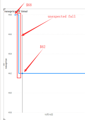
When I try to use the default line chart of power bi to make a price step chart like keepa (a amazon price tracker tool), I have the following problems:
1. The gradient function of the line chart will make the curve change in the middle, for example, from $68 on 2016/10/7 to $62 on 2016/10/9, there will be an undesired intermediate value in the middle of the curve, ideally it should be direct Falling, like step before in "power kpi".
2. When the price value is nan, it means that the product is out of stock, so the curve should be broken until a new price value appears next time. My current approach is to replace nan with 0 to make the curve bottom, but this method does not meet expectations.
3. When the date is selected, the curve will be disconnected. For example, when the selected time is 2016/10/20-2016/11/30, the ideal situation is that the price of $62 on 2016/10/9 will be displayed directly, but the reality is, Only curves starting from $68 on 2016/11/16 will be displayed.
Below are a example of how keepa show price curve.
https://keepa.com/#!product/1-B07DJ4ZGZR
Thanks a lot if you can share a solution of the problesm above.
| time | newprice |
| 2016/10/7 13:32 | 68 |
| 2016/10/9 8:48 | 62 |
| 2016/11/26 6:52 | 58 |
| 2016/11/27 8:16 | 62 |
| 2016/12/8 11:14 | 68 |
| 2016/12/16 20:50 | nan |
| 2016/12/23 7:00 | 68 |
| 2017/2/1 8:24 | 65 |
| 2017/3/9 1:42 | 68 |
| 2017/3/9 11:20 | 65 |
| 2017/3/20 7:14 | 68 |
| 2017/3/24 6:12 | 65 |
| 2017/4/9 0:32 | nan |
| 2017/4/11 0:32 | 68 |
| 2017/4/12 15:26 | nan |
| 2017/4/13 16:42 | 65 |
| 2017/4/17 6:02 | nan |
| 2017/4/18 13:10 | 65 |
| 2017/7/10 14:48 | 58.51 |
| 2017/7/11 3:48 | 65 |
| 2017/7/17 2:36 | 68 |
| 2017/7/30 15:04 | nan |
| 2017/7/31 2:44 | 68 |
| 2017/8/28 8:36 | 65.99 |
| 2017/8/29 5:28 | 68.99 |
| 2017/9/11 5:10 | 65 |
| 2017/10/30 7:20 | 63.99 |
- Mark as New
- Bookmark
- Subscribe
- Mute
- Subscribe to RSS Feed
- Permalink
- Report Inappropriate Content
Hi @gaoact1 ,
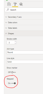
1) Change your line chart shape to 'Stepped' in chart formatting:
2) Remove NaN in your data and replace with nulls. See how I did this by pasting this code over the default in a Blank Query in Power Query:
let
    Source = Table.FromRows(Json.Document(Binary.Decompress(Binary.FromText("bVJJEsIwDPuKp2eGWM7m+CsMBz7Q/x9x0jI0gatkWXKUx2MTRgngUAnRomy3rej2vH2JRmpJOy4XHEEKFctdkHUmqitQVoUEJcCQVgsJKCRsmZ3ZX/tESaRqzJOmBpe4h4xV+QtHDwtLskwPGCb8My7s25dEA09+G2SZT76Hjze6xOw48CGuexwXQjYpfxSRUM6okwWqW/M/D+0NYT2iekeEdFSU9Z4xcaB4tjdrKonFsgT207kH5rTaOwNXpPWpNIh6E8emfG9tohr58cNcJ6r1XPn3Fv9tsTdyNBWH5vkG", BinaryEncoding.Base64), Compression.Deflate)), let _t = ((type nullable text) meta [Serialized.Text = true]) in type table [time = _t, newprice = _t]),
    #"Changed Type" = Table.TransformColumnTypes(Source,{{"time", type datetime}, {"newprice", type number}}),
    #"Replaced Errors" = Table.ReplaceErrorValues(#"Changed Type", {{"newprice", null}})
in
    #"Replaced Errors"
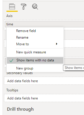
Then, right-click on your axis field and select 'Show items with no data':
3) I'm not really clear what you are asking for here, sorry.
Implementing steps 1) and 2) give me the following output:
Pete
Now accepting Kudos! If my post helped you, why not give it a thumbs-up?
Proud to be a Datanaut!
Helpful resources

Microsoft Fabric Learn Together
Covering the world! 9:00-10:30 AM Sydney, 4:00-5:30 PM CET (Paris/Berlin), 7:00-8:30 PM Mexico City

Power BI Monthly Update - April 2024
Check out the April 2024 Power BI update to learn about new features.

| User | Count |
|---|---|
| 118 | |
| 107 | |
| 70 | |
| 70 | |
| 43 |
| User | Count |
|---|---|
| 148 | |
| 104 | |
| 104 | |
| 89 | |
| 66 |


