- Power BI forums
- Updates
- News & Announcements
- Get Help with Power BI
- Desktop
- Service
- Report Server
- Power Query
- Mobile Apps
- Developer
- DAX Commands and Tips
- Custom Visuals Development Discussion
- Health and Life Sciences
- Power BI Spanish forums
- Translated Spanish Desktop
- Power Platform Integration - Better Together!
- Power Platform Integrations (Read-only)
- Power Platform and Dynamics 365 Integrations (Read-only)
- Training and Consulting
- Instructor Led Training
- Dashboard in a Day for Women, by Women
- Galleries
- Community Connections & How-To Videos
- COVID-19 Data Stories Gallery
- Themes Gallery
- Data Stories Gallery
- R Script Showcase
- Webinars and Video Gallery
- Quick Measures Gallery
- 2021 MSBizAppsSummit Gallery
- 2020 MSBizAppsSummit Gallery
- 2019 MSBizAppsSummit Gallery
- Events
- Ideas
- Custom Visuals Ideas
- Issues
- Issues
- Events
- Upcoming Events
- Community Blog
- Power BI Community Blog
- Custom Visuals Community Blog
- Community Support
- Community Accounts & Registration
- Using the Community
- Community Feedback
Register now to learn Fabric in free live sessions led by the best Microsoft experts. From Apr 16 to May 9, in English and Spanish.
- Power BI forums
- Forums
- Get Help with Power BI
- Desktop
- How to make Visual graph follows the date range fi...
- Subscribe to RSS Feed
- Mark Topic as New
- Mark Topic as Read
- Float this Topic for Current User
- Bookmark
- Subscribe
- Printer Friendly Page
- Mark as New
- Bookmark
- Subscribe
- Mute
- Subscribe to RSS Feed
- Permalink
- Report Inappropriate Content
How to make Visual graph follows the date range filter automatically (after daily data refresh)
I am sharing my Pbix file here at Google drive.
Thank you so much for those of you who tried to help me for last three weeks, but my issue has not been resolved.
So, I am posting again (this time, I am sharing my Pbix file).
Here is scenario.
I have a data that starts from January 1st, 2021 upto July 22nd,, 2021.
I am trying to work with a date slicer which I set up for last 14 days.
What I would like to happen are two things:
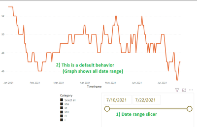
1) slicer (date range) - automatically adjusts to last 14 days when there is a daily data refresh everyday.
So, after tomorrow morning's daily data refresh, it would be updated to 7/11/2021 - 7/23/2021 (from 7/10/2021 - 7/22/2021).
This one works. So, there is no issue.
2) Graph would display last 14 days's data as well (not the whole date range which starts with 1/1/2021).
This is a default behavior:
This is expected behavior:
The challenge that I had was graph to be automatically adjusted to last 14 days (after data refresh).
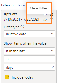
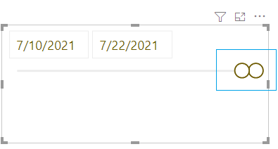
If I clear the filter here, date range slicer moves temporarily according to the date range that I had earlier, but it would not change anything after data gets refreshed tomorrow.
After clearing filter:
Thank you for your help!
Solved! Go to Solution.
- Mark as New
- Bookmark
- Subscribe
- Mute
- Subscribe to RSS Feed
- Permalink
- Report Inappropriate Content
Thanks for help.
Date Slicer gets updated by ifself (before daily data refresh and after daily data refresh) for relative last 14 days, so I don't think I have an issue with a date slicer.
The issue is I want visual to go along with the date ranges (relative: last 14 days). But apparently, it show the whole range of dates (not last 14 days).
I went ahead and created a date table (that ranges from last 14 days to yesterday), and linked to a main table. It appears to be working fine. I publshed in DEV and will take a look tomorrow after daily data refresh. I think it will work. 🙂 Thanks!
- Mark as New
- Bookmark
- Subscribe
- Mute
- Subscribe to RSS Feed
- Permalink
- Report Inappropriate Content
can't you apply the same relative date filter to the date field in the graph visual itself?
or alternatively, use a measure which filters the values for the last 14 days in the table. whatever you try, you should absolutely follow @vanessafvg advice and work with a date table. It's highly recommended and a "best practice"
Did I answer your question? Mark my post as a solution!
In doing so, you are also helping me. Thank you!
Proud to be a Super User!
Paul on Linkedin.
- Mark as New
- Bookmark
- Subscribe
- Mute
- Subscribe to RSS Feed
- Permalink
- Report Inappropriate Content
does your data update everyday? i think you need to create a separate date table and link the reporting date to the date table, to a continious set of dates in a date table.
If I took the time to answer your question and I came up with a solution, please mark my post as a solution and /or give kudos freely for the effort 🙂 Thank you!
Proud to be a Super User!
- Mark as New
- Bookmark
- Subscribe
- Mute
- Subscribe to RSS Feed
- Permalink
- Report Inappropriate Content
@vanessafvg Thank you for your help. Yes, it is supposed to be updated everyday. Sorry. What is the logic of creating a continous set of dates? It is new to me.
- Mark as New
- Bookmark
- Subscribe
- Mute
- Subscribe to RSS Feed
- Permalink
- Report Inappropriate Content
ok, if your dates aren't continious and you dont have a date table to regulate that it has all date values, then there could be issues with using time and date functions- its best practise to always create a date table and link your dates to that, that will eliminate if that is the issue.
So what you basically saying, is that your current14 day selection works fine the first time (the one you have in the pbix), but when you refresh the data it shows all the data for the current calendar year?
Its hard to know what happens after you refresh, can you send an example of what it looks like its refreshed. Have you tried placing the relative filter on the line chart itself?
You can also create a date table with just the dates you want in it dynamically and link that table to your data and plot that date from the date table on your visual.
I dont know the exact solution to your problem but I think the date table with only the dates you need, even if not elegant will probably work.
If I took the time to answer your question and I came up with a solution, please mark my post as a solution and /or give kudos freely for the effort 🙂 Thank you!
Proud to be a Super User!
- Mark as New
- Bookmark
- Subscribe
- Mute
- Subscribe to RSS Feed
- Permalink
- Report Inappropriate Content
Thanks for help.
Date Slicer gets updated by ifself (before daily data refresh and after daily data refresh) for relative last 14 days, so I don't think I have an issue with a date slicer.
The issue is I want visual to go along with the date ranges (relative: last 14 days). But apparently, it show the whole range of dates (not last 14 days).
I went ahead and created a date table (that ranges from last 14 days to yesterday), and linked to a main table. It appears to be working fine. I publshed in DEV and will take a look tomorrow after daily data refresh. I think it will work. 🙂 Thanks!
Helpful resources

Microsoft Fabric Learn Together
Covering the world! 9:00-10:30 AM Sydney, 4:00-5:30 PM CET (Paris/Berlin), 7:00-8:30 PM Mexico City

Power BI Monthly Update - April 2024
Check out the April 2024 Power BI update to learn about new features.

| User | Count |
|---|---|
| 111 | |
| 100 | |
| 80 | |
| 64 | |
| 58 |
| User | Count |
|---|---|
| 146 | |
| 110 | |
| 93 | |
| 84 | |
| 67 |


