- Power BI forums
- Updates
- News & Announcements
- Get Help with Power BI
- Desktop
- Service
- Report Server
- Power Query
- Mobile Apps
- Developer
- DAX Commands and Tips
- Custom Visuals Development Discussion
- Health and Life Sciences
- Power BI Spanish forums
- Translated Spanish Desktop
- Power Platform Integration - Better Together!
- Power Platform Integrations (Read-only)
- Power Platform and Dynamics 365 Integrations (Read-only)
- Training and Consulting
- Instructor Led Training
- Dashboard in a Day for Women, by Women
- Galleries
- Community Connections & How-To Videos
- COVID-19 Data Stories Gallery
- Themes Gallery
- Data Stories Gallery
- R Script Showcase
- Webinars and Video Gallery
- Quick Measures Gallery
- 2021 MSBizAppsSummit Gallery
- 2020 MSBizAppsSummit Gallery
- 2019 MSBizAppsSummit Gallery
- Events
- Ideas
- Custom Visuals Ideas
- Issues
- Issues
- Events
- Upcoming Events
- Community Blog
- Power BI Community Blog
- Custom Visuals Community Blog
- Community Support
- Community Accounts & Registration
- Using the Community
- Community Feedback
Register now to learn Fabric in free live sessions led by the best Microsoft experts. From Apr 16 to May 9, in English and Spanish.
- Power BI forums
- Forums
- Get Help with Power BI
- Desktop
- Re: How to label the date/time on X axis of a mont...
- Subscribe to RSS Feed
- Mark Topic as New
- Mark Topic as Read
- Float this Topic for Current User
- Bookmark
- Subscribe
- Printer Friendly Page
- Mark as New
- Bookmark
- Subscribe
- Mute
- Subscribe to RSS Feed
- Permalink
- Report Inappropriate Content
How to label the date/time on X axis of a monthly max value?
Hi all,
I am attempting to build a bar chart in Power BI that mirrors an excel table detailing the max hourly value of every month. The excel version looks like this ("HE" means "hour ending". This is the time component):
What i have right now in Power BI is this:
How do i convert the X axis to Date & time for every month? For example: Jan 29, 6:00AM; Feb 28th, 5:00AM, etc?
I appreciate any help provided. Thank you.
Solved! Go to Solution.
- Mark as New
- Bookmark
- Subscribe
- Mute
- Subscribe to RSS Feed
- Permalink
- Report Inappropriate Content
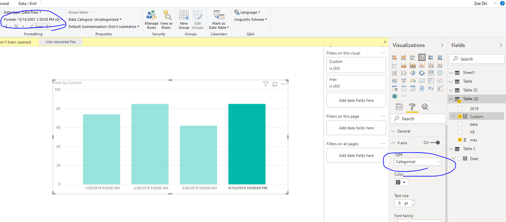
Hi helmsbk,
You could try to use below M code
let
    Source = Table.FromRows(Json.Document(Binary.Decompress(Binary.FromText("i45W8krMU9JRMjcBEkaWukCerqElkO3hqmCmFKsTreSWmgTkWpiC5C10gTy4vClY3jexKDkDKGBmBFJhpgvko6lwLCjKhBlhaKoL5MIVGBkpxcYCAA==", BinaryEncoding.Base64), Compression.Deflate)), let _t = ((type text) meta [Serialized.Text = true]) in type table [#"2019" = _t, max = _t, date = _t, HE = _t]),
    #"Added Custom" = Table.AddColumn(Source, "Custom", each [date]&" "&(Text.Combine(List.RemoveNulls(List.Transform(Text.ToList([HE]),each if Value.Is(Value.FromText(_), type number) then _ else null)))&":00:00")),
    #"Changed Type" = Table.TransformColumnTypes(#"Added Custom",{{"Custom", type datetime}})
in
    #"Changed Type"
Then convert date format like below
Best Regards,
Zoe Zhi
If this post helps, then please consider Accept it as the solution to help the other members find it more quickly.
- Mark as New
- Bookmark
- Subscribe
- Mute
- Subscribe to RSS Feed
- Permalink
- Report Inappropriate Content
My apologies, i did not explain my raw data table well enough. The excel file i showed above is what we are using now, but it is pulling from the same raw data as what i will be using in Power BI. I would like to move away from using that clunky excel file and substitute it with Power BI.
The chart you built is perfect, but i cannot recreate it. This is what the raw data table looks like in Power BI:
- I have the date/time column formatted as "date/time" in the query tool. That current format is exactly what i need for the X axis.
- I need the "Total rolling MW" column to show up how you did your table. Right now the "categorical" option under the X axis does not show up.
Here is how i have the data formatted in Visualizations currently:
Thank you for your help!
- Mark as New
- Bookmark
- Subscribe
- Mute
- Subscribe to RSS Feed
- Permalink
- Report Inappropriate Content
Hi helmsbk,
You could try to use below M code
let
    Source = Table.FromRows(Json.Document(Binary.Decompress(Binary.FromText("i45W8krMU9JRMjcBEkaWukCerqElkO3hqmCmFKsTreSWmgTkWpiC5C10gTy4vClY3jexKDkDKGBmBFJhpgvko6lwLCjKhBlhaKoL5MIVGBkpxcYCAA==", BinaryEncoding.Base64), Compression.Deflate)), let _t = ((type text) meta [Serialized.Text = true]) in type table [#"2019" = _t, max = _t, date = _t, HE = _t]),
    #"Added Custom" = Table.AddColumn(Source, "Custom", each [date]&" "&(Text.Combine(List.RemoveNulls(List.Transform(Text.ToList([HE]),each if Value.Is(Value.FromText(_), type number) then _ else null)))&":00:00")),
    #"Changed Type" = Table.TransformColumnTypes(#"Added Custom",{{"Custom", type datetime}})
in
    #"Changed Type"
Then convert date format like below
Best Regards,
Zoe Zhi
If this post helps, then please consider Accept it as the solution to help the other members find it more quickly.
Helpful resources

Microsoft Fabric Learn Together
Covering the world! 9:00-10:30 AM Sydney, 4:00-5:30 PM CET (Paris/Berlin), 7:00-8:30 PM Mexico City

Power BI Monthly Update - April 2024
Check out the April 2024 Power BI update to learn about new features.

| User | Count |
|---|---|
| 110 | |
| 94 | |
| 80 | |
| 67 | |
| 59 |
| User | Count |
|---|---|
| 150 | |
| 119 | |
| 104 | |
| 87 | |
| 67 |


