- Power BI forums
- Updates
- News & Announcements
- Get Help with Power BI
- Desktop
- Service
- Report Server
- Power Query
- Mobile Apps
- Developer
- DAX Commands and Tips
- Custom Visuals Development Discussion
- Health and Life Sciences
- Power BI Spanish forums
- Translated Spanish Desktop
- Power Platform Integration - Better Together!
- Power Platform Integrations (Read-only)
- Power Platform and Dynamics 365 Integrations (Read-only)
- Training and Consulting
- Instructor Led Training
- Dashboard in a Day for Women, by Women
- Galleries
- Community Connections & How-To Videos
- COVID-19 Data Stories Gallery
- Themes Gallery
- Data Stories Gallery
- R Script Showcase
- Webinars and Video Gallery
- Quick Measures Gallery
- 2021 MSBizAppsSummit Gallery
- 2020 MSBizAppsSummit Gallery
- 2019 MSBizAppsSummit Gallery
- Events
- Ideas
- Custom Visuals Ideas
- Issues
- Issues
- Events
- Upcoming Events
- Community Blog
- Power BI Community Blog
- Custom Visuals Community Blog
- Community Support
- Community Accounts & Registration
- Using the Community
- Community Feedback
Register now to learn Fabric in free live sessions led by the best Microsoft experts. From Apr 16 to May 9, in English and Spanish.
- Power BI forums
- Forums
- Get Help with Power BI
- Desktop
- Re: How to include data from two variables in the ...
- Subscribe to RSS Feed
- Mark Topic as New
- Mark Topic as Read
- Float this Topic for Current User
- Bookmark
- Subscribe
- Printer Friendly Page
- Mark as New
- Bookmark
- Subscribe
- Mute
- Subscribe to RSS Feed
- Permalink
- Report Inappropriate Content
How to include data from two variables in the same chart
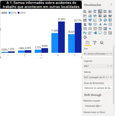
How do I put data on a Likert scale (grades 1 to 5) from the same applied research in 2 consecutive years? The sum of all bars (2018 + 2019) gives 100%, but I would like the data for each year to add up to 100%

Solved! Go to Solution.
- Mark as New
- Bookmark
- Subscribe
- Mute
- Subscribe to RSS Feed
- Permalink
- Report Inappropriate Content
Hi, @rachel_luiz
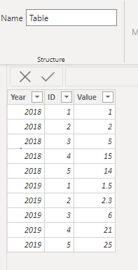
According to your description and sample picture, I think you want to get the value in the column chart that shows the Percentage of the total group by year. Right? You can achieve this using this measure:
This is my test data based on your sample picture:
Value1 =

var _total=

CALCULATE(SUM('Table'[Value]),FILTER(ALLSELECTED('Table'),[Year]=MAX('Table'[Year])))

var _value=

MAX('Table'[Value])

return DIVIDE(_value,_total)
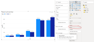
Then go to the Column chart and replace the Value1 with the field in the “Value”, like this:
And you can get what you want.
You can download my test pbix file here
If this result is not what you want, you can post some sample data(without sensitive data) and your expected result.
How to Get Your Question Answered Quickly
Best Regards,
Community Support Team _Robert Qin
If this post helps, then please consider Accept it as the solution to help the other members find it more quickly.
- Mark as New
- Bookmark
- Subscribe
- Mute
- Subscribe to RSS Feed
- Permalink
- Report Inappropriate Content
Hi @parry2k !
Actually, I wanted the bars to appear next to each other, because I'm comparing different years. I think this chart would be very good if the data were complementary, but in my case they are more comparative.
Anyway, thank you very much for your answer!
- Mark as New
- Bookmark
- Subscribe
- Mute
- Subscribe to RSS Feed
- Permalink
- Report Inappropriate Content
Hi, @rachel_luiz
According to your description and sample picture, I think you want to get the value in the column chart that shows the Percentage of the total group by year. Right? You can achieve this using this measure:
This is my test data based on your sample picture:
Value1 =

var _total=

CALCULATE(SUM('Table'[Value]),FILTER(ALLSELECTED('Table'),[Year]=MAX('Table'[Year])))

var _value=

MAX('Table'[Value])

return DIVIDE(_value,_total)
Then go to the Column chart and replace the Value1 with the field in the “Value”, like this:
And you can get what you want.
You can download my test pbix file here
If this result is not what you want, you can post some sample data(without sensitive data) and your expected result.
How to Get Your Question Answered Quickly
Best Regards,
Community Support Team _Robert Qin
If this post helps, then please consider Accept it as the solution to help the other members find it more quickly.
- Mark as New
- Bookmark
- Subscribe
- Mute
- Subscribe to RSS Feed
- Permalink
- Report Inappropriate Content
- Mark as New
- Bookmark
- Subscribe
- Mute
- Subscribe to RSS Feed
- Permalink
- Report Inappropriate Content
@rachel_luiz not sure if I understood, maybe you are looking for 100% stacked bar chart.
Check my latest blog post Compare Budgeted Scenarios vs. Actuals to get a summary of my favourite Power BI feature releases in 2020
I would ❤ Kudos if my solution helped. 👉 If you can spend time posting the question, you can also make efforts to give Kudos to whoever helped to solve your problem. It is a token of appreciation!
⚡Visit us at https://perytus.com, your one-stop-shop for Power BI-related projects/training/consultancy.⚡
Subscribe to the @PowerBIHowTo YT channel for an upcoming video on List and Record functions in Power Query!!
Learn Power BI and Fabric - subscribe to our YT channel - Click here: @PowerBIHowTo
If my solution proved useful, I'd be delighted to receive Kudos. When you put effort into asking a question, it's equally thoughtful to acknowledge and give Kudos to the individual who helped you solve the problem. It's a small gesture that shows appreciation and encouragement! ❤
Did I answer your question? Mark my post as a solution. Proud to be a Super User! Appreciate your Kudos 🙂
Feel free to email me with any of your BI needs.
Helpful resources

Microsoft Fabric Learn Together
Covering the world! 9:00-10:30 AM Sydney, 4:00-5:30 PM CET (Paris/Berlin), 7:00-8:30 PM Mexico City

Power BI Monthly Update - April 2024
Check out the April 2024 Power BI update to learn about new features.

| User | Count |
|---|---|
| 111 | |
| 95 | |
| 80 | |
| 68 | |
| 59 |
| User | Count |
|---|---|
| 150 | |
| 119 | |
| 104 | |
| 87 | |
| 67 |


