- Power BI forums
- Updates
- News & Announcements
- Get Help with Power BI
- Desktop
- Service
- Report Server
- Power Query
- Mobile Apps
- Developer
- DAX Commands and Tips
- Custom Visuals Development Discussion
- Health and Life Sciences
- Power BI Spanish forums
- Translated Spanish Desktop
- Power Platform Integration - Better Together!
- Power Platform Integrations (Read-only)
- Power Platform and Dynamics 365 Integrations (Read-only)
- Training and Consulting
- Instructor Led Training
- Dashboard in a Day for Women, by Women
- Galleries
- Community Connections & How-To Videos
- COVID-19 Data Stories Gallery
- Themes Gallery
- Data Stories Gallery
- R Script Showcase
- Webinars and Video Gallery
- Quick Measures Gallery
- 2021 MSBizAppsSummit Gallery
- 2020 MSBizAppsSummit Gallery
- 2019 MSBizAppsSummit Gallery
- Events
- Ideas
- Custom Visuals Ideas
- Issues
- Issues
- Events
- Upcoming Events
- Community Blog
- Power BI Community Blog
- Custom Visuals Community Blog
- Community Support
- Community Accounts & Registration
- Using the Community
- Community Feedback
Register now to learn Fabric in free live sessions led by the best Microsoft experts. From Apr 16 to May 9, in English and Spanish.
- Power BI forums
- Forums
- Get Help with Power BI
- Desktop
- How to group data
- Subscribe to RSS Feed
- Mark Topic as New
- Mark Topic as Read
- Float this Topic for Current User
- Bookmark
- Subscribe
- Printer Friendly Page
- Mark as New
- Bookmark
- Subscribe
- Mute
- Subscribe to RSS Feed
- Permalink
- Report Inappropriate Content
How to group data
Hello, I want to ask how to group the data. I have discount product data which contains discount number from 0 - 150 like this :
And i want to make a pie chart that only will be divided into 2 categories : '0%' and 'Not 0% Discount'. Then, if I click the the pie chart on 'Not 0% Discount', there will be a table that will show all the discounts percentage > 0% list (1%, 3%, 5%, 7%, etc)
Whether i have to make a measure or column to make it? And then how the content of that measure/column?
Really hope your all help, Thank you.
Solved! Go to Solution.
- Mark as New
- Bookmark
- Subscribe
- Mute
- Subscribe to RSS Feed
- Permalink
- Report Inappropriate Content
Hi @ohohbudi,
>>I want to create a pie chart divided into 2 categories : '0%' and 'Not 0% Discount'. Then, if I click the the pie chart on 'Not 0% Discount', there will be a table that will show all the discounts percentage > 0% list (1%, 3%, 5%, 7%, etc)
For your requriement, I try to reproduce and get expected result.
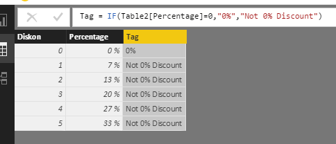
I create sample table.
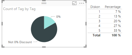
I create a calculated column to get percentage ([Diskon Product]/[Total Product]). Then use IF...ELSE function to judge if the percentage is 0.
Percentage = Table2[Diskon]/CALCULATE(SUM(Table2[Diskon]),ALL(Table2))

Tag = IF(Table2[Percentage]=0,"0%","Not 0% Discount")
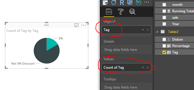
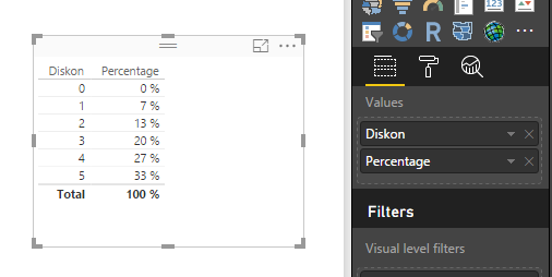
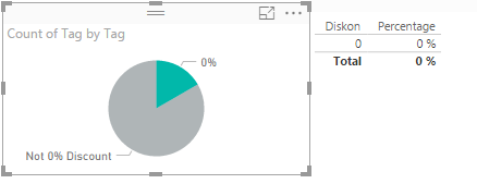
Create a Pie Chart and Table visual. Please view the following screenshot. The green part show the count of 0 percents, and the back part shows the not 0 percents.
When you click the 0%, it will list the 0 %. Otherwise, it will returns other results.
Please let me know if you have any issue.
Best Regards,
Angelia
- Mark as New
- Bookmark
- Subscribe
- Mute
- Subscribe to RSS Feed
- Permalink
- Report Inappropriate Content
Click on your discount field in the field list on the right, then on the ribbon click on Modeling > New Group. Set group type to List, then click on the 0 and click the Group button. That's your 0% group. There should also be an 'Other' group that will automatically contain everything else (which you can rename if you like). Click OK and the group will show up as a new field that you can add to your pie chart, etc.
If you add a table with the discount field it will list all of the discounts (make sure you set it to Don't Summarize), then when you click on the pie chart it will automatically filter the table the way you want.
Helpful resources

Microsoft Fabric Learn Together
Covering the world! 9:00-10:30 AM Sydney, 4:00-5:30 PM CET (Paris/Berlin), 7:00-8:30 PM Mexico City

Power BI Monthly Update - April 2024
Check out the April 2024 Power BI update to learn about new features.

| User | Count |
|---|---|
| 110 | |
| 94 | |
| 81 | |
| 66 | |
| 58 |
| User | Count |
|---|---|
| 150 | |
| 119 | |
| 104 | |
| 87 | |
| 67 |


