- Power BI forums
- Updates
- News & Announcements
- Get Help with Power BI
- Desktop
- Service
- Report Server
- Power Query
- Mobile Apps
- Developer
- DAX Commands and Tips
- Custom Visuals Development Discussion
- Health and Life Sciences
- Power BI Spanish forums
- Translated Spanish Desktop
- Power Platform Integration - Better Together!
- Power Platform Integrations (Read-only)
- Power Platform and Dynamics 365 Integrations (Read-only)
- Training and Consulting
- Instructor Led Training
- Dashboard in a Day for Women, by Women
- Galleries
- Community Connections & How-To Videos
- COVID-19 Data Stories Gallery
- Themes Gallery
- Data Stories Gallery
- R Script Showcase
- Webinars and Video Gallery
- Quick Measures Gallery
- 2021 MSBizAppsSummit Gallery
- 2020 MSBizAppsSummit Gallery
- 2019 MSBizAppsSummit Gallery
- Events
- Ideas
- Custom Visuals Ideas
- Issues
- Issues
- Events
- Upcoming Events
- Community Blog
- Power BI Community Blog
- Custom Visuals Community Blog
- Community Support
- Community Accounts & Registration
- Using the Community
- Community Feedback
Register now to learn Fabric in free live sessions led by the best Microsoft experts. From Apr 16 to May 9, in English and Spanish.
- Power BI forums
- Forums
- Get Help with Power BI
- Desktop
- How to graphic a Matrix
- Subscribe to RSS Feed
- Mark Topic as New
- Mark Topic as Read
- Float this Topic for Current User
- Bookmark
- Subscribe
- Printer Friendly Page
- Mark as New
- Bookmark
- Subscribe
- Mute
- Subscribe to RSS Feed
- Permalink
- Report Inappropriate Content
How to graphic a Matrix
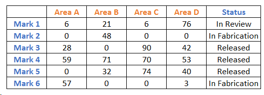
Im new in this, please help me to graphic this.
If you can not see the image i will explain.
In the first column I have listed for steel members...mark 1, mark 2, mark 3, etc...
The areas where those steel members will be sent are many, so I put in every columnn a facility name with its quantity. the columns are Area A, Area B, Area C...etc. The marks are not restricted to facilities, so they can be sent in different numbers to more than one facility. Also, in the final column I have the status of every mark...In review, Released,
How can i praphic it?
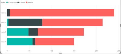
I want a stacked bar chart with facilities in Y axis, number of pieces by facility in X axis, and inside the color of the different status of theses pieces. Somenthing as it shows below (it is a random drawing so it may not match with the table).
Thank you!
Solved! Go to Solution.
- Mark as New
- Bookmark
- Subscribe
- Mute
- Subscribe to RSS Feed
- Permalink
- Report Inappropriate Content
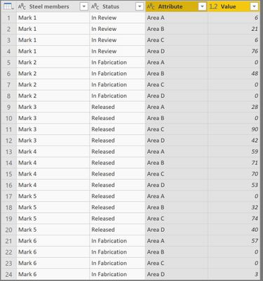
1. Go to Edit Queries, select columns Area A, Area B, Area C, Area D. Right click and select Unpivot Only Selected Columns. You will get a table like this from your original table.
2. Select Status and Attribute column. Right click and select Group By -> Advanced. Add new column name as SUM, select Operation as Sum and Column as Value. You will get a table like this.
3. Select close and apply to exit from Edit Queries. Select Stacked Bar Chart, keep Attribute in Axis, Status in Legend and SUM in Value.
- Mark as New
- Bookmark
- Subscribe
- Mute
- Subscribe to RSS Feed
- Permalink
- Report Inappropriate Content
Thank you! It worked perfectly.
- Mark as New
- Bookmark
- Subscribe
- Mute
- Subscribe to RSS Feed
- Permalink
- Report Inappropriate Content
@Anonymous I am glad that it helped. Could you please mark my post as a solution
Helpful resources

Microsoft Fabric Learn Together
Covering the world! 9:00-10:30 AM Sydney, 4:00-5:30 PM CET (Paris/Berlin), 7:00-8:30 PM Mexico City

Power BI Monthly Update - April 2024
Check out the April 2024 Power BI update to learn about new features.

| User | Count |
|---|---|
| 107 | |
| 98 | |
| 77 | |
| 66 | |
| 53 |
| User | Count |
|---|---|
| 144 | |
| 104 | |
| 100 | |
| 86 | |
| 64 |


