- Power BI forums
- Updates
- News & Announcements
- Get Help with Power BI
- Desktop
- Service
- Report Server
- Power Query
- Mobile Apps
- Developer
- DAX Commands and Tips
- Custom Visuals Development Discussion
- Health and Life Sciences
- Power BI Spanish forums
- Translated Spanish Desktop
- Power Platform Integration - Better Together!
- Power Platform Integrations (Read-only)
- Power Platform and Dynamics 365 Integrations (Read-only)
- Training and Consulting
- Instructor Led Training
- Dashboard in a Day for Women, by Women
- Galleries
- Community Connections & How-To Videos
- COVID-19 Data Stories Gallery
- Themes Gallery
- Data Stories Gallery
- R Script Showcase
- Webinars and Video Gallery
- Quick Measures Gallery
- 2021 MSBizAppsSummit Gallery
- 2020 MSBizAppsSummit Gallery
- 2019 MSBizAppsSummit Gallery
- Events
- Ideas
- Custom Visuals Ideas
- Issues
- Issues
- Events
- Upcoming Events
- Community Blog
- Power BI Community Blog
- Custom Visuals Community Blog
- Community Support
- Community Accounts & Registration
- Using the Community
- Community Feedback
Register now to learn Fabric in free live sessions led by the best Microsoft experts. From Apr 16 to May 9, in English and Spanish.
- Power BI forums
- Forums
- Get Help with Power BI
- Desktop
- Re: How to format a row of numbers in Power BI
- Subscribe to RSS Feed
- Mark Topic as New
- Mark Topic as Read
- Float this Topic for Current User
- Bookmark
- Subscribe
- Printer Friendly Page
- Mark as New
- Bookmark
- Subscribe
- Mute
- Subscribe to RSS Feed
- Permalink
- Report Inappropriate Content
How to format a row of numbers in Power BI
I have a table in my report that looks like this:
I need it to look like this:
I haven't the foggiest idea how to get from "point A to B."😢 I think it has something to do with conditional formatting, but I can't figure out how; seems like Power BI only allows "design" of a table in terms of columns, not rows. Very frustrating!
Failing the ability to highlight the row via a colur field, I could get away with the numbers in the row being itatalized, but I'm at a loss how to do that either. (The highlighted numbers indicte the % percentage change in the row above from the previous period, so must be highlighted in some way.)
Any guidence for this rookie would be appreciated. I'm on an insanely tight deadline for this project and don't have time any longer for "a learning curve!" 😟
Solved! Go to Solution.
- Mark as New
- Bookmark
- Subscribe
- Mute
- Subscribe to RSS Feed
- Permalink
- Report Inappropriate Content
Hi @wadden0032
You want your slicers/filters to not filter all data, but to only highlight the chosen what you selected.
See the below,it may be what you need:
Highlighting with slicer Power BI: https://stackoverflow.com/questions/59930844/highlighting-with-slicer-power-bi
Wish it is helpful for you!
If you have this problem solved,could you pls my reply as answered,thanks!
Best Regard
Lucien Wang
- Mark as New
- Bookmark
- Subscribe
- Mute
- Subscribe to RSS Feed
- Permalink
- Report Inappropriate Content
Hi @wadden0032
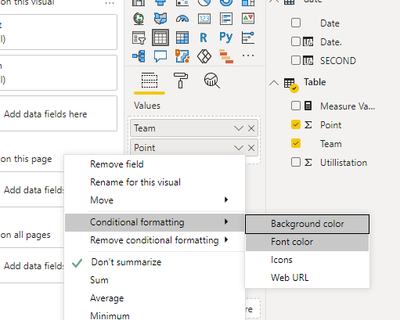
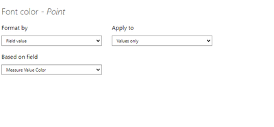
You can try the following steps to format a row of numbers in Power BI(the following steps is only a sample ,The specific use is adapted to your table and visual)
Step 1,create a color measure:
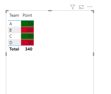
Measure Value Color = IF(MAX('Table'[Point])<=50,"#ff0000","#000000")
Then:
Then you will see:
More about how to configure color measure,you can see the below:
https://community.powerbi.com/t5/Desktop/Colour-formatting-on-Measure/m-p/864818#M414953
Wish it is helpful for you!
Best Regard
Lucien Wang
- Mark as New
- Bookmark
- Subscribe
- Mute
- Subscribe to RSS Feed
- Permalink
- Report Inappropriate Content
Thanks, Lucien. That was a problem for another day, and I'll get back to that to try out your solution. I appreciate the help!
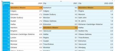
In a similar vein, I think, is todays's problem. I have a table of rankings, as below, that shows a list of cities and how they rank over certain years. How would I just creat a simialar "colour-measure to highlight a specific city based on a slicer selection? This all seems so complicated to me, but I am just learning! 🤔😁
This is how I'd like the table to appear, say, if one were to select Abbotsford–Mission from a slicer:
Again, I appreciate all the wisdom you have to offer! 👍
- Mark as New
- Bookmark
- Subscribe
- Mute
- Subscribe to RSS Feed
- Permalink
- Report Inappropriate Content
Hi @wadden0032
You want your slicers/filters to not filter all data, but to only highlight the chosen what you selected.
See the below,it may be what you need:
Highlighting with slicer Power BI: https://stackoverflow.com/questions/59930844/highlighting-with-slicer-power-bi
Wish it is helpful for you!
If you have this problem solved,could you pls my reply as answered,thanks!
Best Regard
Lucien Wang
- Mark as New
- Bookmark
- Subscribe
- Mute
- Subscribe to RSS Feed
- Permalink
- Report Inappropriate Content
Create a color measure.
Color Measure =
Switch( True() ,
isblank(max('Table'[office sector])) , "Cyan", /// Or use the coorect color name
"white"
)
and use that is conditional formatting using "field value" option and choose this measure
Microsoft Power BI Learning Resources, 2023 !!
Learn Power BI - Full Course with Dec-2022, with Window, Index, Offset, 100+ Topics !!
Did I answer your question? Mark my post as a solution! Appreciate your Kudos !! Proud to be a Super User! !!
- Mark as New
- Bookmark
- Subscribe
- Mute
- Subscribe to RSS Feed
- Permalink
- Report Inappropriate Content
Sounds promising, and I really appreciate your help.
Could you provide me more of a step-by-step process? Don't know how go about creating a "colour measure" or where to do it. Nor am I sure how to specify those 2 rows to apply it, although I'm guessing it has something to do with the "isblank" part of the code you wrote above. Sorry—might seem like a silly question but I really need you to "dumb-it-down" for me. 😉
- Mark as New
- Bookmark
- Subscribe
- Mute
- Subscribe to RSS Feed
- Permalink
- Report Inappropriate Content
@wadden0032 , I am assuming you are using a year in the Matrix column so conditional formatting for one value will do it for you. Also, those row has a blank value for row's column; so, I created a measure like that.
This heading and next heading in the link
Microsoft Power BI Learning Resources, 2023 !!
Learn Power BI - Full Course with Dec-2022, with Window, Index, Offset, 100+ Topics !!
Did I answer your question? Mark my post as a solution! Appreciate your Kudos !! Proud to be a Super User! !!
Helpful resources

Microsoft Fabric Learn Together
Covering the world! 9:00-10:30 AM Sydney, 4:00-5:30 PM CET (Paris/Berlin), 7:00-8:30 PM Mexico City

Power BI Monthly Update - April 2024
Check out the April 2024 Power BI update to learn about new features.

| User | Count |
|---|---|
| 107 | |
| 93 | |
| 77 | |
| 64 | |
| 50 |
| User | Count |
|---|---|
| 147 | |
| 106 | |
| 104 | |
| 87 | |
| 61 |


