- Power BI forums
- Updates
- News & Announcements
- Get Help with Power BI
- Desktop
- Service
- Report Server
- Power Query
- Mobile Apps
- Developer
- DAX Commands and Tips
- Custom Visuals Development Discussion
- Health and Life Sciences
- Power BI Spanish forums
- Translated Spanish Desktop
- Power Platform Integration - Better Together!
- Power Platform Integrations (Read-only)
- Power Platform and Dynamics 365 Integrations (Read-only)
- Training and Consulting
- Instructor Led Training
- Dashboard in a Day for Women, by Women
- Galleries
- Community Connections & How-To Videos
- COVID-19 Data Stories Gallery
- Themes Gallery
- Data Stories Gallery
- R Script Showcase
- Webinars and Video Gallery
- Quick Measures Gallery
- 2021 MSBizAppsSummit Gallery
- 2020 MSBizAppsSummit Gallery
- 2019 MSBizAppsSummit Gallery
- Events
- Ideas
- Custom Visuals Ideas
- Issues
- Issues
- Events
- Upcoming Events
- Community Blog
- Power BI Community Blog
- Custom Visuals Community Blog
- Community Support
- Community Accounts & Registration
- Using the Community
- Community Feedback
Register now to learn Fabric in free live sessions led by the best Microsoft experts. From Apr 16 to May 9, in English and Spanish.
- Power BI forums
- Forums
- Get Help with Power BI
- Desktop
- Re: How to fix Y axis scale
- Subscribe to RSS Feed
- Mark Topic as New
- Mark Topic as Read
- Float this Topic for Current User
- Bookmark
- Subscribe
- Printer Friendly Page
- Mark as New
- Bookmark
- Subscribe
- Mute
- Subscribe to RSS Feed
- Permalink
- Report Inappropriate Content
How to fix Y axis scale
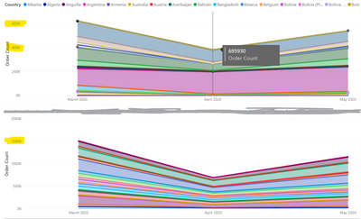
I have made two visuals showing the total number of orders and in both the totals are the same per date, but the scale in the y axis doesn't show that, for one it shows almost double the amount:
When I hover to show the tooltip, they have the same amount in all the dates, which is what is expected, but the Order Count axis numbers are wrong, how can I fix that for the visual on top as the bottom one seems to be right?
- Mark as New
- Bookmark
- Subscribe
- Mute
- Subscribe to RSS Feed
- Permalink
- Report Inappropriate Content
//Posting this because it may help others
So I fixed this by creating a custom column where I basically only used countries where the count is more than 10 (in this case acceptable to ignore) and using that column of country names instead of the original one... somehow this made the y axis show the right numbers, so this is completely a workaround that makes the axis un-confused somehow.
I know it is not a good fix, and I think this is a bug in powerbi, but for now taking the time to clean the data and sending in a pbix to fix this is not a priority.
- Mark as New
- Bookmark
- Subscribe
- Mute
- Subscribe to RSS Feed
- Permalink
- Report Inappropriate Content
Hi @Karolina ,
The issue could be caused by the legend field.
Could you share the sample pbix via cloud service like onedrive for business?
Please mask any sensitive data before uploading.
Best Regards,
Liang
If this post helps, then please consider Accept it as the solution to help the other members find it more quickly.
- Mark as New
- Bookmark
- Subscribe
- Mute
- Subscribe to RSS Feed
- Permalink
- Report Inappropriate Content
@Karolina not sure I fully followed your question, what is the legend in both the visuals? Can you use matrix visual and check the numbers? Are you using any measures? Are you using any filters on the visuals?
Subscribe to the @PowerBIHowTo YT channel for an upcoming video on List and Record functions in Power Query!!
Learn Power BI and Fabric - subscribe to our YT channel - Click here: @PowerBIHowTo
If my solution proved useful, I'd be delighted to receive Kudos. When you put effort into asking a question, it's equally thoughtful to acknowledge and give Kudos to the individual who helped you solve the problem. It's a small gesture that shows appreciation and encouragement! ❤
Did I answer your question? Mark my post as a solution. Proud to be a Super User! Appreciate your Kudos 🙂
Feel free to email me with any of your BI needs.
- Mark as New
- Bookmark
- Subscribe
- Mute
- Subscribe to RSS Feed
- Permalink
- Report Inappropriate Content
The legens are different for both visuals but the totals in the same date should be the same no matter the dimensions I use.
For the top one the legend is country and the bottom one is product (colored out). I am not using any custom measures and I have the exact same filters in both of them (a date range).
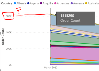
The problem is that the y axis in the top visual is not showing the right numbers, as shown in the image, the tool tip has a value of 1.5M (total orders), but the y axis (also total orders) shows 600k, which is clearly incorrect
- Mark as New
- Bookmark
- Subscribe
- Mute
- Subscribe to RSS Feed
- Permalink
- Report Inappropriate Content
@Karolina I know the total should be the same whatever dimension you used, the question was more about if there is any filter and sees like that is not the case. Are you using any measures? Did you manually change the y-axis min and max values? Maybe it is a bug, trying to find out what could cause this. Can you try to create a new visual and check if it still gives you 600k as the upper limit.
Subscribe to the @PowerBIHowTo YT channel for an upcoming video on List and Record functions in Power Query!!
Learn Power BI and Fabric - subscribe to our YT channel - Click here: @PowerBIHowTo
If my solution proved useful, I'd be delighted to receive Kudos. When you put effort into asking a question, it's equally thoughtful to acknowledge and give Kudos to the individual who helped you solve the problem. It's a small gesture that shows appreciation and encouragement! ❤
Did I answer your question? Mark my post as a solution. Proud to be a Super User! Appreciate your Kudos 🙂
Feel free to email me with any of your BI needs.
- Mark as New
- Bookmark
- Subscribe
- Mute
- Subscribe to RSS Feed
- Permalink
- Report Inappropriate Content
Hi @parry2k, sorry for the late reply, but yes, I have created the same visual in 2 different documents at first and noticed the differences. Then created them side by side so I can compare, and every time with the country dimension it gets the same axis, even on different types of visuals.
I have not set the limits of the axis manually nor have I used custom measures.
Helpful resources

Microsoft Fabric Learn Together
Covering the world! 9:00-10:30 AM Sydney, 4:00-5:30 PM CET (Paris/Berlin), 7:00-8:30 PM Mexico City

Power BI Monthly Update - April 2024
Check out the April 2024 Power BI update to learn about new features.

| User | Count |
|---|---|
| 118 | |
| 107 | |
| 70 | |
| 70 | |
| 43 |
| User | Count |
|---|---|
| 148 | |
| 105 | |
| 104 | |
| 89 | |
| 65 |


