- Power BI forums
- Updates
- News & Announcements
- Get Help with Power BI
- Desktop
- Service
- Report Server
- Power Query
- Mobile Apps
- Developer
- DAX Commands and Tips
- Custom Visuals Development Discussion
- Health and Life Sciences
- Power BI Spanish forums
- Translated Spanish Desktop
- Power Platform Integration - Better Together!
- Power Platform Integrations (Read-only)
- Power Platform and Dynamics 365 Integrations (Read-only)
- Training and Consulting
- Instructor Led Training
- Dashboard in a Day for Women, by Women
- Galleries
- Community Connections & How-To Videos
- COVID-19 Data Stories Gallery
- Themes Gallery
- Data Stories Gallery
- R Script Showcase
- Webinars and Video Gallery
- Quick Measures Gallery
- 2021 MSBizAppsSummit Gallery
- 2020 MSBizAppsSummit Gallery
- 2019 MSBizAppsSummit Gallery
- Events
- Ideas
- Custom Visuals Ideas
- Issues
- Issues
- Events
- Upcoming Events
- Community Blog
- Power BI Community Blog
- Custom Visuals Community Blog
- Community Support
- Community Accounts & Registration
- Using the Community
- Community Feedback
Register now to learn Fabric in free live sessions led by the best Microsoft experts. From Apr 16 to May 9, in English and Spanish.
- Power BI forums
- Forums
- Get Help with Power BI
- Desktop
- Re: How to exactly size a bubble in scatter chart?
- Subscribe to RSS Feed
- Mark Topic as New
- Mark Topic as Read
- Float this Topic for Current User
- Bookmark
- Subscribe
- Printer Friendly Page
- Mark as New
- Bookmark
- Subscribe
- Mute
- Subscribe to RSS Feed
- Permalink
- Report Inappropriate Content
How to exactly size a bubble in scatter chart?
Hello,
We have a chart with 4 numerical values where we must explicitly state size and/or color. Works for everything except bubble size:
(1) X-Axis - works fine - can define begin and end value.
(2) Y-Axis - works fine - can define begin and end value.
(3) Legend - works fine - can define colors based on specific values.
(4) Bubble size - DOES NOT WORK - while the bubble does size based on larger, smaller #s - you cannot define exact size - like you can on a line chart where you say 0 is begin value and 10 is end value. If 1 is the lowest and 10 is largest value for a bubble --for a given filter -- then 1 is small and 10 is big. If filter returns 10-20 - then the size of 10 matches prior size 1.
Thoughts on how to resolve this? Have tried various enhanced scatter charts, dot plots, etc - but nothing seems to work. Ideas for a workaround?
Appreciate your assistance.
Thanks,
Dan
Solved! Go to Solution.
- Mark as New
- Bookmark
- Subscribe
- Mute
- Subscribe to RSS Feed
- Permalink
- Report Inappropriate Content
Yeah, @dancarr22 not sure I see a way around this one. The minute you slice down to a specific value, you lose any kind of min/max reference. I can't see a way around that.
@ me in replies or I'll lose your thread!!!
Instead of a Kudo, please vote for this idea
Become an expert!: Enterprise DNA
External Tools: MSHGQM
YouTube Channel!: Microsoft Hates Greg
Latest book!: The Definitive Guide to Power Query (M)
DAX is easy, CALCULATE makes DAX hard...
- Mark as New
- Bookmark
- Subscribe
- Mute
- Subscribe to RSS Feed
- Permalink
- Report Inappropriate Content
Please refer this link:
https://community.powerbi.com/t5/Desktop/Controlling-the-bubble-size-in-a-scatter-chart/m-p/169927
Hope it helpful.
- Mark as New
- Bookmark
- Subscribe
- Mute
- Subscribe to RSS Feed
- Permalink
- Report Inappropriate Content
Thanks @rajendraongole1 and @Greg_Deckler but those solutions did not work.
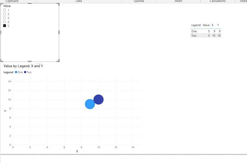
The field which the bubble size is based on has 5 potential values: 1-5. That is it. If the dataset contains all 5 values: 1,2,3,4 and 5. Then everything sizes properly. 1 is small, 3 is medium and 5 is big. But, if the user filters the dataset so only 2-3 values appear - say 3 and 4 then the bubbles resize and 3 becomes small - since, due to the filters, that is now the smallest displayed value. But, we do not want that. 3 should be middle/average sized regardless if only 3 is in the dataset of 1-5 or 1-3.
Thanks,
Dan
- Mark as New
- Bookmark
- Subscribe
- Mute
- Subscribe to RSS Feed
- Permalink
- Report Inappropriate Content
Hmm, I am not seeing this in my example. Please see attached PBIX. If I select 3 and 5 from the slicer and then add 1, all the bubbles remain the same sizes. @dancarr22
@ me in replies or I'll lose your thread!!!
Instead of a Kudo, please vote for this idea
Become an expert!: Enterprise DNA
External Tools: MSHGQM
YouTube Channel!: Microsoft Hates Greg
Latest book!: The Definitive Guide to Power Query (M)
DAX is easy, CALCULATE makes DAX hard...
- Mark as New
- Bookmark
- Subscribe
- Mute
- Subscribe to RSS Feed
- Permalink
- Report Inappropriate Content
@Greg_DecklerThanks for posting this! Can see that it sort of works - if you choose 2 at a time. But if you just select 1 then just select 5 you'll see that they become the same sized bubbles.
- Mark as New
- Bookmark
- Subscribe
- Mute
- Subscribe to RSS Feed
- Permalink
- Report Inappropriate Content
Yeah, @dancarr22 not sure I see a way around this one. The minute you slice down to a specific value, you lose any kind of min/max reference. I can't see a way around that.
@ me in replies or I'll lose your thread!!!
Instead of a Kudo, please vote for this idea
Become an expert!: Enterprise DNA
External Tools: MSHGQM
YouTube Channel!: Microsoft Hates Greg
Latest book!: The Definitive Guide to Power Query (M)
DAX is easy, CALCULATE makes DAX hard...
- Mark as New
- Bookmark
- Subscribe
- Mute
- Subscribe to RSS Feed
- Permalink
- Report Inappropriate Content
- Mark as New
- Bookmark
- Subscribe
- Mute
- Subscribe to RSS Feed
- Permalink
- Report Inappropriate Content
Hi @dancarr22
Instead of filtering, could you have the unselected items turn white and blend into the background? Essentially you create a measure which show as selected/unselected. If the measure is unselected, you can customize the color and label series to be white. That way all sizes are still incorporated.
- Mark as New
- Bookmark
- Subscribe
- Mute
- Subscribe to RSS Feed
- Permalink
- Report Inappropriate Content
@Anonymous
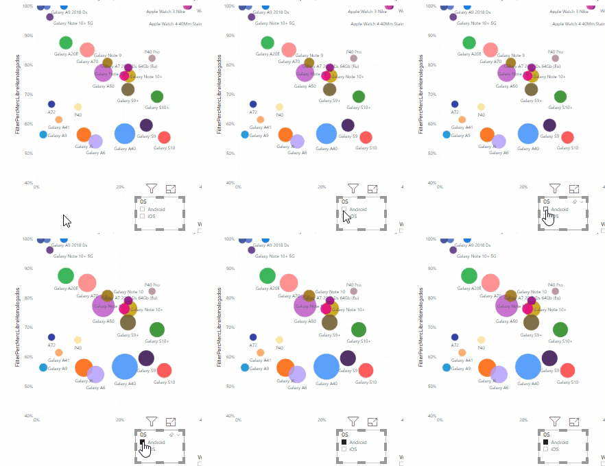
Can you elaborate a bit more your suggestion? I think I'm facing the same challenge as @dancarr22, since my bubble chart is showing bubbles that are classified under two different category values (A / B) , and if I apply a filter visual to show the ones whose category is A, I manage to remove the ones whose category is B, but some of the remaining bubbles grow automatically... I do not find the way to keep their original sizes:
Thanx!
- Mark as New
- Bookmark
- Subscribe
- Mute
- Subscribe to RSS Feed
- Permalink
- Report Inappropriate Content
Hi @efialttes
Unfortunately, I never came up with a good solution.
So we came up with a different graph type.
Curious if you come up with something!
Thanks,
Dan
- Mark as New
- Bookmark
- Subscribe
- Mute
- Subscribe to RSS Feed
- Permalink
- Report Inappropriate Content
Sure, put a constant value column in your Size. Then they are all the same? If you are trying to say that a 10 value has a 5 radius and a 1 value has a 1 radius and a 5 value has a 2 radius you can't do that to be best of my knowledge. What are you trying to achieve?
@ me in replies or I'll lose your thread!!!
Instead of a Kudo, please vote for this idea
Become an expert!: Enterprise DNA
External Tools: MSHGQM
YouTube Channel!: Microsoft Hates Greg
Latest book!: The Definitive Guide to Power Query (M)
DAX is easy, CALCULATE makes DAX hard...
Helpful resources

Microsoft Fabric Learn Together
Covering the world! 9:00-10:30 AM Sydney, 4:00-5:30 PM CET (Paris/Berlin), 7:00-8:30 PM Mexico City

Power BI Monthly Update - April 2024
Check out the April 2024 Power BI update to learn about new features.

| User | Count |
|---|---|
| 113 | |
| 97 | |
| 85 | |
| 70 | |
| 61 |
| User | Count |
|---|---|
| 151 | |
| 121 | |
| 104 | |
| 87 | |
| 67 |


