- Power BI forums
- Updates
- News & Announcements
- Get Help with Power BI
- Desktop
- Service
- Report Server
- Power Query
- Mobile Apps
- Developer
- DAX Commands and Tips
- Custom Visuals Development Discussion
- Health and Life Sciences
- Power BI Spanish forums
- Translated Spanish Desktop
- Power Platform Integration - Better Together!
- Power Platform Integrations (Read-only)
- Power Platform and Dynamics 365 Integrations (Read-only)
- Training and Consulting
- Instructor Led Training
- Dashboard in a Day for Women, by Women
- Galleries
- Community Connections & How-To Videos
- COVID-19 Data Stories Gallery
- Themes Gallery
- Data Stories Gallery
- R Script Showcase
- Webinars and Video Gallery
- Quick Measures Gallery
- 2021 MSBizAppsSummit Gallery
- 2020 MSBizAppsSummit Gallery
- 2019 MSBizAppsSummit Gallery
- Events
- Ideas
- Custom Visuals Ideas
- Issues
- Issues
- Events
- Upcoming Events
- Community Blog
- Power BI Community Blog
- Custom Visuals Community Blog
- Community Support
- Community Accounts & Registration
- Using the Community
- Community Feedback
Register now to learn Fabric in free live sessions led by the best Microsoft experts. From Apr 16 to May 9, in English and Spanish.
- Power BI forums
- Forums
- Get Help with Power BI
- Desktop
- Re: How to dynamically change columns in a Matrix ...
- Subscribe to RSS Feed
- Mark Topic as New
- Mark Topic as Read
- Float this Topic for Current User
- Bookmark
- Subscribe
- Printer Friendly Page
- Mark as New
- Bookmark
- Subscribe
- Mute
- Subscribe to RSS Feed
- Permalink
- Report Inappropriate Content
How to dynamically change columns in a Matrix or Chart
I have three components as mentioned above.
- Base data with two independent columns and one dependent column.
- A matrix to show the sum and count calculations.
- A slicer containing the column names of base data.
The question is how to dynamically change columns in matrix results when the slicer is changed from Column1 to Column2?
Note: I can't pivot the table as I have other calculations also running on top of the base data. And I have 70+ columns and 5M rows of data. So pivoting or creating a union-like table would make a 350M+ rows table which I don't need.
Thank you.
Solved! Go to Solution.
- Mark as New
- Bookmark
- Subscribe
- Mute
- Subscribe to RSS Feed
- Permalink
- Report Inappropriate Content
I think new feture field parameters from Power BI May update 2022 will help you
https://www.youtube.com/watch?v=LTdpe2ENW4M&t=177s
https://docs.microsoft.com/en-us/power-bi/create-reports/power-bi-field-parameters
- Mark as New
- Bookmark
- Subscribe
- Mute
- Subscribe to RSS Feed
- Permalink
- Report Inappropriate Content
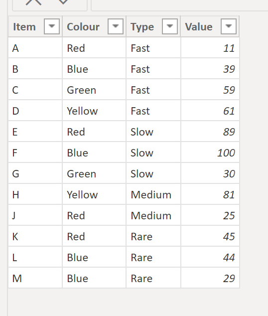
Actually there is a way to accomplish this without the new fields parameter option. Bascially you need to build a table to use as the slicer listing the values of all the columns you need in a single column. Take this data as an example:
To be able to filter the item, colour and type columns, we need to create a table to use as a slicer listing all the values & the column name (& and order column for sorting purposes.
To create the new table, you can append the columns in Power Query or use the following DAX:
Select Column Table =
VAR _item =
    SELECTCOLUMNS (
        FactTable,
        "SelColumn", FactTable[Item],
        "ColumnName", "Item",
        "Order", 1
    )
VAR _colour =
    SELECTCOLUMNS (
        FactTable,
        "SelColumn", FactTable[Colour],
        "ColumnName", "Colour",
        "Order", 2
    )
VAR _type =
    SELECTCOLUMNS (
        FactTable,
        "SelColumn", FactTable[Type],
        "ColumnName", "Type",
        "Order", 3
    )
RETURN
    DISTINCT ( UNION ( _item, _colour, _type ) )
to get..
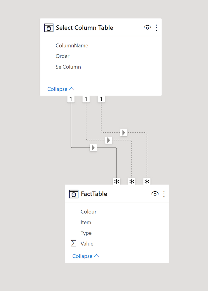
Next create relationships between the SelColumn field in this new table and each of the columns in the fact table:
Then a simple SUM measure and the following measure to use in the matrix:
Select Column Measure =
SWITCH (
    SELECTEDVALUE ( 'Select Column Table'[ColumnName] ),
    "Item", [Sum Value],
    "Colour",
        CALCULATE (
            [Sum Value],
            USERELATIONSHIP ( 'Select Column Table'[SelColumn], FactTable[Colour] )
        ),
    "Type",
        CALCULATE (
            [Sum Value],
            USERELATIONSHIP ( 'Select Column Table'[SelColumn], FactTable[Type] )
        )
)
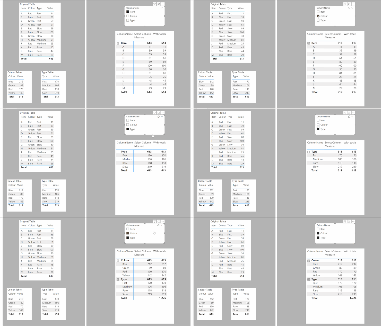
or if you also need the grand total (which I don´t think makes much sense since the result is multiplied by the number of columns selected):
With totals =
SUMX (
    'Select Column Table',
    CALCULATE (
        SWITCH (
            SELECTEDVALUE ( 'Select Column Table'[ColumnName] ),
            "Item", [Sum Value],
            "Colour",
                CALCULATE (
                    [Sum Value],
                    USERELATIONSHIP ( 'Select Column Table'[SelColumn], FactTable[Colour] )
                ),
            "Type",
                CALCULATE (
                    [Sum Value],
                    USERELATIONSHIP ( 'Select Column Table'[SelColumn], FactTable[Type] )
                )
        )
    )
)
To get:
I've attached the sample PBIX file
Did I answer your question? Mark my post as a solution!
In doing so, you are also helping me. Thank you!
Proud to be a Super User!
Paul on Linkedin.
- Mark as New
- Bookmark
- Subscribe
- Mute
- Subscribe to RSS Feed
- Permalink
- Report Inappropriate Content
This is a viable solution. In my case, the data would be too long. 428M rows of data to be precise. That increases the size of the PBIX file to nearly 1.5GB which causes trouble while hosting. As there's a 1Gb upload limit.
- Mark as New
- Bookmark
- Subscribe
- Mute
- Subscribe to RSS Feed
- Permalink
- Report Inappropriate Content
Hi @jothi_prakash_a ,
If this report is published, you can give users the right to personalize as needed.
In that case, they can select whatever column they need and it will be right away done.
Hope it helps.
- Mark as New
- Bookmark
- Subscribe
- Mute
- Subscribe to RSS Feed
- Permalink
- Report Inappropriate Content
I think new feture field parameters from Power BI May update 2022 will help you
https://www.youtube.com/watch?v=LTdpe2ENW4M&t=177s
https://docs.microsoft.com/en-us/power-bi/create-reports/power-bi-field-parameters
- Mark as New
- Bookmark
- Subscribe
- Mute
- Subscribe to RSS Feed
- Permalink
- Report Inappropriate Content
This is a great solution for the May 2022 version, @SolomonovAnton.
I'm using May 2021 because the Report server is compatible with it. So if there's a solution to May 2021 Please share, I'll accept this as the solution too.
- Mark as New
- Bookmark
- Subscribe
- Mute
- Subscribe to RSS Feed
- Permalink
- Report Inappropriate Content
Create a new unrelated table (use the Enter Data option in the ribbon an type in the names of the measures you wish to toggle between). Use this table as the slicer.
next create the following equivalent measure to use in the matrix:
toggle = IF(SELECTEDVALUE(SlicerTable[Measure]) = "Measure 1", [Measure 1], [Measure 2])
Did I answer your question? Mark my post as a solution!
In doing so, you are also helping me. Thank you!
Proud to be a Super User!
Paul on Linkedin.
- Mark as New
- Bookmark
- Subscribe
- Mute
- Subscribe to RSS Feed
- Permalink
- Report Inappropriate Content
This will not solve my objective. I'm actually trying to make the dynamic change of columns and not measures.
- Mark as New
- Bookmark
- Subscribe
- Mute
- Subscribe to RSS Feed
- Permalink
- Report Inappropriate Content
Right, sorry, I see what you mean. In that case, you can use buttons and bookmarks to toggle between visuals
Did I answer your question? Mark my post as a solution!
In doing so, you are also helping me. Thank you!
Proud to be a Super User!
Paul on Linkedin.
- Mark as New
- Bookmark
- Subscribe
- Mute
- Subscribe to RSS Feed
- Permalink
- Report Inappropriate Content
Already had this idea. As mentioned in the question, I have about 70+ columns so creating 70+ bookmarks and hiding one visual from another will be a huge task. The exact solution I'm looking for is mentioned by @SolomonovAnton . The only hurdle is the report server version is lower than the version mentioned by him.
- Mark as New
- Bookmark
- Subscribe
- Mute
- Subscribe to RSS Feed
- Permalink
- Report Inappropriate Content
Final try before I give up! Might be worth exploring the options Calculation Groups has to offer: point 10 in this blog might help
https://apexinsights.net/blog/10-uses-for-calculation-groups
Did I answer your question? Mark my post as a solution!
In doing so, you are also helping me. Thank you!
Proud to be a Super User!
Paul on Linkedin.
- Mark as New
- Bookmark
- Subscribe
- Mute
- Subscribe to RSS Feed
- Permalink
- Report Inappropriate Content
Checked it out and calculation groups only accept Measures and not Columns. Thank you for your answers and replies.
Helpful resources

Microsoft Fabric Learn Together
Covering the world! 9:00-10:30 AM Sydney, 4:00-5:30 PM CET (Paris/Berlin), 7:00-8:30 PM Mexico City

Power BI Monthly Update - April 2024
Check out the April 2024 Power BI update to learn about new features.

| User | Count |
|---|---|
| 113 | |
| 100 | |
| 78 | |
| 76 | |
| 52 |
| User | Count |
|---|---|
| 144 | |
| 109 | |
| 108 | |
| 88 | |
| 61 |


