- Power BI forums
- Updates
- News & Announcements
- Get Help with Power BI
- Desktop
- Service
- Report Server
- Power Query
- Mobile Apps
- Developer
- DAX Commands and Tips
- Custom Visuals Development Discussion
- Health and Life Sciences
- Power BI Spanish forums
- Translated Spanish Desktop
- Power Platform Integration - Better Together!
- Power Platform Integrations (Read-only)
- Power Platform and Dynamics 365 Integrations (Read-only)
- Training and Consulting
- Instructor Led Training
- Dashboard in a Day for Women, by Women
- Galleries
- Community Connections & How-To Videos
- COVID-19 Data Stories Gallery
- Themes Gallery
- Data Stories Gallery
- R Script Showcase
- Webinars and Video Gallery
- Quick Measures Gallery
- 2021 MSBizAppsSummit Gallery
- 2020 MSBizAppsSummit Gallery
- 2019 MSBizAppsSummit Gallery
- Events
- Ideas
- Custom Visuals Ideas
- Issues
- Issues
- Events
- Upcoming Events
- Community Blog
- Power BI Community Blog
- Custom Visuals Community Blog
- Community Support
- Community Accounts & Registration
- Using the Community
- Community Feedback
Register now to learn Fabric in free live sessions led by the best Microsoft experts. From Apr 16 to May 9, in English and Spanish.
- Power BI forums
- Forums
- Get Help with Power BI
- Desktop
- How to do Store Busy time Analysis
- Subscribe to RSS Feed
- Mark Topic as New
- Mark Topic as Read
- Float this Topic for Current User
- Bookmark
- Subscribe
- Printer Friendly Page
- Mark as New
- Bookmark
- Subscribe
- Mute
- Subscribe to RSS Feed
- Permalink
- Report Inappropriate Content
How to do Store Busy time Analysis
i have transaction time entered to my db whenever customer closes a deal.
how can i use the time information to analyze the busy time and busy day reports ?
for example i want to know what time during the day we closed most deals?
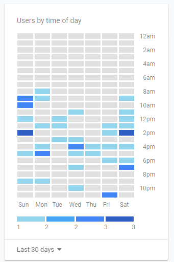
I am looking for a result like the following:
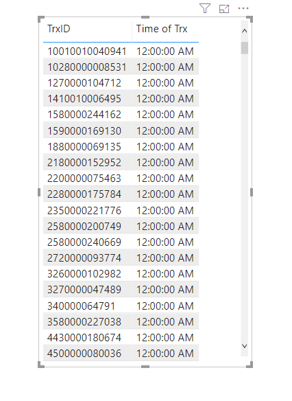
the following is the table i have in my data model. Along with store name and location where the transaction took place.
Besides, i want to do it on a line chart for the same.
is there a visual that will help?
regards
Solved! Go to Solution.
- Mark as New
- Bookmark
- Subscribe
- Mute
- Subscribe to RSS Feed
- Permalink
- Report Inappropriate Content
Hi @Anonymous ,
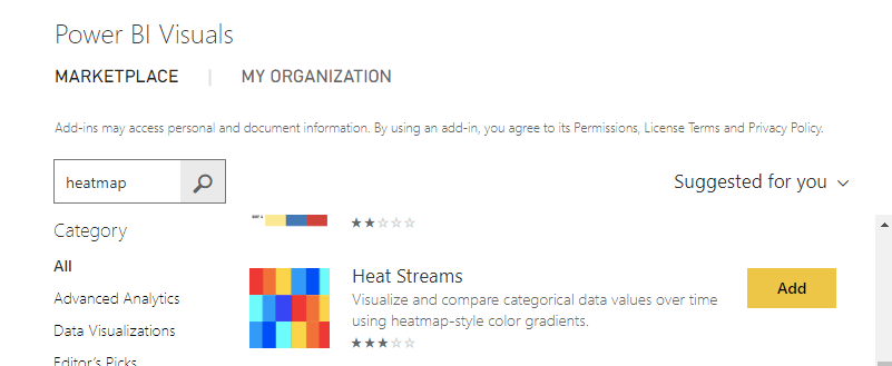
What about the heat streams chart which you can find in the marketplace?
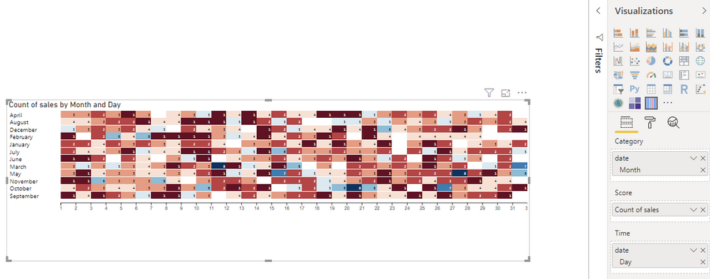
In my example below I use it to chart sales count based on day and month.
Regards
LC
Here is my visualization:
- Mark as New
- Bookmark
- Subscribe
- Mute
- Subscribe to RSS Feed
- Permalink
- Report Inappropriate Content
Above solution is good. but after extensive search i found a better solution.
We will have to use D3.js custom visual.
to use the D3 i qoute from the article titled "How to render D3.js custom charts in Power BI Desktop"
source https://www.mssqltips.com/sqlservertip/5273/how-to-render-d3js-custom-charts-in-power-bi-desktop/
"One needs to know D3 programming to develop custom visualizations. In this tip, the intention is to just take the D3.js code and port it to Power BI Desktop to render the visualization. So, we will be focusing on sample D3.js code and will understand how to use this in Power BI Desktop."
there's a gallery on github with D3 custom visuals https://github.com/d3/d3/wiki/Gallery
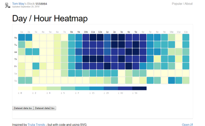
from this gallery i used Day / Hour Heatmap for Tom May. here is a screenshot.
check the tutorial here. https://www.mssqltips.com/sqlservertip/5273/how-to-render-d3js-custom-charts-in-power-bi-desktop/
Thanks for supporting me
- Mark as New
- Bookmark
- Subscribe
- Mute
- Subscribe to RSS Feed
- Permalink
- Report Inappropriate Content
Hi @Anonymous ,
What about the heat streams chart which you can find in the marketplace?
In my example below I use it to chart sales count based on day and month.
Regards
LC
Here is my visualization:
- Mark as New
- Bookmark
- Subscribe
- Mute
- Subscribe to RSS Feed
- Permalink
- Report Inappropriate Content
This is a good visual indeed. Thank you for suggesting.
How can i change the size of the month name, also sort the month starting from Jan to Devember.
is there any other visual you suggest besides this?
Appreciate your help
- Mark as New
- Bookmark
- Subscribe
- Mute
- Subscribe to RSS Feed
- Permalink
- Report Inappropriate Content
You are right, this visual orders the months in alphabetical order, even if it does not make sense..
You can create a new column 'Month number' with the month as a 2 digits numbers. You put the formula below for you. It's less nice than having the month written down but it works.
I could not find any other visualization for this.
Regards,
LC
Month number = FORMAT(month([date]),"00")
- Mark as New
- Bookmark
- Subscribe
- Mute
- Subscribe to RSS Feed
- Permalink
- Report Inappropriate Content
Above solution is good. but after extensive search i found a better solution.
We will have to use D3.js custom visual.
to use the D3 i qoute from the article titled "How to render D3.js custom charts in Power BI Desktop"
source https://www.mssqltips.com/sqlservertip/5273/how-to-render-d3js-custom-charts-in-power-bi-desktop/
"One needs to know D3 programming to develop custom visualizations. In this tip, the intention is to just take the D3.js code and port it to Power BI Desktop to render the visualization. So, we will be focusing on sample D3.js code and will understand how to use this in Power BI Desktop."
there's a gallery on github with D3 custom visuals https://github.com/d3/d3/wiki/Gallery
from this gallery i used Day / Hour Heatmap for Tom May. here is a screenshot.
check the tutorial here. https://www.mssqltips.com/sqlservertip/5273/how-to-render-d3js-custom-charts-in-power-bi-desktop/
Thanks for supporting me

- Mark as New
- Bookmark
- Subscribe
- Mute
- Subscribe to RSS Feed
- Permalink
- Report Inappropriate Content
Hi @Anonymous ,
I am glad you found an even better solution.
The D3js charts look good.
Do not hesitate if you have more questions,
LC
Helpful resources

Microsoft Fabric Learn Together
Covering the world! 9:00-10:30 AM Sydney, 4:00-5:30 PM CET (Paris/Berlin), 7:00-8:30 PM Mexico City

Power BI Monthly Update - April 2024
Check out the April 2024 Power BI update to learn about new features.

| User | Count |
|---|---|
| 114 | |
| 100 | |
| 81 | |
| 70 | |
| 62 |
| User | Count |
|---|---|
| 148 | |
| 116 | |
| 104 | |
| 90 | |
| 65 |
