- Power BI forums
- Updates
- News & Announcements
- Get Help with Power BI
- Desktop
- Service
- Report Server
- Power Query
- Mobile Apps
- Developer
- DAX Commands and Tips
- Custom Visuals Development Discussion
- Health and Life Sciences
- Power BI Spanish forums
- Translated Spanish Desktop
- Power Platform Integration - Better Together!
- Power Platform Integrations (Read-only)
- Power Platform and Dynamics 365 Integrations (Read-only)
- Training and Consulting
- Instructor Led Training
- Dashboard in a Day for Women, by Women
- Galleries
- Community Connections & How-To Videos
- COVID-19 Data Stories Gallery
- Themes Gallery
- Data Stories Gallery
- R Script Showcase
- Webinars and Video Gallery
- Quick Measures Gallery
- 2021 MSBizAppsSummit Gallery
- 2020 MSBizAppsSummit Gallery
- 2019 MSBizAppsSummit Gallery
- Events
- Ideas
- Custom Visuals Ideas
- Issues
- Issues
- Events
- Upcoming Events
- Community Blog
- Power BI Community Blog
- Custom Visuals Community Blog
- Community Support
- Community Accounts & Registration
- Using the Community
- Community Feedback
Register now to learn Fabric in free live sessions led by the best Microsoft experts. From Apr 16 to May 9, in English and Spanish.
- Power BI forums
- Forums
- Get Help with Power BI
- Desktop
- How to display real time data correctly in a chart...
- Subscribe to RSS Feed
- Mark Topic as New
- Mark Topic as Read
- Float this Topic for Current User
- Bookmark
- Subscribe
- Printer Friendly Page
- Mark as New
- Bookmark
- Subscribe
- Mute
- Subscribe to RSS Feed
- Permalink
- Report Inappropriate Content
How to display real time data correctly in a chart (total number per month)
I have setup a power BI file using real time data from Microsoft forms, which is sent to Power BI through Microsoft flow. The flow is working fine but not sure how to display some data in Power BI correctly. Very new to DAX programming so if someone can help that would be great.
The data I would like to display comes from the question:
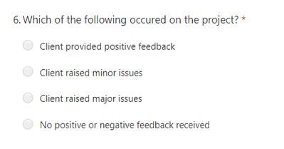
Which of the following occured on the project?
- Client provided positive feedback
- Client raised minor issues
- Client raised major issues
- No positive or negative feedback received
From the results I would like to display a graph or chart highlighting the total number of each option selected per month.
The problem I have is splitting and displaying the totals per month. I'm not sure if this is due to restrictions in dealing with real time data in Power BI, or my lack of knowledge in creating DAX measures. Pretty sure there should be a way. Any ideas welcome.
- Mark as New
- Bookmark
- Subscribe
- Mute
- Subscribe to RSS Feed
- Permalink
- Report Inappropriate Content
Hi @SimpoPower ,
As I know, we can use all the DAX functions in live connection mode. For your scenario, if you could share some sample data and your expected results, I think we might understand clearly and solve it quickly. Please see this post regarding How to Get Your Question Answered Quickly:
https://community.powerbi.com/t5/Community-Blog/How-to-Get-Your-Question-Answered-Quickly/ba-p/38490
Best Regards,
Xue Ding
If this post helps, then please consider Accept it as the solution to help the other members find it more quickly. Kudos are nice too.
Xue Ding
If this post helps, then please consider Accept it as the solution to help the other members find it more quickly.
- Mark as New
- Bookmark
- Subscribe
- Mute
- Subscribe to RSS Feed
- Permalink
- Report Inappropriate Content
Hello Xue, thanks for responding.
I'll try to provide some more information to explain better. Let me know if anything doesnt make sense.
The question asked in Microsoft Forms is below:
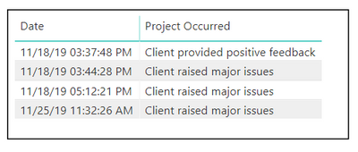
The answers are retrieved in Microsfot Flow and sent through to Power BI. Below is a basic table from some sample data created in Power BI:
I am looking to put this information into a graph, showing a line for each option, indicating the percentage of the total for each option (Y axis), compared to the month (X axis).
For example on the chart above, assuming this was the full results for November, 'Client raised major issues' would be set to 75% on the graph for November. 'Client raised positive feedback' would equal 25%. This would continue for December, January etc.
The problem I am having is writing the DAX code to calculate the percentages of the totals. Also to create a total for each month.
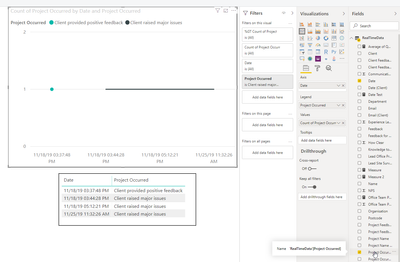
Below is what happens when I add the data to a simple chart, but would require the DAX code to create new measures to total percentages from the text replies. Also to create percentage per month. Any ideas grateful.
Helpful resources

Microsoft Fabric Learn Together
Covering the world! 9:00-10:30 AM Sydney, 4:00-5:30 PM CET (Paris/Berlin), 7:00-8:30 PM Mexico City

Power BI Monthly Update - April 2024
Check out the April 2024 Power BI update to learn about new features.

| User | Count |
|---|---|
| 112 | |
| 99 | |
| 73 | |
| 72 | |
| 49 |
| User | Count |
|---|---|
| 145 | |
| 109 | |
| 109 | |
| 90 | |
| 64 |


