Go To
- Power BI forums
- Updates
- News & Announcements
- Get Help with Power BI
- Desktop
- Service
- Report Server
- Power Query
- Mobile Apps
- Developer
- DAX Commands and Tips
- Custom Visuals Development Discussion
- Health and Life Sciences
- Power BI Spanish forums
- Translated Spanish Desktop
- Power Platform Integration - Better Together!
- Power Platform Integrations (Read-only)
- Power Platform and Dynamics 365 Integrations (Read-only)
- Training and Consulting
- Instructor Led Training
- Dashboard in a Day for Women, by Women
- Galleries
- Community Connections & How-To Videos
- COVID-19 Data Stories Gallery
- Themes Gallery
- Data Stories Gallery
- R Script Showcase
- Webinars and Video Gallery
- Quick Measures Gallery
- 2021 MSBizAppsSummit Gallery
- 2020 MSBizAppsSummit Gallery
- 2019 MSBizAppsSummit Gallery
- Events
- Ideas
- Custom Visuals Ideas
- Issues
- Issues
- Events
- Upcoming Events
- Community Blog
- Power BI Community Blog
- Custom Visuals Community Blog
- Community Support
- Community Accounts & Registration
- Using the Community
- Community Feedback
Turn on suggestions
Auto-suggest helps you quickly narrow down your search results by suggesting possible matches as you type.
Showing results for
Register now to learn Fabric in free live sessions led by the best Microsoft experts. From Apr 16 to May 9, in English and Spanish.
- Power BI forums
- Forums
- Get Help with Power BI
- Desktop
- How to display multiple columns as a filter on a c...
Reply
Topic Options
- Subscribe to RSS Feed
- Mark Topic as New
- Mark Topic as Read
- Float this Topic for Current User
- Bookmark
- Subscribe
- Printer Friendly Page
- Mark as New
- Bookmark
- Subscribe
- Mute
- Subscribe to RSS Feed
- Permalink
- Report Inappropriate Content
How to display multiple columns as a filter on a chart
04-05-2018
03:14 PM
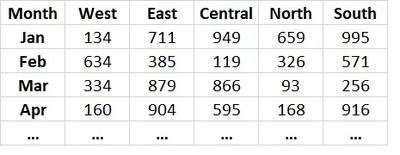
My table is set up with columns of different regions (Central, West, etc.) and their monthly ticket volume in rows.
Is there a way for me to create a chart with Region as a filter? Example, if a user selected 'Central', the chart would display the month-over-month ticket volume of Central region?
Solved! Go to Solution.
1 ACCEPTED SOLUTION
- Mark as New
- Bookmark
- Subscribe
- Mute
- Subscribe to RSS Feed
- Permalink
- Report Inappropriate Content
04-05-2018
05:19 PM
Hi @liu,
On query editor select your columns and unpivot them, you will have 3 columns:
- Date
- Category
- Values
Then just add the Category column to a slicer and date and value to your chart you will then get the expected result.
Regards,
MFelix
Did I answer your question? Mark my post as a solution!

On query editor select your columns and unpivot them, you will have 3 columns:
- Date
- Category
- Values
Then just add the Category column to a slicer and date and value to your chart you will then get the expected result.
Regards,
MFelix
Regards
Miguel Félix
Did I answer your question? Mark my post as a solution!
Proud to be a Super User!
Check out my blog: Power BI em Português
1 REPLY 1
- Mark as New
- Bookmark
- Subscribe
- Mute
- Subscribe to RSS Feed
- Permalink
- Report Inappropriate Content
04-05-2018
05:19 PM
Hi @liu,
On query editor select your columns and unpivot them, you will have 3 columns:
- Date
- Category
- Values
Then just add the Category column to a slicer and date and value to your chart you will then get the expected result.
Regards,
MFelix
Did I answer your question? Mark my post as a solution!

On query editor select your columns and unpivot them, you will have 3 columns:
- Date
- Category
- Values
Then just add the Category column to a slicer and date and value to your chart you will then get the expected result.
Regards,
MFelix
Regards
Miguel Félix
Did I answer your question? Mark my post as a solution!
Proud to be a Super User!
Check out my blog: Power BI em PortuguêsHelpful resources
Announcements

Microsoft Fabric Learn Together
Covering the world! 9:00-10:30 AM Sydney, 4:00-5:30 PM CET (Paris/Berlin), 7:00-8:30 PM Mexico City

Power BI Monthly Update - April 2024
Check out the April 2024 Power BI update to learn about new features.

Featured Topics
Top Solution Authors
| User | Count |
|---|---|
| 118 | |
| 107 | |
| 69 | |
| 68 | |
| 43 |
Top Kudoed Authors
| User | Count |
|---|---|
| 148 | |
| 104 | |
| 102 | |
| 89 | |
| 66 |

