Hello folks, I need some help here if you please.
I am trying to visualize 3 cathegories of data in a combined way, like the following:
- range maximum: a reference value for maximum
- range minimum: a reference value for minimum
- actual: the actual performance achieved (it can be below, inside or above the reference range)
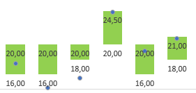
I actually could do it on excel using two stacked columns, one for max and other for min, and "hiding" the minimum stack. However, I needed to recalculate the maximum value, so the lenght of the max column would be equal to the difference between the max and min. But I could make Excel display custom data at the data label.
For example:
- max value displayed: 20
- min value displayed: 16
- min column lenght: 16
- max column lenght: 4 (20 - 16)
- actual value performed: 17,5
Do you guys know any way of building this in power bi?
Thank you


