- Power BI forums
- Updates
- News & Announcements
- Get Help with Power BI
- Desktop
- Service
- Report Server
- Power Query
- Mobile Apps
- Developer
- DAX Commands and Tips
- Custom Visuals Development Discussion
- Health and Life Sciences
- Power BI Spanish forums
- Translated Spanish Desktop
- Power Platform Integration - Better Together!
- Power Platform Integrations (Read-only)
- Power Platform and Dynamics 365 Integrations (Read-only)
- Training and Consulting
- Instructor Led Training
- Dashboard in a Day for Women, by Women
- Galleries
- Community Connections & How-To Videos
- COVID-19 Data Stories Gallery
- Themes Gallery
- Data Stories Gallery
- R Script Showcase
- Webinars and Video Gallery
- Quick Measures Gallery
- 2021 MSBizAppsSummit Gallery
- 2020 MSBizAppsSummit Gallery
- 2019 MSBizAppsSummit Gallery
- Events
- Ideas
- Custom Visuals Ideas
- Issues
- Issues
- Events
- Upcoming Events
- Community Blog
- Power BI Community Blog
- Custom Visuals Community Blog
- Community Support
- Community Accounts & Registration
- Using the Community
- Community Feedback
Register now to learn Fabric in free live sessions led by the best Microsoft experts. From Apr 16 to May 9, in English and Spanish.
- Power BI forums
- Forums
- Get Help with Power BI
- Desktop
- Re: How to display a project progress schedule
- Subscribe to RSS Feed
- Mark Topic as New
- Mark Topic as Read
- Float this Topic for Current User
- Bookmark
- Subscribe
- Printer Friendly Page
- Mark as New
- Bookmark
- Subscribe
- Mute
- Subscribe to RSS Feed
- Permalink
- Report Inappropriate Content
How to display a project progress schedule
Hi there,
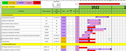
I need to create a report based on an Excel schedule. This schedule illustrates the different activities of the company and the projects that must be carried out. Planning is shown in purple and execution in pink. If the completion of the project is behind schedule, the box is red. For example, if a project was to be carried out from April to October (line 17 & 18 on the screenshot) but only begins in June, the project is two months late (therefore 2 red boxes). If everything goes as planned, all boxes are red. Here I hope it is clear for the explanations of Excel.
Now what I need to do is a bit different. Already, Excel is completely unusable on Power BI. So I took the data and redid an Excel table.
A : Title of worksites
B : Activity - Planned start date
G : Planned end date
H : Actual start date
I : Actual end date
J : Percentage of completion
Here is the idea of the Power BI layout:
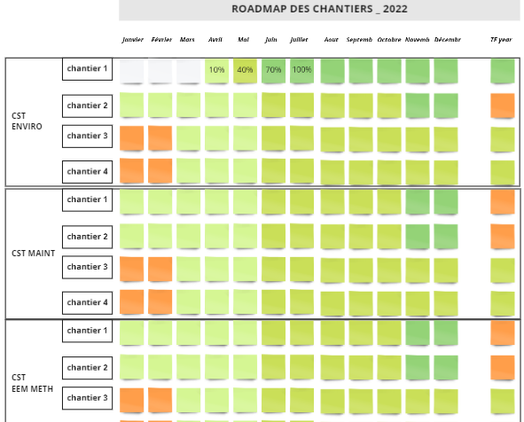
There is the title of the activity, the different sites and then, depending on each project site, a progress report on the project. On this frieze, we must see the progress of the project only with the actual dates. However, to take the example above, if a project is planned from April to October, two possibilities are available to us:
1. The project follows its normal course. The project manager gradually enters the percentage of progress. The frieze is colored green (a gradient from lightest to darkest where dark = 100%).
2. The project is late. Instead of starting in April, it starts in June. The first two months must be in red, then from June, the project must be in orange since it has started but is still late.
Here is what I managed to do: (yes, it's not a lot oupsi)
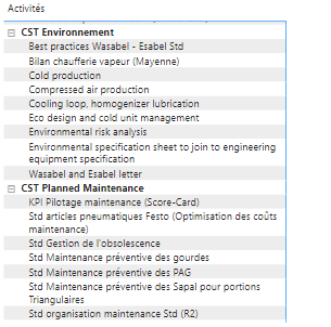
I do have my Activities columns with the details of the sites (it doesn't matter if it doesn't look like the model, we'll see the presentation later), but I can't even create a calendar. I would like the months to be displayed, with progress bars (with conditional colors). I can't get this, it gives me nonsense when I enter the start and end dates in a column. In addition, the difficulty is that the planned / actual end dates are confronting each other in order to be able to display the delays, but without the planned dates being visible... Here it is much more complicated than what I expected, I am embarked on something impossible... If someone can help me I will be very grateful! Also, I'm a complete beginner on Power BI so the easy stuff is fine, I can handle it, but the measures and everything I'm not very comfortable with...
Thanks in advance!
Emilie ❤️
PS : I found a formula that allows to have calendars in a table but it is not connected to my first table so it is useless but if it can help...
- Mark as New
- Bookmark
- Subscribe
- Mute
- Subscribe to RSS Feed
- Permalink
- Report Inappropriate Content
https://www.youtube.com/watch?v=cdUg8LfarCg
I think this will give you some idea
Did I answer your question? If so, please mark my post as a solution!
Proud to be a Super User!
Helpful resources

Microsoft Fabric Learn Together
Covering the world! 9:00-10:30 AM Sydney, 4:00-5:30 PM CET (Paris/Berlin), 7:00-8:30 PM Mexico City

Power BI Monthly Update - April 2024
Check out the April 2024 Power BI update to learn about new features.

| User | Count |
|---|---|
| 110 | |
| 95 | |
| 76 | |
| 65 | |
| 51 |
| User | Count |
|---|---|
| 146 | |
| 109 | |
| 106 | |
| 88 | |
| 61 |


