- Power BI forums
- Updates
- News & Announcements
- Get Help with Power BI
- Desktop
- Service
- Report Server
- Power Query
- Mobile Apps
- Developer
- DAX Commands and Tips
- Custom Visuals Development Discussion
- Health and Life Sciences
- Power BI Spanish forums
- Translated Spanish Desktop
- Power Platform Integration - Better Together!
- Power Platform Integrations (Read-only)
- Power Platform and Dynamics 365 Integrations (Read-only)
- Training and Consulting
- Instructor Led Training
- Dashboard in a Day for Women, by Women
- Galleries
- Community Connections & How-To Videos
- COVID-19 Data Stories Gallery
- Themes Gallery
- Data Stories Gallery
- R Script Showcase
- Webinars and Video Gallery
- Quick Measures Gallery
- 2021 MSBizAppsSummit Gallery
- 2020 MSBizAppsSummit Gallery
- 2019 MSBizAppsSummit Gallery
- Events
- Ideas
- Custom Visuals Ideas
- Issues
- Issues
- Events
- Upcoming Events
- Community Blog
- Power BI Community Blog
- Custom Visuals Community Blog
- Community Support
- Community Accounts & Registration
- Using the Community
- Community Feedback
Register now to learn Fabric in free live sessions led by the best Microsoft experts. From Apr 16 to May 9, in English and Spanish.
- Power BI forums
- Forums
- Get Help with Power BI
- Desktop
- Re: How to create date entries for how long a Tick...
- Subscribe to RSS Feed
- Mark Topic as New
- Mark Topic as Read
- Float this Topic for Current User
- Bookmark
- Subscribe
- Printer Friendly Page
- Mark as New
- Bookmark
- Subscribe
- Mute
- Subscribe to RSS Feed
- Permalink
- Report Inappropriate Content
How to create date entries for how long a Ticket has been open?
Hi. I have a dataset that contains information on our Tickets in the IT department. I have a created date, closed date and amount of days the ticket has been open.
My issue is that we want a bar chart showing each day how many tickets have been open for different time groups:
0-2 days = green
3-7 = yellow
8-30 = red
31+ = black
However, the chart only displays the ticket for the created date. Please see the below example. The Black section of the chart shows 1 ticket that has been open for 37 days and was created on the 15/01. Therefore, the same Black section should show on each bar (the pink underlined bars) from 15/01 to the 22/02. How would I achieve this? Thank you:
Solved! Go to Solution.
- Mark as New
- Bookmark
- Subscribe
- Mute
- Subscribe to RSS Feed
- Permalink
- Report Inappropriate Content
Hi @GeorgeG
I think you have a bar chart and show the count of the value which create date and close date are all in range.
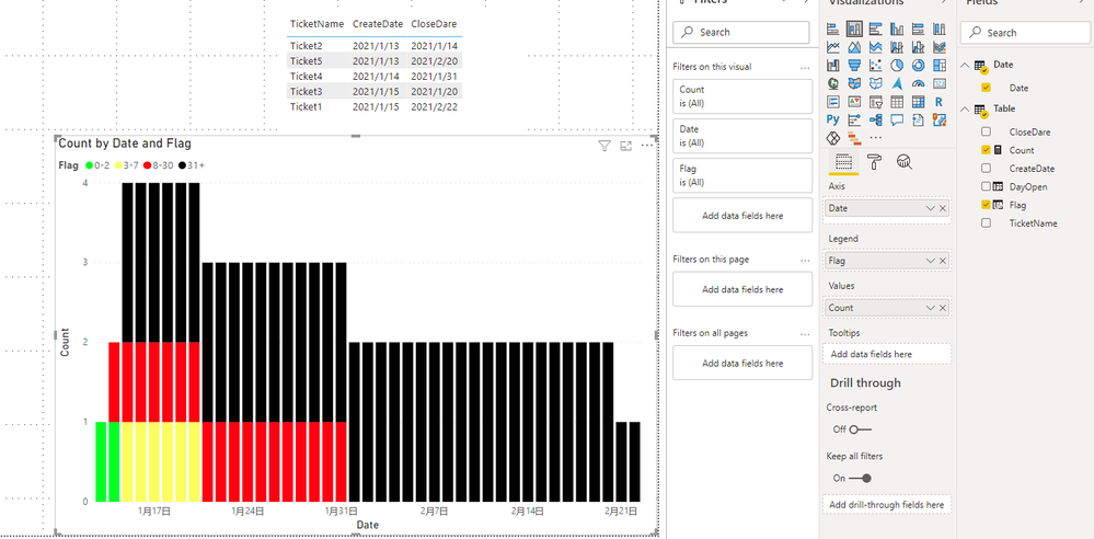
Ex: 1 ticket that has been open for 37 days and was created on the 2021/01/15 and closed on the 2021/02/22. Therefore, the same Black section should show on each bar from 2021/01/15 to the 2021/02/22.
My Sample:
Day Open and Flag are all calculated columns.
DayOpen = DATEDIFF('Table'[CreateDate],'Table'[CloseDare],DAY)Flag =
SWITCH (
TRUE (),
'Table'[DayOpen] <= 2, "0-2",
'Table'[DayOpen] <= 7, "3-7",
'Table'[DayOpen] <= 30, "8-30",
"31+"
)Build an unrelated date table by dax.
Date = CALENDAR(MIN('Table'[CreateDate]),MAX('Table'[CloseDare]))Then build a count measure as below.
Count =
IF(
MAX('Table'[CreateDate])<=MAX('Date'[Date])&&MAX('Table'[CloseDare])>=MAX('Date'[Date]),
CALCULATE(COUNT('Table'[Flag]),FILTER(ALL('Table'),'Table'[Flag]=MAX('Table'[Flag])&&'Table'[CreateDate]<=MAX('Date'[Date])&&'Table'[CloseDare]>=MAX('Date'[Date]))),
0)
Build a bar chart.
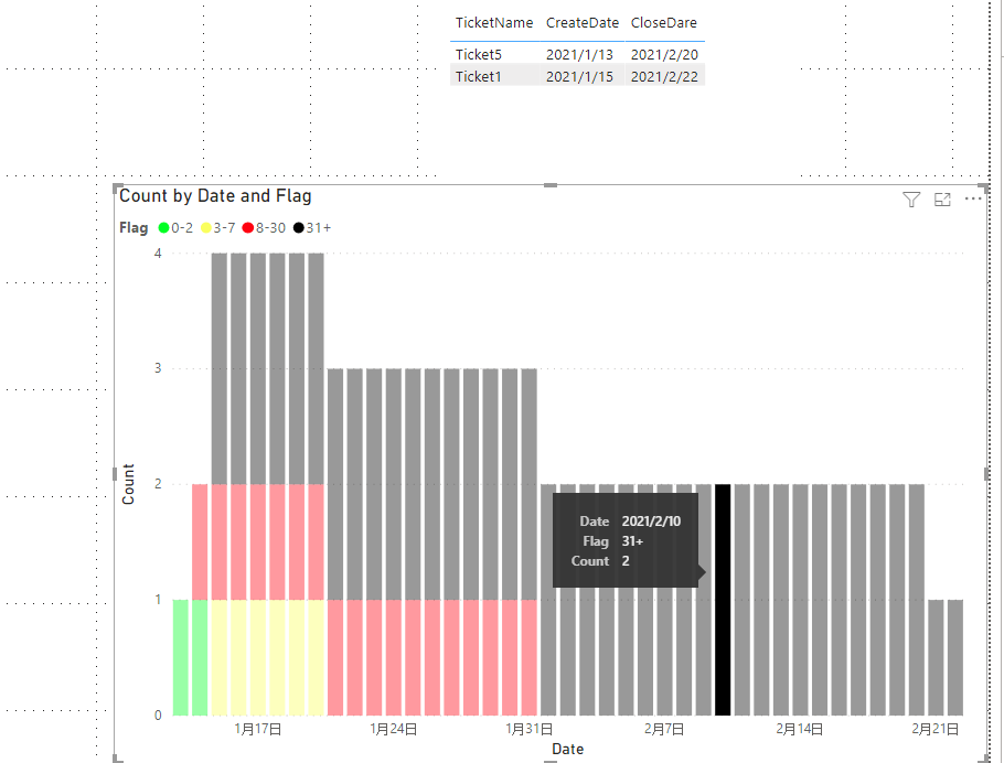
You see 31+ has two, one is between 2021/01/13 to 2021/02/20 and another is between 2021/01/15 to 2021/02/22.
Select Blank bar in 2020/2/10
You can download the pbix file from this link: File
Best Regards,
Rico Zhou
If this post helps, then please consider Accept it as the solution to help the other members find it more quickly.
Helpful resources

Microsoft Fabric Learn Together
Covering the world! 9:00-10:30 AM Sydney, 4:00-5:30 PM CET (Paris/Berlin), 7:00-8:30 PM Mexico City

Power BI Monthly Update - April 2024
Check out the April 2024 Power BI update to learn about new features.

| User | Count |
|---|---|
| 109 | |
| 98 | |
| 77 | |
| 66 | |
| 54 |
| User | Count |
|---|---|
| 144 | |
| 104 | |
| 100 | |
| 86 | |
| 64 |


