- Power BI forums
- Updates
- News & Announcements
- Get Help with Power BI
- Desktop
- Service
- Report Server
- Power Query
- Mobile Apps
- Developer
- DAX Commands and Tips
- Custom Visuals Development Discussion
- Health and Life Sciences
- Power BI Spanish forums
- Translated Spanish Desktop
- Power Platform Integration - Better Together!
- Power Platform Integrations (Read-only)
- Power Platform and Dynamics 365 Integrations (Read-only)
- Training and Consulting
- Instructor Led Training
- Dashboard in a Day for Women, by Women
- Galleries
- Community Connections & How-To Videos
- COVID-19 Data Stories Gallery
- Themes Gallery
- Data Stories Gallery
- R Script Showcase
- Webinars and Video Gallery
- Quick Measures Gallery
- 2021 MSBizAppsSummit Gallery
- 2020 MSBizAppsSummit Gallery
- 2019 MSBizAppsSummit Gallery
- Events
- Ideas
- Custom Visuals Ideas
- Issues
- Issues
- Events
- Upcoming Events
- Community Blog
- Power BI Community Blog
- Custom Visuals Community Blog
- Community Support
- Community Accounts & Registration
- Using the Community
- Community Feedback
Register now to learn Fabric in free live sessions led by the best Microsoft experts. From Apr 16 to May 9, in English and Spanish.
- Power BI forums
- Forums
- Get Help with Power BI
- Desktop
- Re: How to create a slicer based on column value (...
- Subscribe to RSS Feed
- Mark Topic as New
- Mark Topic as Read
- Float this Topic for Current User
- Bookmark
- Subscribe
- Printer Friendly Page
- Mark as New
- Bookmark
- Subscribe
- Mute
- Subscribe to RSS Feed
- Permalink
- Report Inappropriate Content
How to create a slicer based on column value (now I need to link measure (logic) to a slicer table)
I am opening up a new post because I have not gotten a solution from my original post last week.
I was able to get some feedbacks on the approach (as far as Measure is concerned), but need some advice on how to link a table (for a slicer selection value) with a measure (logic).
I am sharing Pbix file here.
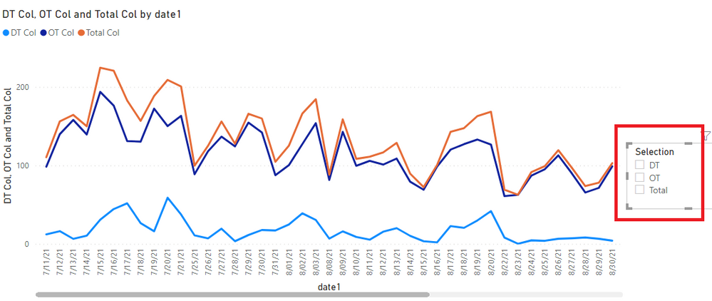
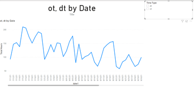
I am trying to have a slicer based on the value of columns (DT, OT and Total).
I am trying to have a slicer that changes a Line graph based on selection of DT, OT and Total.
There are three columns (DT Col, OT Col and Total Col).
I also have a three measures (DT, OT and Total).
I created a table called 'Slicer" (to be used as a slicer).
I honestly am not sure this is a way to create a table as it is a very simple table.
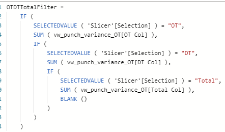
I created two measures that have a logic of selection of a slicer.
I created two different versions (one with IF and the other one with Switch), but both should have a same logic.
My question now is how to link the table (that has a simple output of choice) with the logic?
Thanks for help.
Solved! Go to Solution.
- Mark as New
- Bookmark
- Subscribe
- Mute
- Subscribe to RSS Feed
- Permalink
- Report Inappropriate Content
You would write a measure that reads the slection of the slicer and returns the correct measure, like this.
Display Measure =
VAR _Selection = SELECTEDVALUE ( Slicer[Selection] )
RETURN
SWITCH (
    _Selection,
    "OT",[OT],
    "DT",[DT],
    "Total",[Total]
)
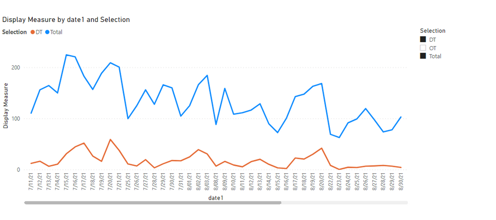
Then you put that measure in the values and the Slicer[Selection] column in the Legend of the chart.
I have updated the attached file with the changes.
- Mark as New
- Bookmark
- Subscribe
- Mute
- Subscribe to RSS Feed
- Permalink
- Report Inappropriate Content
Hmm, this is an interesting one. Do you want them to be able to select multiple choices at once or just one?
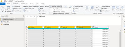
I'm not sure what your other post was, but this looks to me like data that could be unpivoted?
Do this in Power Query, so click 'Transform Data' to get there:
Create a 'title' measure with DAX:
Then you can use conditional formatting to update the date of the chart to match what the user selects:
I wasn't sure if OT and DT are the only choices, but you can change the 'title' measure to say 'Total' or anything you want really, just need to know all the scenarios. 😀
See file below signature. To view what I've done in Power Query you'll have to 'Apply changes' and look at the vw_punch_variance_OT table only.
Please @mention me in your reply if you want a response.
Copying DAX from this post? Click here for a hack to quickly replace it with your own table names
Has this post solved your problem? Please Accept as Solution so that others can find it quickly and to let the community know your problem has been solved.
If you found this post helpful, please give Kudos C
I work as a Microsoft trainer and consultant, specialising in Power BI and Power Query.
www.excelwithallison.com
- Mark as New
- Bookmark
- Subscribe
- Mute
- Subscribe to RSS Feed
- Permalink
- Report Inappropriate Content
@JustinDoh1 Sorry for my delayed reply - are you still needing help with the unpivot totals? Generally with the 'total' we remove that column first, then Unpivot just the values.
Think of Power BI like Excel - it works best with a database format table. You need to have one piece of info in each column and only one column per piece of info: so not two or three columns for hours like you currently have, but just one column for hours and one column for the type (OT vs DT).
Just like you wouldn't include the OT, DT and Total in a graph in Excel (you'd pick either Totals or no Totals), same goes for Power BI: decide what level of granularity you want/need the report in. Use that only, and let the measures create the totals for you in the visuals.
For your stacked bar chart, you wouldn't want OT, DT and Total: That would make everything look like double what it is. To get total, just select OT and DT in the slicer. If you want a 'Total' option in the slicer, we can make a workaround for that, but can also just clear the filter in slicer.
I'm interested to hear how you're going, so keep in touch!
Please @mention me in your reply if you want a response.
Copying DAX from this post? Click here for a hack to quickly replace it with your own table names
Has this post solved your problem? Please Accept as Solution so that others can find it quickly and to let the community know your problem has been solved.
If you found this post helpful, please give Kudos C
I work as a Microsoft trainer and consultant, specialising in Power BI and Power Query.
www.excelwithallison.com
- Mark as New
- Bookmark
- Subscribe
- Mute
- Subscribe to RSS Feed
- Permalink
- Report Inappropriate Content
Hmm, this is an interesting one. Do you want them to be able to select multiple choices at once or just one?
I'm not sure what your other post was, but this looks to me like data that could be unpivoted?
Do this in Power Query, so click 'Transform Data' to get there:
Create a 'title' measure with DAX:
Then you can use conditional formatting to update the date of the chart to match what the user selects:
I wasn't sure if OT and DT are the only choices, but you can change the 'title' measure to say 'Total' or anything you want really, just need to know all the scenarios. 😀
See file below signature. To view what I've done in Power Query you'll have to 'Apply changes' and look at the vw_punch_variance_OT table only.
Please @mention me in your reply if you want a response.
Copying DAX from this post? Click here for a hack to quickly replace it with your own table names
Has this post solved your problem? Please Accept as Solution so that others can find it quickly and to let the community know your problem has been solved.
If you found this post helpful, please give Kudos C
I work as a Microsoft trainer and consultant, specialising in Power BI and Power Query.
www.excelwithallison.com
- Mark as New
- Bookmark
- Subscribe
- Mute
- Subscribe to RSS Feed
- Permalink
- Report Inappropriate Content
@AllisonKennedy I am trying to understand how Unpivot works when it requires Total (OT + DT).
I was trying to follow the step of Unpivoting, but not quiet understand from your graphics. Also, I have a new requirement it would be stacked bar graph that shows three scenarios (OT, DT and Total (that shows OT and DT in different colors)). How can we unpivot Total since this is a calculation?
- Mark as New
- Bookmark
- Subscribe
- Mute
- Subscribe to RSS Feed
- Permalink
- Report Inappropriate Content
@JustinDoh1 Sorry for my delayed reply - are you still needing help with the unpivot totals? Generally with the 'total' we remove that column first, then Unpivot just the values.
Think of Power BI like Excel - it works best with a database format table. You need to have one piece of info in each column and only one column per piece of info: so not two or three columns for hours like you currently have, but just one column for hours and one column for the type (OT vs DT).
Just like you wouldn't include the OT, DT and Total in a graph in Excel (you'd pick either Totals or no Totals), same goes for Power BI: decide what level of granularity you want/need the report in. Use that only, and let the measures create the totals for you in the visuals.
For your stacked bar chart, you wouldn't want OT, DT and Total: That would make everything look like double what it is. To get total, just select OT and DT in the slicer. If you want a 'Total' option in the slicer, we can make a workaround for that, but can also just clear the filter in slicer.
I'm interested to hear how you're going, so keep in touch!
Please @mention me in your reply if you want a response.
Copying DAX from this post? Click here for a hack to quickly replace it with your own table names
Has this post solved your problem? Please Accept as Solution so that others can find it quickly and to let the community know your problem has been solved.
If you found this post helpful, please give Kudos C
I work as a Microsoft trainer and consultant, specialising in Power BI and Power Query.
www.excelwithallison.com
- Mark as New
- Bookmark
- Subscribe
- Mute
- Subscribe to RSS Feed
- Permalink
- Report Inappropriate Content
@AllisonKennedy Actually, I ended up using unpivot, and everything is working. First when somebody suggested 'unpivot', I thought he was referring to Excel, not PowerBI. I tried using other way that other person indicated (I thought that approach is more dynamic), but I got stuck creating a slicer for matrix visual together. So, I ended up creating a calculated value of DT (dt1 + dt2) and OT (ot1 + ot2) from SQL, and just imported those two columns and unpivoted in Power BI. Thanks! Keep in touch. I am getting deeper into Power BI now. 🙂
- Mark as New
- Bookmark
- Subscribe
- Mute
- Subscribe to RSS Feed
- Permalink
- Report Inappropriate Content
Enjoy it! Yes, you'll be MUCH happier with the Unpivot. It's actually more dynamic and flexible than the other way, even though it seems longer/difficult at first.
Power BI was born in Excel, so the Power Query/Power Pivot in Excel are the same tools we use in Power BI, and it's pretty easy to convert from one to the other.
Please @mention me in your reply if you want a response.
Copying DAX from this post? Click here for a hack to quickly replace it with your own table names
Has this post solved your problem? Please Accept as Solution so that others can find it quickly and to let the community know your problem has been solved.
If you found this post helpful, please give Kudos C
I work as a Microsoft trainer and consultant, specialising in Power BI and Power Query.
www.excelwithallison.com
- Mark as New
- Bookmark
- Subscribe
- Mute
- Subscribe to RSS Feed
- Permalink
- Report Inappropriate Content
@AllisonKennedy Thank you so much for your help. Now, I realized that Power Query is available in PowerBI. When somebody mentioned about Power Query, I was thinking about modifying in Excel. 🙂
- Mark as New
- Bookmark
- Subscribe
- Mute
- Subscribe to RSS Feed
- Permalink
- Report Inappropriate Content
You would write a measure that reads the slection of the slicer and returns the correct measure, like this.
Display Measure =
VAR _Selection = SELECTEDVALUE ( Slicer[Selection] )
RETURN
SWITCH (
    _Selection,
    "OT",[OT],
    "DT",[DT],
    "Total",[Total]
)
Then you put that measure in the values and the Slicer[Selection] column in the Legend of the chart.
I have updated the attached file with the changes.
Helpful resources

Microsoft Fabric Learn Together
Covering the world! 9:00-10:30 AM Sydney, 4:00-5:30 PM CET (Paris/Berlin), 7:00-8:30 PM Mexico City

Power BI Monthly Update - April 2024
Check out the April 2024 Power BI update to learn about new features.

| User | Count |
|---|---|
| 109 | |
| 96 | |
| 77 | |
| 66 | |
| 54 |
| User | Count |
|---|---|
| 144 | |
| 104 | |
| 102 | |
| 88 | |
| 63 |
