- Power BI forums
- Updates
- News & Announcements
- Get Help with Power BI
- Desktop
- Service
- Report Server
- Power Query
- Mobile Apps
- Developer
- DAX Commands and Tips
- Custom Visuals Development Discussion
- Health and Life Sciences
- Power BI Spanish forums
- Translated Spanish Desktop
- Power Platform Integration - Better Together!
- Power Platform Integrations (Read-only)
- Power Platform and Dynamics 365 Integrations (Read-only)
- Training and Consulting
- Instructor Led Training
- Dashboard in a Day for Women, by Women
- Galleries
- Community Connections & How-To Videos
- COVID-19 Data Stories Gallery
- Themes Gallery
- Data Stories Gallery
- R Script Showcase
- Webinars and Video Gallery
- Quick Measures Gallery
- 2021 MSBizAppsSummit Gallery
- 2020 MSBizAppsSummit Gallery
- 2019 MSBizAppsSummit Gallery
- Events
- Ideas
- Custom Visuals Ideas
- Issues
- Issues
- Events
- Upcoming Events
- Community Blog
- Power BI Community Blog
- Custom Visuals Community Blog
- Community Support
- Community Accounts & Registration
- Using the Community
- Community Feedback
Register now to learn Fabric in free live sessions led by the best Microsoft experts. From Apr 16 to May 9, in English and Spanish.
- Power BI forums
- Forums
- Get Help with Power BI
- Desktop
- Re: How to create a line chart with percentage by ...
- Subscribe to RSS Feed
- Mark Topic as New
- Mark Topic as Read
- Float this Topic for Current User
- Bookmark
- Subscribe
- Printer Friendly Page
- Mark as New
- Bookmark
- Subscribe
- Mute
- Subscribe to RSS Feed
- Permalink
- Report Inappropriate Content
How to create a line chart with percentage by day + only show today -14 when filtering
Dear All,
Hopefully someone can assist me with the following, I would like to create a line chart with percentage showing on time and late based on the containers planned for that day. For some reason it shows me total amount.
Also i would like the output to only show up today -14 days everytime i filter on a certain day.
For example, if i filter on today the 6th, the graph should show today -14 days (this might be adjusted but for now 14 days is fine)
Is this something that is possible?
Solved! Go to Solution.
- Mark as New
- Bookmark
- Subscribe
- Mute
- Subscribe to RSS Feed
- Permalink
- Report Inappropriate Content
Part II
Now for the next part:
Also when I do not filter I just need the chart to show the last 14 days of ontime/late and destinations. so that in total will be 8 lines because there are 4 possible locations and its late and on time.
Two things here:
1) The default Line Graph Visual does not allow you to have two measures and a field legend simultaneously. In other words, you can either show both lines (but no option to show all destinations at the same time) or show can show only one line with all destinations visible in the chart. You'll have to decide, or show one visual next to another.
There is a custom visual which will allow both options, but I'll get to that later.
2) As regards the other request (when I do not filter I just need the chart to show the last 14 days of ontime/late and destinations) this you can do, but need a couple of new measures.
First let's create the measures for when there is no date selection:
Cut-offs at the latest date in model -14 days (these cut-off dates are for the last date in the model; if you need the cut-off dates for the last dates available for each of your "Late" or "On Time" the measures vary)
Late (no date selected) =
VAR maxdate = CALCULATE(MAX('Calendar Table'[Date]); ALL('Calendar Table'[Date]))
RETURN
IF(MIN('Calendar Table'[Date])< maxdate -14; BLANK(); [Late])
and
On Time (no date selected) =
VAR maxdate = CALCULATE(MAX('Calendar Table'[Date]); ALL('Calendar Table')) - 14
RETURN
IF(MIN('Calendar Table'[Date])< maxdate; BLANK(); [On Time])
And finally the measures which we will be using in the final visual:
On Time Visual = IF(ISFILTERED('Selection Date Table'[Date]);
                 [Measure On Time (14 days)];
                  [On Time (no date selected)])
and
Late Visual = IF(ISFILTERED('Selection Date Table'[Date]);
              [Measure Late (14 days)];
               [Late (no date selected)])
Now you can subsitute the measures in your line graph for these last two.
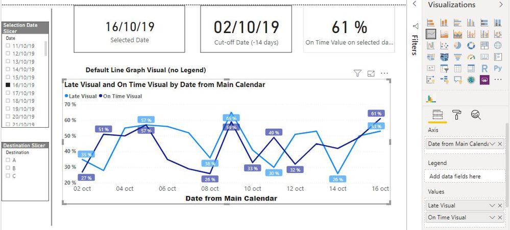
So when no date is selected you get this (notice the dates and the cut-off date):
And when you select a date you get this:
If you select a value in the Destination Slicer the graph will change accordingly.
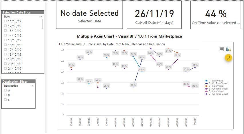
And finally, if you want to try a visual which will allow you to show all destinations and both lines simultaneaously, you can download the visual called Multiple Axes Chart - VisualBI v 1.0.1 from the Marketplace.
When no date or destination is selected you will see both lines for each destination (bear in mind my data is not perfect which is why you see the broken lines)
And I think that more or less covers your questions. Do let me know if you have any further problems.
The link to the file: PBIX File
Did I answer your question? Mark my post as a solution!
In doing so, you are also helping me. Thank you!
Proud to be a Super User!
Paul on Linkedin.
- Mark as New
- Bookmark
- Subscribe
- Mute
- Subscribe to RSS Feed
- Permalink
- Report Inappropriate Content
It would be very helpful if you provided some sample data and a mock-up of what you are trying to achieve
Did I answer your question? Mark my post as a solution!
In doing so, you are also helping me. Thank you!
Proud to be a Super User!
Paul on Linkedin.
- Mark as New
- Bookmark
- Subscribe
- Mute
- Subscribe to RSS Feed
- Permalink
- Report Inappropriate Content
Hi @PaulDBrown,
Yes, ofcourse. Please see below the setup I have currently.
For any given day i can choose by a slicer to show the amount of items to be delivered, have been delivered, how many on time etc. Also i can select either all locations in the slicer or seperate by one.
What i would like to do is, create a line chart where it shows the score (percentage) per day for the 14 previous days of the slicer filter I choose, I also want to be able to filter with slicer on location.
If i choose today the 8th of december with the slicer and I select Duisburg, i want to see in the line chart the score per day in percentage of the last 14 days. If i were to select/filter on the 4th it should be 4th - 14 days is starting 20th of november.
Currently when I create a chart, i only get the total amount scored each day, it combines al data of all months and adds a first of the months together and 2nds etc etc even though i filter.
Hope this makes sense, and hopefully there is a solution.
- Mark as New
- Bookmark
- Subscribe
- Mute
- Subscribe to RSS Feed
- Permalink
- Report Inappropriate Content
Thanks for expanding on your quest.. I think I understand what you are trying to achieve. Please bear in mind that how your model is structured is of course very relevant.
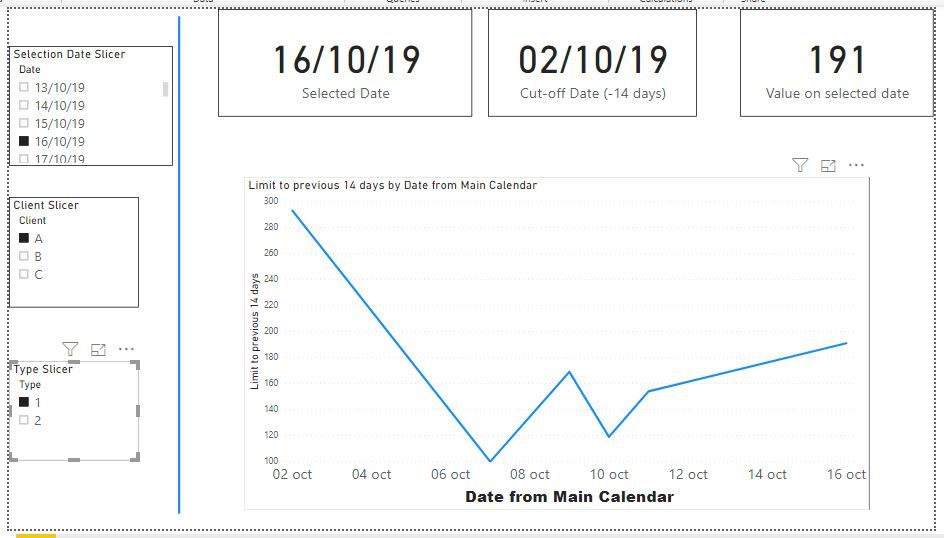
I have prepared an example of how to achieve the line graph for a measure displaying only the values between a selected date and the previous 14 days to the selection.
The way to do it is to duplicate your dates table (I've called this duplicate table "Selection Date") and make sure it has no relationships with any other tables in your model. This Selection Date table is what you use in your slicer (you will only be using "day" dates, so if this Selection Date table has other columns - month, year etc- you can delete them if you wish).
However, in your line graph visual your must use the date from your main date table (which has the relationships with other tables in your model - in my example this is the Calendar table).
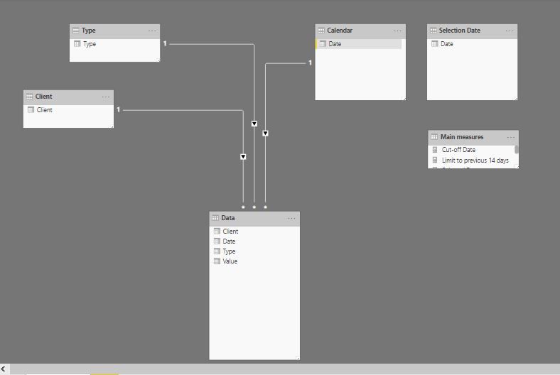
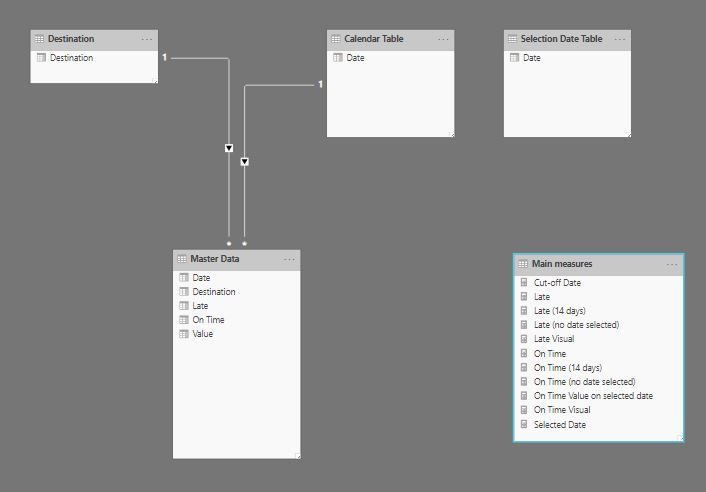
My example model looks like this:
Next you need to establish the cut off date, measured from the date you will be selecting in your slicer (Selection Date slicer):
(BTW, you can also make the number of days you wish to visualize selectable through a slicer: so it could be 7 days, 14, 21 and so on...)
Cut-off Date = SELECTEDVALUE('Selection Date'[Date]) -14
Now you create the measure that you will be using in your line graph visual. (in my example, I am seeing the [Sum of values], but use whatever measure you wish to visualize obviously):
Limit to previous 14 days =
IF(MIN('Calendar'[Date])<[Cut-off Date];
BLANK();
IF(MIN('Calendar'[Date])> SELECTEDVALUE('Selection Date'[Date]);
BLANK();
[Sum of Values]))
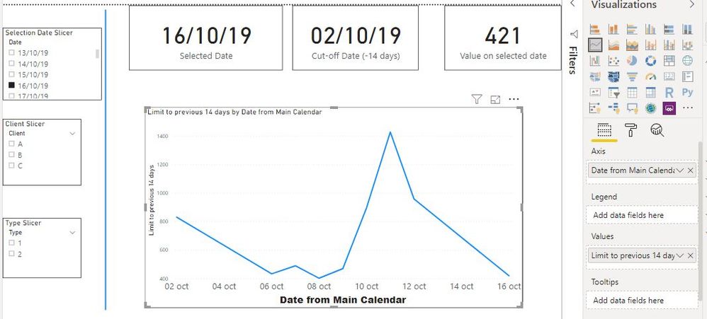
You can then create you visual using your main date table date field in the x-axis (in my example the date from the Calendar table), and this [Limit to previous 14 days] measure as your values.
You can include other slicers in your page (as you can see from my screenshots). Please bear in mind that since the table you are using to select your date is not linked via a relationship to any other table in your model, you will need to create new measures which take this into account - ie. the other values seen in your image above. In my example you can see the card box which shows the [Sum of Values] for the selected date. The way to create these measures is simple:
Value on selected date = CALCULATE([Sum of Values];
    FILTER('Calendar';
        'Calendar'[Date] = SELECTEDVALUE('Selection Date'[Date])))
Here is the PBIX file if you're interested: PBIX file
Did I answer your question? Mark my post as a solution!
In doing so, you are also helping me. Thank you!
Proud to be a Super User!
Paul on Linkedin.
- Mark as New
- Bookmark
- Subscribe
- Mute
- Subscribe to RSS Feed
- Permalink
- Report Inappropriate Content
Hi @PaulDBrown ,
Thank you so much for the extensive explanation and the file, let me give it a try (will take a few days) and then i'll come back to show that I finally succeeded.
- Mark as New
- Bookmark
- Subscribe
- Mute
- Subscribe to RSS Feed
- Permalink
- Report Inappropriate Content
Hi @PaulDBrown ,
I have tried the solution however, i'm still not there yet.
Ill show what I have done untill now.
I created multiple measures
--------------------------------------------
--------------------------------------------
--------------------------------------------
--------------------------------------------
- Mark as New
- Bookmark
- Subscribe
- Mute
- Subscribe to RSS Feed
- Permalink
- Report Inappropriate Content
Part II
Now for the next part:
Also when I do not filter I just need the chart to show the last 14 days of ontime/late and destinations. so that in total will be 8 lines because there are 4 possible locations and its late and on time.
Two things here:
1) The default Line Graph Visual does not allow you to have two measures and a field legend simultaneously. In other words, you can either show both lines (but no option to show all destinations at the same time) or show can show only one line with all destinations visible in the chart. You'll have to decide, or show one visual next to another.
There is a custom visual which will allow both options, but I'll get to that later.
2) As regards the other request (when I do not filter I just need the chart to show the last 14 days of ontime/late and destinations) this you can do, but need a couple of new measures.
First let's create the measures for when there is no date selection:
Cut-offs at the latest date in model -14 days (these cut-off dates are for the last date in the model; if you need the cut-off dates for the last dates available for each of your "Late" or "On Time" the measures vary)
Late (no date selected) =
VAR maxdate = CALCULATE(MAX('Calendar Table'[Date]); ALL('Calendar Table'[Date]))
RETURN
IF(MIN('Calendar Table'[Date])< maxdate -14; BLANK(); [Late])
and
On Time (no date selected) =
VAR maxdate = CALCULATE(MAX('Calendar Table'[Date]); ALL('Calendar Table')) - 14
RETURN
IF(MIN('Calendar Table'[Date])< maxdate; BLANK(); [On Time])
And finally the measures which we will be using in the final visual:
On Time Visual = IF(ISFILTERED('Selection Date Table'[Date]);
                 [Measure On Time (14 days)];
                  [On Time (no date selected)])
and
Late Visual = IF(ISFILTERED('Selection Date Table'[Date]);
              [Measure Late (14 days)];
               [Late (no date selected)])
Now you can subsitute the measures in your line graph for these last two.
So when no date is selected you get this (notice the dates and the cut-off date):
And when you select a date you get this:
If you select a value in the Destination Slicer the graph will change accordingly.
And finally, if you want to try a visual which will allow you to show all destinations and both lines simultaneaously, you can download the visual called Multiple Axes Chart - VisualBI v 1.0.1 from the Marketplace.
When no date or destination is selected you will see both lines for each destination (bear in mind my data is not perfect which is why you see the broken lines)
And I think that more or less covers your questions. Do let me know if you have any further problems.
The link to the file: PBIX File
Did I answer your question? Mark my post as a solution!
In doing so, you are also helping me. Thank you!
Proud to be a Super User!
Paul on Linkedin.
- Mark as New
- Bookmark
- Subscribe
- Mute
- Subscribe to RSS Feed
- Permalink
- Report Inappropriate Content
PART I (Messages are limited to under 20,000 words, and I do waffle a bit...)
Better if we go through this slowly I guess... (It would be easier if you could post a screenshot of the relevant part of the data model in Power BI to see the tables and their relationships to avoid a lot of guess work)
IF(MIN('MasterData'[Requested Slot Date])> SELECTEDVALUE('MasterData'[Requested Slot Date]),
From your measures, it seems you are using your main data table (MasterData) as your reference for your measures. Correct?
First question: do you have a date or calendar table in your model? If not, please create one by choosing "New Table" under "Modeling" in the ribbon and type in the code (see following screenshot):
Next create a new "Selection Date table" which is what you will used as a slicer to select the dates on your report page (same process as you followed to create the calendar table above):
PLease make sure that the date columns in both these newly created tables are formatted as dates.
Now go to the "Model" view and create a relationship (One-to-many) between your newly created Calendar Table and your MasterData Table by joining the Calendar[Date] field to your MasterData[Requested Slot Date] field.
If there are any relationships between you newly created "Selection Date Table" and any other tables in your model, please delete them.
Ideally you should also have a Destination Table created in Power Query as a lookup table in your model (but you can get by without one).
You rmodel should look like this:
Based on this, I have edited your measures to the following:
--------------------------------------------
--------------------------------------------
--------------------------------------------
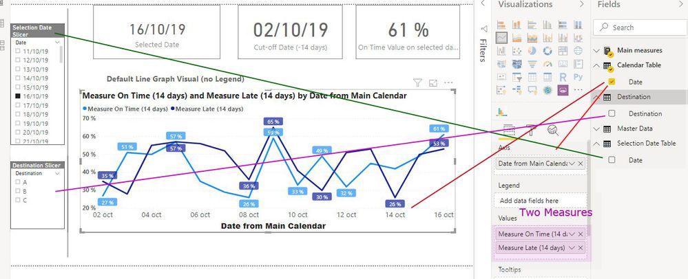
With this you can create the basic Line Graph Visual to show both these measures and the relevant slicers:
Important:
a) the "Selection Date Slicer" is from the Selection Date Table[Date] field .
b) the Destination Slicer is from the Destination[Destination] field. If you do not have this table in your model, you can use the MasterData[Destination] field instead.
Did I answer your question? Mark my post as a solution!
In doing so, you are also helping me. Thank you!
Proud to be a Super User!
Paul on Linkedin.
Helpful resources

Microsoft Fabric Learn Together
Covering the world! 9:00-10:30 AM Sydney, 4:00-5:30 PM CET (Paris/Berlin), 7:00-8:30 PM Mexico City

Power BI Monthly Update - April 2024
Check out the April 2024 Power BI update to learn about new features.

| User | Count |
|---|---|
| 110 | |
| 94 | |
| 82 | |
| 66 | |
| 58 |
| User | Count |
|---|---|
| 151 | |
| 121 | |
| 104 | |
| 87 | |
| 67 |

