- Power BI forums
- Updates
- News & Announcements
- Get Help with Power BI
- Desktop
- Service
- Report Server
- Power Query
- Mobile Apps
- Developer
- DAX Commands and Tips
- Custom Visuals Development Discussion
- Health and Life Sciences
- Power BI Spanish forums
- Translated Spanish Desktop
- Power Platform Integration - Better Together!
- Power Platform Integrations (Read-only)
- Power Platform and Dynamics 365 Integrations (Read-only)
- Training and Consulting
- Instructor Led Training
- Dashboard in a Day for Women, by Women
- Galleries
- Community Connections & How-To Videos
- COVID-19 Data Stories Gallery
- Themes Gallery
- Data Stories Gallery
- R Script Showcase
- Webinars and Video Gallery
- Quick Measures Gallery
- 2021 MSBizAppsSummit Gallery
- 2020 MSBizAppsSummit Gallery
- 2019 MSBizAppsSummit Gallery
- Events
- Ideas
- Custom Visuals Ideas
- Issues
- Issues
- Events
- Upcoming Events
- Community Blog
- Power BI Community Blog
- Custom Visuals Community Blog
- Community Support
- Community Accounts & Registration
- Using the Community
- Community Feedback
Register now to learn Fabric in free live sessions led by the best Microsoft experts. From Apr 16 to May 9, in English and Spanish.
- Power BI forums
- Forums
- Get Help with Power BI
- Desktop
- Re: How to create a line and clustered stacked col...
- Subscribe to RSS Feed
- Mark Topic as New
- Mark Topic as Read
- Float this Topic for Current User
- Bookmark
- Subscribe
- Printer Friendly Page
- Mark as New
- Bookmark
- Subscribe
- Mute
- Subscribe to RSS Feed
- Permalink
- Report Inappropriate Content
How to create a line and clustered stacked column chart?
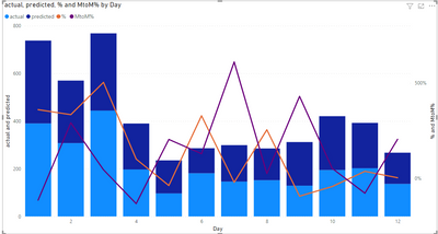
How to create a line and clustered stacked column chart? In this chart, I'd like to have two clustered stacked columns(actual vs. predicted sliced by three categories), and two line charts(% between actual vs. predicted; month to month % actual changes), the x axis will month.
The current "line ad clustered column chart" can work with either actual or predicted value, but not both. I'd like to have both in the charts.
Thanks!
Solved! Go to Solution.
- Mark as New
- Bookmark
- Subscribe
- Mute
- Subscribe to RSS Feed
- Permalink
- Report Inappropriate Content
Hi @Anonymous ,
Has refered believe this can be achieved using a disconnected table and a switch function the only question is about the line visual.
My option is the following:
- Create a table with the following data:
Type
| Actual |
| Predicted |
- Add the following measures:
Total Values = SWITCH(SELECTEDVALUE('Type'[Type]), "Actual", SUM(Test[actual]), SUM(Test[predicted]))

MTOM% = SUM(Test[MtoM%])

% value = SUM(Test[% ])
Now do your visualization in the following way:
- Line and stacked column chart
- Shared axis:
- Date - Day
- Type (table created previously)
- Column series - Category
- Column Values - Total Values measure
- Line Values - MTOM% and %value measures
- Turn off the concatenated labels on the x-axis
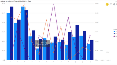
Final result below:
Has you can see the only question is about the data of the lines that are giving a plateau in days this is because of the fact that the predict is and actual are two categories and the values are duplicated.
If you do not like this appearance I can check how to get a value that is withing the slope for the next point of data.
Check PBIX file attach and tell me if this helps or not on your needs.
Regards
Miguel Félix
Did I answer your question? Mark my post as a solution!
Proud to be a Super User!
Check out my blog: Power BI em Português- Mark as New
- Bookmark
- Subscribe
- Mute
- Subscribe to RSS Feed
- Permalink
- Report Inappropriate Content
@Anonymous
Try following:
Page 1: Remove the category column from legend.
Page 2: Remove the category column from column series and add the add actual and prediction column to column value.
Since you need actual and prediction to be side by side you should use the Multi Axes Chart - xViz on page 1.
Paul Zheng _ Community Support Team
If this post helps, please Accept it as the solution to help the other members find it more quickly.
- Mark as New
- Bookmark
- Subscribe
- Mute
- Subscribe to RSS Feed
- Permalink
- Report Inappropriate Content
Hi @Anonymous ,
You can do this by using different measures and not the legend. In this case you have several variations atual and category versus month so you need to create a measure for each one this can also be achieved using a switch function depedending on how your data is presented.
Can you please share a mockup data or sample of your PBIX file and if possible a final result. You can use a onedrive, google drive, we transfer or similar link to upload your files.
If the information is sensitive please share it trough private message.
Regards
Miguel Félix
Did I answer your question? Mark my post as a solution!
Proud to be a Super User!
Check out my blog: Power BI em Português- Mark as New
- Bookmark
- Subscribe
- Mute
- Subscribe to RSS Feed
- Permalink
- Report Inappropriate Content
Hi Miguel,
Thanks for helping.
I made a dummy example and here is the link: https://drive.google.com/file/d/1qWO3BjMufg2UGyD2GM9HEzM5GKHeuJdR/view?usp=sharing
The problem with page 1 chart is: two line charts should be based on total instead of category;
the problem with page 2 chart is: one more predicted stacked column should be added side by side actual column.
Appreciate your time!
- Mark as New
- Bookmark
- Subscribe
- Mute
- Subscribe to RSS Feed
- Permalink
- Report Inappropriate Content
Hi @Anonymous ,
Has refered believe this can be achieved using a disconnected table and a switch function the only question is about the line visual.
My option is the following:
- Create a table with the following data:
Type
| Actual |
| Predicted |
- Add the following measures:
Total Values = SWITCH(SELECTEDVALUE('Type'[Type]), "Actual", SUM(Test[actual]), SUM(Test[predicted]))

MTOM% = SUM(Test[MtoM%])

% value = SUM(Test[% ])
Now do your visualization in the following way:
- Line and stacked column chart
- Shared axis:
- Date - Day
- Type (table created previously)
- Column series - Category
- Column Values - Total Values measure
- Line Values - MTOM% and %value measures
- Turn off the concatenated labels on the x-axis
Final result below:
Has you can see the only question is about the data of the lines that are giving a plateau in days this is because of the fact that the predict is and actual are two categories and the values are duplicated.
If you do not like this appearance I can check how to get a value that is withing the slope for the next point of data.
Check PBIX file attach and tell me if this helps or not on your needs.
Regards
Miguel Félix
Did I answer your question? Mark my post as a solution!
Proud to be a Super User!
Check out my blog: Power BI em Português- Mark as New
- Bookmark
- Subscribe
- Mute
- Subscribe to RSS Feed
- Permalink
- Report Inappropriate Content
Super! This works out so beautifully. Appreciate your time to help me out.
Helpful resources

Microsoft Fabric Learn Together
Covering the world! 9:00-10:30 AM Sydney, 4:00-5:30 PM CET (Paris/Berlin), 7:00-8:30 PM Mexico City

Power BI Monthly Update - April 2024
Check out the April 2024 Power BI update to learn about new features.

| User | Count |
|---|---|
| 106 | |
| 94 | |
| 76 | |
| 62 | |
| 50 |
| User | Count |
|---|---|
| 147 | |
| 106 | |
| 104 | |
| 87 | |
| 61 |


