- Power BI forums
- Updates
- News & Announcements
- Get Help with Power BI
- Desktop
- Service
- Report Server
- Power Query
- Mobile Apps
- Developer
- DAX Commands and Tips
- Custom Visuals Development Discussion
- Health and Life Sciences
- Power BI Spanish forums
- Translated Spanish Desktop
- Power Platform Integration - Better Together!
- Power Platform Integrations (Read-only)
- Power Platform and Dynamics 365 Integrations (Read-only)
- Training and Consulting
- Instructor Led Training
- Dashboard in a Day for Women, by Women
- Galleries
- Community Connections & How-To Videos
- COVID-19 Data Stories Gallery
- Themes Gallery
- Data Stories Gallery
- R Script Showcase
- Webinars and Video Gallery
- Quick Measures Gallery
- 2021 MSBizAppsSummit Gallery
- 2020 MSBizAppsSummit Gallery
- 2019 MSBizAppsSummit Gallery
- Events
- Ideas
- Custom Visuals Ideas
- Issues
- Issues
- Events
- Upcoming Events
- Community Blog
- Power BI Community Blog
- Custom Visuals Community Blog
- Community Support
- Community Accounts & Registration
- Using the Community
- Community Feedback
Register now to learn Fabric in free live sessions led by the best Microsoft experts. From Apr 16 to May 9, in English and Spanish.
- Power BI forums
- Forums
- Get Help with Power BI
- Desktop
- How to create a Many to One relationship to create...
- Subscribe to RSS Feed
- Mark Topic as New
- Mark Topic as Read
- Float this Topic for Current User
- Bookmark
- Subscribe
- Printer Friendly Page
- Mark as New
- Bookmark
- Subscribe
- Mute
- Subscribe to RSS Feed
- Permalink
- Report Inappropriate Content
How to create a Many to One relationship to create line graph
Hello,
I'm new to Power BI so i'm having trouble finding a solution to this. I have a table below:
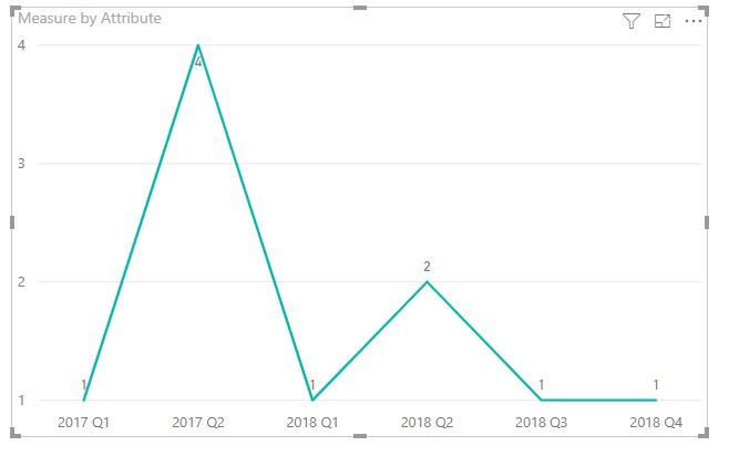
I want to build a report with Line Graph on Power BI with the Quarters on the X-Axis, and the count of dates on the Y-Axis. Example: (But the 2017 Q1 would have a count of 1 and 2017 Q2 would have a count of 4...and so on.
I tried Transposing the original table to get a column of Quarters so I can use the Line Graph but I can't seem to create a relationship between the two tables. (Since Supplier ID is not the unique column after transposing). I can't think of anyway to create a unique table that can connect the two either.
I also tried to create individual Measures to total up the count from each Quarter in the original table but I can't get it to look right using the Line Graph.
Any ideas to help me get from the original table to the Line Graph is appreciated.
Thanks.
Solved! Go to Solution.
- Mark as New
- Bookmark
- Subscribe
- Mute
- Subscribe to RSS Feed
- Permalink
- Report Inappropriate Content
HI, @Anonymous
You could try this way as below:
Step1:
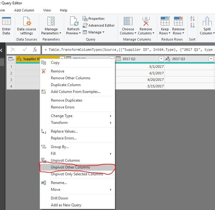
In Edit Queries, select Supplier ID column then right-click ->Unpivot Other Columns
or select 2017 Q1 - 2018 Q4 column Unpivot Columns
Step2:
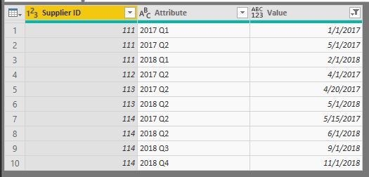
Filter blank value and click Close&Apply
Step3:
You could drag the field Attribute ino X-Axis and use this measure as Value
Measure = CALCULATE(COUNTA(Table1[Value]))
or add a year quarter fact table and create the relationship with data table by Attribute .
Result:
Best Regards,
Lin
If this post helps, then please consider Accept it as the solution to help the other members find it more quickly.
- Mark as New
- Bookmark
- Subscribe
- Mute
- Subscribe to RSS Feed
- Permalink
- Report Inappropriate Content
I tried this and after some editting I was able to get the Line Graph and Create the Relationship! Thank you very much all.
- Mark as New
- Bookmark
- Subscribe
- Mute
- Subscribe to RSS Feed
- Permalink
- Report Inappropriate Content
Hello Ninanguyen24,
In PowerQuery via Power BI Desktop, I duplicate the table I'd like to extract unique values from, then remove all cloumns not needed from the duplicated table, then remove duplicates from the cloumn I expect to turn into a unique vlaue table. I then reference through this table to create connection where needed.
I know it doesn't solve your whole problem, but it's an approach to isolate a table with unique vlaues.
PM
- Mark as New
- Bookmark
- Subscribe
- Mute
- Subscribe to RSS Feed
- Permalink
- Report Inappropriate Content
Hi,
Which 2 Tables are you talking about? There is only 1 Table there.
Regards,
Ashish Mathur
http://www.ashishmathur.com
https://www.linkedin.com/in/excelenthusiasts/
- Mark as New
- Bookmark
- Subscribe
- Mute
- Subscribe to RSS Feed
- Permalink
- Report Inappropriate Content
Sorry, I should have been more clear. To create a continuous Line Graph, I had to transpose the original table to the table below:
So when I create a visual in Power BI, the Quarters will be on the X-Axis and the count of dates for each quarter will be on the Y-Axis. When I do this, the Suppier ID is in individual columns, there's no way for me to create a relationship. Maybe i'm heading in the wrong direction.
I'm just trying to get a Line Graph with Quarters on the X-Axis and Count of Dates on the Y-Axis.
- Mark as New
- Bookmark
- Subscribe
- Mute
- Subscribe to RSS Feed
- Permalink
- Report Inappropriate Content
Hi,
Paste the Table here so that i can take it into an Excel file.
Regards,
Ashish Mathur
http://www.ashishmathur.com
https://www.linkedin.com/in/excelenthusiasts/
Helpful resources

Microsoft Fabric Learn Together
Covering the world! 9:00-10:30 AM Sydney, 4:00-5:30 PM CET (Paris/Berlin), 7:00-8:30 PM Mexico City

Power BI Monthly Update - April 2024
Check out the April 2024 Power BI update to learn about new features.

| User | Count |
|---|---|
| 114 | |
| 97 | |
| 86 | |
| 70 | |
| 62 |
| User | Count |
|---|---|
| 151 | |
| 120 | |
| 103 | |
| 87 | |
| 68 |


