- Power BI forums
- Updates
- News & Announcements
- Get Help with Power BI
- Desktop
- Service
- Report Server
- Power Query
- Mobile Apps
- Developer
- DAX Commands and Tips
- Custom Visuals Development Discussion
- Health and Life Sciences
- Power BI Spanish forums
- Translated Spanish Desktop
- Power Platform Integration - Better Together!
- Power Platform Integrations (Read-only)
- Power Platform and Dynamics 365 Integrations (Read-only)
- Training and Consulting
- Instructor Led Training
- Dashboard in a Day for Women, by Women
- Galleries
- Community Connections & How-To Videos
- COVID-19 Data Stories Gallery
- Themes Gallery
- Data Stories Gallery
- R Script Showcase
- Webinars and Video Gallery
- Quick Measures Gallery
- 2021 MSBizAppsSummit Gallery
- 2020 MSBizAppsSummit Gallery
- 2019 MSBizAppsSummit Gallery
- Events
- Ideas
- Custom Visuals Ideas
- Issues
- Issues
- Events
- Upcoming Events
- Community Blog
- Power BI Community Blog
- Custom Visuals Community Blog
- Community Support
- Community Accounts & Registration
- Using the Community
- Community Feedback
Register now to learn Fabric in free live sessions led by the best Microsoft experts. From Apr 16 to May 9, in English and Spanish.
- Power BI forums
- Forums
- Get Help with Power BI
- Desktop
- Re: How to count the amount of numbers in a scatte...
- Subscribe to RSS Feed
- Mark Topic as New
- Mark Topic as Read
- Float this Topic for Current User
- Bookmark
- Subscribe
- Printer Friendly Page
- Mark as New
- Bookmark
- Subscribe
- Mute
- Subscribe to RSS Feed
- Permalink
- Report Inappropriate Content
How to count the amount of numbers in a scatterchart (conditional formatting with colors)
Hi there!
I have a question which I can't seem to solve...
Someone from my team asked if it is possible to do a gradient color based on the amount of times a certain grade has been given.
I thought of doing a conditional formatting based on COUNT(grade), but it of course counts all the grades. So I basically would like to COUNT the amount a certain grade (1 till 10) was given and do a gradient on that.
I know that the average grade in this dataset is around 7, so I would expect that the line around 7 is colored more intensively/darker compared to grades around 2 and 9.
My measures are as follows:
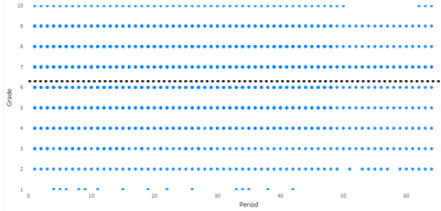
- Y Axis: Sum of Grade (1 till 10, could also be grades with 2 decimals, but I put an INT to round the grades)
- Details: RowID (Based on my fact table where all the grades per student, per period, per exam etc. are stored)
- X Axis: Sum of Range (1 till 64, which represent the year, period and exam number, since the school does not work with dates)
Hope someone could help me or lead me to the right direction! Thanks in advance 🙂
Solved! Go to Solution.
- Mark as New
- Bookmark
- Subscribe
- Mute
- Subscribe to RSS Feed
- Permalink
- Report Inappropriate Content
Try changing ALL(Grades) to ALLSELECTED(Grades) in the measure, and let me know if that doesn't fix it.
Regards,
Pat
Did I answer your question? Mark my post as a solution! Kudos are also appreciated!
To learn more about Power BI, follow me on Twitter or subscribe on YouTube.
@mahoneypa HoosierBI on YouTube
- Mark as New
- Bookmark
- Subscribe
- Mute
- Subscribe to RSS Feed
- Permalink
- Report Inappropriate Content
@mahoneypat I think that the problem might be that it counts all the grades instead of how many times a 1 has been given, and a 2 and a 3 ...... and a 9 etc.
I think that would solve the problem maybe?
- Mark as New
- Bookmark
- Subscribe
- Mute
- Subscribe to RSS Feed
- Permalink
- Report Inappropriate Content
Try changing ALL(Grades) to ALLSELECTED(Grades) in the measure, and let me know if that doesn't fix it.
Regards,
Pat
Did I answer your question? Mark my post as a solution! Kudos are also appreciated!
To learn more about Power BI, follow me on Twitter or subscribe on YouTube.
@mahoneypa HoosierBI on YouTube
- Mark as New
- Bookmark
- Subscribe
- Mute
- Subscribe to RSS Feed
- Permalink
- Report Inappropriate Content
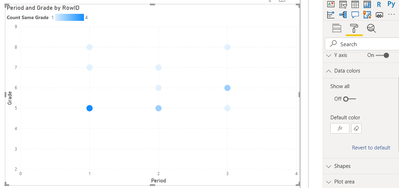
You could also consider using the size field to differentiate the count at each grade/exame (it would be easier). I made a small dataset like yours and used this measure to count the number or RowIDs that had the same grade for the same exam. You could adapt it for your table/column names.
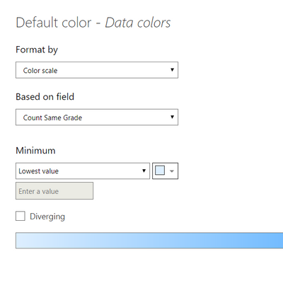
Use the measure in the format options for your visual. Hit fx next to Data Color
If this works for you, please mark it as the solution. Kudos are appreciated too. Please let me know if not.
Regards,
Pat
Did I answer your question? Mark my post as a solution! Kudos are also appreciated!
To learn more about Power BI, follow me on Twitter or subscribe on YouTube.
@mahoneypa HoosierBI on YouTube
- Mark as New
- Bookmark
- Subscribe
- Mute
- Subscribe to RSS Feed
- Permalink
- Report Inappropriate Content
@mahoneypat Thanks a lot! This measure works indeed. You saved me a lot of headache and time 🙂 thank you for that!
@mahoneypat update:
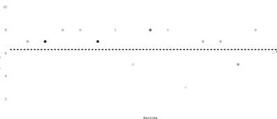
I was checking how it works If I select 1 student for 1 course during 1 period so in theory all the dots should be the same color, because that certain grade has only been given once.
But when I did that, it still showed a gradient view of the grades (see picture below):
Would that measure be thus incorrect? Hope you can still help me out @mahoneypat
- Mark as New
- Bookmark
- Subscribe
- Mute
- Subscribe to RSS Feed
- Permalink
- Report Inappropriate Content
@Gjakova Not really enough information to go on, please first check if your issue is a common issue listed here: https://community.powerbi.com/t5/Community-Blog/Before-You-Post-Read-This/ba-p/1116882
Also, please see this post regarding How to Get Your Question Answered Quickly: https://community.powerbi.com/t5/Community-Blog/How-to-Get-Your-Question-Answered-Quickly/ba-p/38490
The most important parts are:
1. Sample data as text, use the table tool in the editing bar
2. Expected output from sample data
3. Explanation in words of how to get from 1. to 2.
@ me in replies or I'll lose your thread!!!
Instead of a Kudo, please vote for this idea
Become an expert!: Enterprise DNA
External Tools: MSHGQM
YouTube Channel!: Microsoft Hates Greg
Latest book!: The Definitive Guide to Power Query (M)
DAX is easy, CALCULATE makes DAX hard...
Helpful resources

Microsoft Fabric Learn Together
Covering the world! 9:00-10:30 AM Sydney, 4:00-5:30 PM CET (Paris/Berlin), 7:00-8:30 PM Mexico City

Power BI Monthly Update - April 2024
Check out the April 2024 Power BI update to learn about new features.

| User | Count |
|---|---|
| 106 | |
| 94 | |
| 77 | |
| 65 | |
| 53 |
| User | Count |
|---|---|
| 145 | |
| 105 | |
| 104 | |
| 90 | |
| 63 |


