- Power BI forums
- Updates
- News & Announcements
- Get Help with Power BI
- Desktop
- Service
- Report Server
- Power Query
- Mobile Apps
- Developer
- DAX Commands and Tips
- Custom Visuals Development Discussion
- Health and Life Sciences
- Power BI Spanish forums
- Translated Spanish Desktop
- Power Platform Integration - Better Together!
- Power Platform Integrations (Read-only)
- Power Platform and Dynamics 365 Integrations (Read-only)
- Training and Consulting
- Instructor Led Training
- Dashboard in a Day for Women, by Women
- Galleries
- Community Connections & How-To Videos
- COVID-19 Data Stories Gallery
- Themes Gallery
- Data Stories Gallery
- R Script Showcase
- Webinars and Video Gallery
- Quick Measures Gallery
- 2021 MSBizAppsSummit Gallery
- 2020 MSBizAppsSummit Gallery
- 2019 MSBizAppsSummit Gallery
- Events
- Ideas
- Custom Visuals Ideas
- Issues
- Issues
- Events
- Upcoming Events
- Community Blog
- Power BI Community Blog
- Custom Visuals Community Blog
- Community Support
- Community Accounts & Registration
- Using the Community
- Community Feedback
Register now to learn Fabric in free live sessions led by the best Microsoft experts. From Apr 16 to May 9, in English and Spanish.
- Power BI forums
- Forums
- Get Help with Power BI
- Desktop
- How to correct the axis into 0 to 100% in line gra...
- Subscribe to RSS Feed
- Mark Topic as New
- Mark Topic as Read
- Float this Topic for Current User
- Bookmark
- Subscribe
- Printer Friendly Page
- Mark as New
- Bookmark
- Subscribe
- Mute
- Subscribe to RSS Feed
- Permalink
- Report Inappropriate Content
How to correct the axis into 0 to 100% in line graph?
Hi
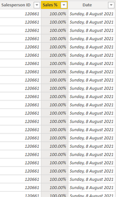
I am having below data,
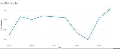
I would like to create a graph of date vs sales percentage in general and having Sales ID as a filter. However, when I tried to make that line graph, I am not able to get the axis correct. My sales (%) column value in % and I would like to want the axis in 0 to 100%. Below is the output I am getting. I tried don't summrize option as well.
I am looking for a below ouput. I generated this in excel.
Can anyone guide me how to do this?
My sampe pbix here https://we.tl/t-dB9JDyAg6B
Solved! Go to Solution.
- Mark as New
- Bookmark
- Subscribe
- Mute
- Subscribe to RSS Feed
- Permalink
- Report Inappropriate Content
@bourne2000 it looks like you have lots of % values for the same date for a single sales person. In order to plot these all on a line graph, you must convert them into a single value. How do you want to do this? MAX? AVERAGE? Don't summarize is not working because there is more than one value per date.
Also, just confirming you have a date table? https://excelwithallison.blogspot.com/2020/04/dimdate-what-why-and-how.html This will help ensure you have a 'continuous' axis - which is something you can set in the format options for the visual in Power BI.
Please @mention me in your reply if you want a response.
Copying DAX from this post? Click here for a hack to quickly replace it with your own table names
Has this post solved your problem? Please Accept as Solution so that others can find it quickly and to let the community know your problem has been solved.
If you found this post helpful, please give Kudos C
I work as a Microsoft trainer and consultant, specialising in Power BI and Power Query.
www.excelwithallison.com
- Mark as New
- Bookmark
- Subscribe
- Mute
- Subscribe to RSS Feed
- Permalink
- Report Inappropriate Content
Hi, @bourne2000
Glad to see your problem solved. Is my answer above helpful?😀
Could you consider sharing your solution? It will help the others in the community find the solution easily if they face the same problem with you. Thank you.
Best Regards,
Community Support Team _ Zeon Zheng
- Mark as New
- Bookmark
- Subscribe
- Mute
- Subscribe to RSS Feed
- Permalink
- Report Inappropriate Content
Hi, @bourne2000
Since you have duplicate rows in your data, you can change the summary method to Average.
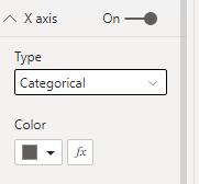
And change the type of X-axis to "categorical"
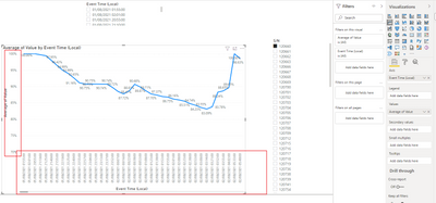
Then you can get the result
Please refer to the attachment below for details. Hope this helps.
Best Regards,
Community Support Team _ Zeon Zheng
If this post helps, then please consider Accept it as the solution to help the other members find it more quickly.
- Mark as New
- Bookmark
- Subscribe
- Mute
- Subscribe to RSS Feed
- Permalink
- Report Inappropriate Content
@bourne2000 it looks like you have lots of % values for the same date for a single sales person. In order to plot these all on a line graph, you must convert them into a single value. How do you want to do this? MAX? AVERAGE? Don't summarize is not working because there is more than one value per date.
Also, just confirming you have a date table? https://excelwithallison.blogspot.com/2020/04/dimdate-what-why-and-how.html This will help ensure you have a 'continuous' axis - which is something you can set in the format options for the visual in Power BI.
Please @mention me in your reply if you want a response.
Copying DAX from this post? Click here for a hack to quickly replace it with your own table names
Has this post solved your problem? Please Accept as Solution so that others can find it quickly and to let the community know your problem has been solved.
If you found this post helpful, please give Kudos C
I work as a Microsoft trainer and consultant, specialising in Power BI and Power Query.
www.excelwithallison.com
Helpful resources

Microsoft Fabric Learn Together
Covering the world! 9:00-10:30 AM Sydney, 4:00-5:30 PM CET (Paris/Berlin), 7:00-8:30 PM Mexico City

Power BI Monthly Update - April 2024
Check out the April 2024 Power BI update to learn about new features.

| User | Count |
|---|---|
| 113 | |
| 97 | |
| 79 | |
| 73 | |
| 56 |
| User | Count |
|---|---|
| 145 | |
| 105 | |
| 104 | |
| 90 | |
| 63 |


