- Power BI forums
- Updates
- News & Announcements
- Get Help with Power BI
- Desktop
- Service
- Report Server
- Power Query
- Mobile Apps
- Developer
- DAX Commands and Tips
- Custom Visuals Development Discussion
- Health and Life Sciences
- Power BI Spanish forums
- Translated Spanish Desktop
- Power Platform Integration - Better Together!
- Power Platform Integrations (Read-only)
- Power Platform and Dynamics 365 Integrations (Read-only)
- Training and Consulting
- Instructor Led Training
- Dashboard in a Day for Women, by Women
- Galleries
- Community Connections & How-To Videos
- COVID-19 Data Stories Gallery
- Themes Gallery
- Data Stories Gallery
- R Script Showcase
- Webinars and Video Gallery
- Quick Measures Gallery
- 2021 MSBizAppsSummit Gallery
- 2020 MSBizAppsSummit Gallery
- 2019 MSBizAppsSummit Gallery
- Events
- Ideas
- Custom Visuals Ideas
- Issues
- Issues
- Events
- Upcoming Events
- Community Blog
- Power BI Community Blog
- Custom Visuals Community Blog
- Community Support
- Community Accounts & Registration
- Using the Community
- Community Feedback
Register now to learn Fabric in free live sessions led by the best Microsoft experts. From Apr 16 to May 9, in English and Spanish.
- Power BI forums
- Forums
- Get Help with Power BI
- Desktop
- Re: How to color code different GPS coordinates by...
- Subscribe to RSS Feed
- Mark Topic as New
- Mark Topic as Read
- Float this Topic for Current User
- Bookmark
- Subscribe
- Printer Friendly Page
- Mark as New
- Bookmark
- Subscribe
- Mute
- Subscribe to RSS Feed
- Permalink
- Report Inappropriate Content
How to color code different GPS coordinates by category?
Hi everyone,
I am having trouble color coding two GPS coordinate by category.
For example, I want the meter GPS coordinate to be red and transformer GPS location to be green on the map. However, when I tried to do that red and green appeared in the same location.
Anyone know what is the best solution to this problem?
I have attached screen shots below for references.
Much appreciated.
Solved! Go to Solution.
- Mark as New
- Bookmark
- Subscribe
- Mute
- Subscribe to RSS Feed
- Permalink
- Report Inappropriate Content
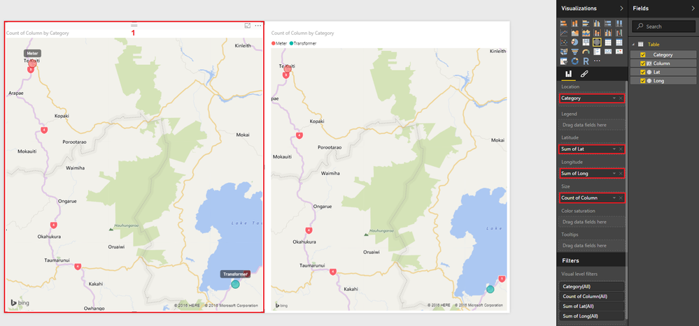
@Anonymous You have 2 options => for both you'll need a Column (e.g. Column = 1 and drag it to the size)
For option 1 you'll have to change the aggregation of Lat and Long to Sum or Avg it won't matter
Pictures are pretty self explanatory - let me know if you have any questions.
Hope this helps!
and here's option 2
- Mark as New
- Bookmark
- Subscribe
- Mute
- Subscribe to RSS Feed
- Permalink
- Report Inappropriate Content
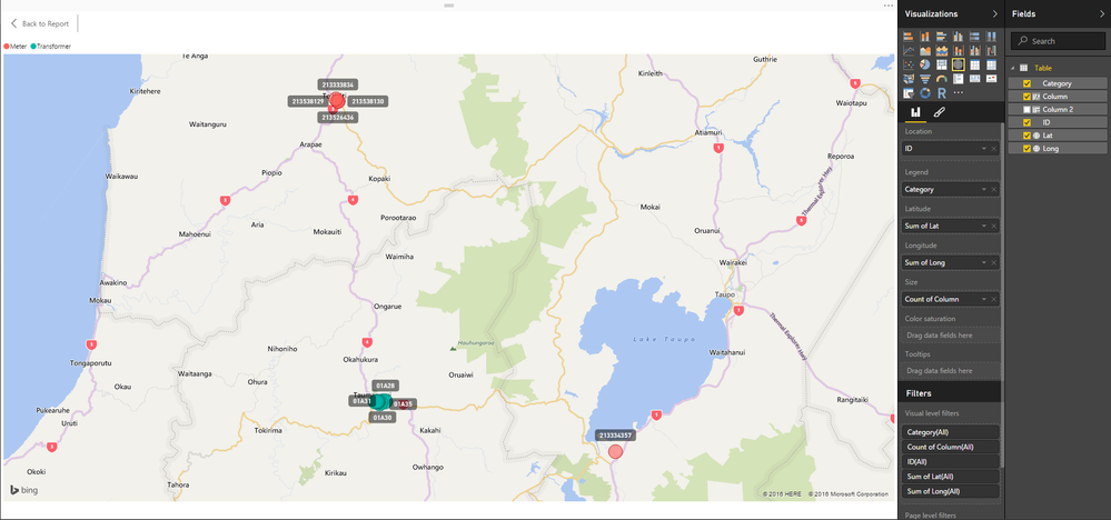
I have no way of knowing what your data looks like?
I answered based on the limited data you originally posted - however PBI can in fact plot ALL your data!
And here it is Zoomed
- Mark as New
- Bookmark
- Subscribe
- Mute
- Subscribe to RSS Feed
- Permalink
- Report Inappropriate Content
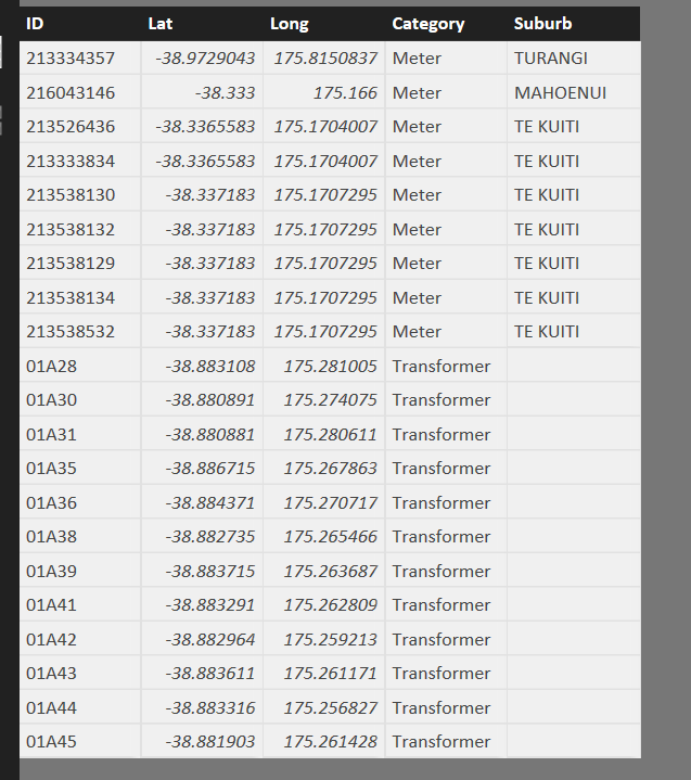
Hi @Anonymous, After seeing the data and trying it on my PBID, I would suggest to please use the option 2 from Sean's Answer.
Count of ID in the Size tab should do all the trick for you.
- Mark as New
- Bookmark
- Subscribe
- Mute
- Subscribe to RSS Feed
- Permalink
- Report Inappropriate Content
Actually I did some further testing it seems to not work for multiple coordinates. The coordinate must be aggregated such as using sum or avg which really doesnt make sense.
Therefore, it did not work when I had mutiple coordinates for transformers and meters.
- Mark as New
- Bookmark
- Subscribe
- Mute
- Subscribe to RSS Feed
- Permalink
- Report Inappropriate Content
I have no way of knowing what your data looks like?
I answered based on the limited data you originally posted - however PBI can in fact plot ALL your data!
And here it is Zoomed
- Mark as New
- Bookmark
- Subscribe
- Mute
- Subscribe to RSS Feed
- Permalink
- Report Inappropriate Content
Hi @Anonymous, I agree with Ankit. Please check the data, both transformer and meter coordinates should be pointing to the same location in this case.
- Mark as New
- Bookmark
- Subscribe
- Mute
- Subscribe to RSS Feed
- Permalink
- Report Inappropriate Content
As you can see the meter and transformer is at a different location.
- Mark as New
- Bookmark
- Subscribe
- Mute
- Subscribe to RSS Feed
- Permalink
- Report Inappropriate Content
@Anonymous You have 2 options => for both you'll need a Column (e.g. Column = 1 and drag it to the size)
For option 1 you'll have to change the aggregation of Lat and Long to Sum or Avg it won't matter
Pictures are pretty self explanatory - let me know if you have any questions.
Hope this helps!
and here's option 2
- Mark as New
- Bookmark
- Subscribe
- Mute
- Subscribe to RSS Feed
- Permalink
- Report Inappropriate Content
Oh wow thanks for that. I didnt know it worked as soon as I put put category under the location property.
- Mark as New
- Bookmark
- Subscribe
- Mute
- Subscribe to RSS Feed
- Permalink
- Report Inappropriate Content
@Anonymous
Yes I prerfer option 1 because when you turn on category labels - they are better (more meaningful) than the lat, long coordinates
You can get creative there and even concatenate some fields to display more with the Labels...
- Mark as New
- Bookmark
- Subscribe
- Mute
- Subscribe to RSS Feed
- Permalink
- Report Inappropriate Content
@Anonymous Isn't that is what is happening currently ? You're getting green for one category and red for another. They both appear in same location because you would have same location in your data for both the categories.
- Mark as New
- Bookmark
- Subscribe
- Mute
- Subscribe to RSS Feed
- Permalink
- Report Inappropriate Content
One the map it is not showing correctedly.
The map should show one GPS coordinate to be red and the other green but instead its showing 50% green and 50% red on the same GPS coordinate.
Hope you can see what is the problem is now.
Helpful resources

Microsoft Fabric Learn Together
Covering the world! 9:00-10:30 AM Sydney, 4:00-5:30 PM CET (Paris/Berlin), 7:00-8:30 PM Mexico City

Power BI Monthly Update - April 2024
Check out the April 2024 Power BI update to learn about new features.

| User | Count |
|---|---|
| 111 | |
| 100 | |
| 80 | |
| 64 | |
| 58 |
| User | Count |
|---|---|
| 146 | |
| 110 | |
| 93 | |
| 84 | |
| 67 |


