- Power BI forums
- Updates
- News & Announcements
- Get Help with Power BI
- Desktop
- Service
- Report Server
- Power Query
- Mobile Apps
- Developer
- DAX Commands and Tips
- Custom Visuals Development Discussion
- Health and Life Sciences
- Power BI Spanish forums
- Translated Spanish Desktop
- Power Platform Integration - Better Together!
- Power Platform Integrations (Read-only)
- Power Platform and Dynamics 365 Integrations (Read-only)
- Training and Consulting
- Instructor Led Training
- Dashboard in a Day for Women, by Women
- Galleries
- Community Connections & How-To Videos
- COVID-19 Data Stories Gallery
- Themes Gallery
- Data Stories Gallery
- R Script Showcase
- Webinars and Video Gallery
- Quick Measures Gallery
- 2021 MSBizAppsSummit Gallery
- 2020 MSBizAppsSummit Gallery
- 2019 MSBizAppsSummit Gallery
- Events
- Ideas
- Custom Visuals Ideas
- Issues
- Issues
- Events
- Upcoming Events
- Community Blog
- Power BI Community Blog
- Custom Visuals Community Blog
- Community Support
- Community Accounts & Registration
- Using the Community
- Community Feedback
Register now to learn Fabric in free live sessions led by the best Microsoft experts. From Apr 16 to May 9, in English and Spanish.
- Power BI forums
- Forums
- Get Help with Power BI
- Desktop
- How to change the column color?
- Subscribe to RSS Feed
- Mark Topic as New
- Mark Topic as Read
- Float this Topic for Current User
- Bookmark
- Subscribe
- Printer Friendly Page
- Mark as New
- Bookmark
- Subscribe
- Mute
- Subscribe to RSS Feed
- Permalink
- Report Inappropriate Content
How to change the column color?
In PowerBI I try to change the column color to red when monthly sales amount doesn't reach the target and green when the target is reached. In the format of old version has data colors where you can default color, but in the new version do not have it. How can I change the colors?
Solved! Go to Solution.
- Mark as New
- Bookmark
- Subscribe
- Mute
- Subscribe to RSS Feed
- Permalink
- Report Inappropriate Content
Right click on the value in the Visualizations slide. Then select conditional formatting. You can adjust it based on background color or font color, etc. Once the pop up shows, select the correct formatting: gradient, field value, or rules. I find that rules is the most adjustable, you just have to fiddle with it sometimes.
- Mark as New
- Bookmark
- Subscribe
- Mute
- Subscribe to RSS Feed
- Permalink
- Report Inappropriate Content
Hi @Anonymous ,
Is your problem solved?? If so, Would you mind accept the helpful replies as solutions? Then we are able to close the thread. More people who have the same requirement will find the solution quickly and benefit here. Thank you.
Best Regards,
Community Support Team _ kalyj
- Mark as New
- Bookmark
- Subscribe
- Mute
- Subscribe to RSS Feed
- Permalink
- Report Inappropriate Content
Hi @Anonymous ,
Has your problem solved by @Anonymous 's suggestion, if you need the formula to set the colour, here's my solution.
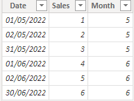
Sales table:
Target table:
The two tables related with the month column. Create a measure:
Color =
IF ( SUM ( 'Sales'[Sales] ) >= MAX ( 'Target'[Target] ), "Green", "Red" )
In the visualization settings pane>Cell element, turn on the backgroud color and click the fx button.
Select field value and select the color measure in the dialog.
Get the result.
I attach my sample below for reference.
Best Regards,
Community Support Team _ kalyj
If this post helps, then please consider Accept it as the solution to help the other members find it more quickly.
- Mark as New
- Bookmark
- Subscribe
- Mute
- Subscribe to RSS Feed
- Permalink
- Report Inappropriate Content
Right click on the value in the Visualizations slide. Then select conditional formatting. You can adjust it based on background color or font color, etc. Once the pop up shows, select the correct formatting: gradient, field value, or rules. I find that rules is the most adjustable, you just have to fiddle with it sometimes.
Helpful resources

Microsoft Fabric Learn Together
Covering the world! 9:00-10:30 AM Sydney, 4:00-5:30 PM CET (Paris/Berlin), 7:00-8:30 PM Mexico City

Power BI Monthly Update - April 2024
Check out the April 2024 Power BI update to learn about new features.

| User | Count |
|---|---|
| 111 | |
| 100 | |
| 80 | |
| 64 | |
| 58 |
| User | Count |
|---|---|
| 146 | |
| 110 | |
| 93 | |
| 84 | |
| 67 |


