- Power BI forums
- Updates
- News & Announcements
- Get Help with Power BI
- Desktop
- Service
- Report Server
- Power Query
- Mobile Apps
- Developer
- DAX Commands and Tips
- Custom Visuals Development Discussion
- Health and Life Sciences
- Power BI Spanish forums
- Translated Spanish Desktop
- Power Platform Integration - Better Together!
- Power Platform Integrations (Read-only)
- Power Platform and Dynamics 365 Integrations (Read-only)
- Training and Consulting
- Instructor Led Training
- Dashboard in a Day for Women, by Women
- Galleries
- Community Connections & How-To Videos
- COVID-19 Data Stories Gallery
- Themes Gallery
- Data Stories Gallery
- R Script Showcase
- Webinars and Video Gallery
- Quick Measures Gallery
- 2021 MSBizAppsSummit Gallery
- 2020 MSBizAppsSummit Gallery
- 2019 MSBizAppsSummit Gallery
- Events
- Ideas
- Custom Visuals Ideas
- Issues
- Issues
- Events
- Upcoming Events
- Community Blog
- Power BI Community Blog
- Custom Visuals Community Blog
- Community Support
- Community Accounts & Registration
- Using the Community
- Community Feedback
Register now to learn Fabric in free live sessions led by the best Microsoft experts. From Apr 16 to May 9, in English and Spanish.
- Power BI forums
- Forums
- Get Help with Power BI
- Desktop
- How to calculate gross profit
- Subscribe to RSS Feed
- Mark Topic as New
- Mark Topic as Read
- Float this Topic for Current User
- Bookmark
- Subscribe
- Printer Friendly Page
- Mark as New
- Bookmark
- Subscribe
- Mute
- Subscribe to RSS Feed
- Permalink
- Report Inappropriate Content
How to calculate gross profit
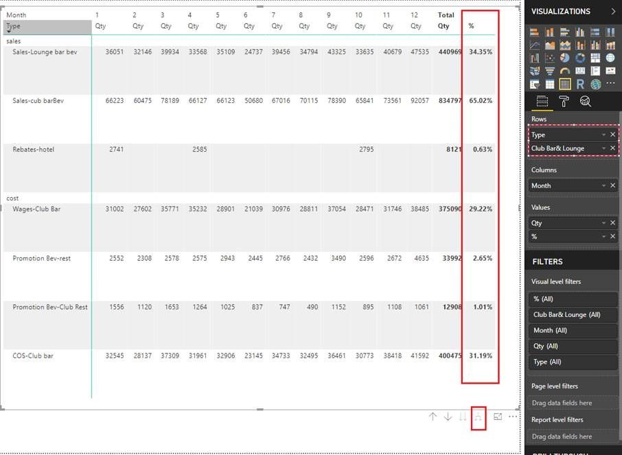
I am trying to create a report like this but I am facing issue with calculating % values. Here in Club Bar and Lounge the top three rows are "sales" and the bottom 6 rows are "cost". So, the percent next to "Sales" when add up comes to 100% and percent next to "costs" is using a formula as cost value/total sale(i.e sum of three sales shown in that location)
Can someone please help me to find a DAX formula for this type of issues?
Thank you.
- Mark as New
- Bookmark
- Subscribe
- Mute
- Subscribe to RSS Feed
- Permalink
- Report Inappropriate Content
Hi,@ Mananj91
You need to add a column to distinguish between “sales” and “cost”,
and add a measure like this;
% = SUM(Table6[Qty])/CALCULATE(SUMX(FILTER(ALL(Table6),Table6[Type]="sales"),Table6[Qty]))
Then field into the matrix, and this is the result:
Best Regards,
Lin
If this post helps, then please consider Accept it as the solution to help the other members find it more quickly.
- Mark as New
- Bookmark
- Subscribe
- Mute
- Subscribe to RSS Feed
- Permalink
- Report Inappropriate Content
I have a quick question How are you only using total "%" in the report and it is not displayed in the rows. Please guide me through the steps.
Thank you in advance
- Mark as New
- Bookmark
- Subscribe
- Mute
- Subscribe to RSS Feed
- Permalink
- Report Inappropriate Content
What does your data look like. If is fairly clean columns with dates, categories and values.
You dont need much more than a date table and a few measures. Spend a little time learning the basics of the tool Its a different paradigm than Standard Excel
You need a decent date table to link your transaction details to
Could probalby do this one date table and single measures
COGS = SUM(table[Cost])
REVENUE = SUM(table[Sales])
Just a warning is its its HARD to mix these in the same visual in teh table format your trying to use. This is NOT the paradigmn of PowerBI. Typcially this is done by showing TOTAL for period in a table with the categories (club bar, etc..) on the rows and your measures REVENUE, COGS, Margin etc on the colum with visuals showing the trends of each indivually (say stacked bars) of Revenue by Category.
If yuu NEED to produce somethign like this I recommend you do it in power query in Excel where you can build multiple pivot tables (same as matrix visuals) convert to formulas and build dashboard like this.
Helpful resources

Microsoft Fabric Learn Together
Covering the world! 9:00-10:30 AM Sydney, 4:00-5:30 PM CET (Paris/Berlin), 7:00-8:30 PM Mexico City

Power BI Monthly Update - April 2024
Check out the April 2024 Power BI update to learn about new features.

| User | Count |
|---|---|
| 109 | |
| 99 | |
| 77 | |
| 66 | |
| 54 |
| User | Count |
|---|---|
| 144 | |
| 104 | |
| 102 | |
| 87 | |
| 64 |


