- Power BI forums
- Updates
- News & Announcements
- Get Help with Power BI
- Desktop
- Service
- Report Server
- Power Query
- Mobile Apps
- Developer
- DAX Commands and Tips
- Custom Visuals Development Discussion
- Health and Life Sciences
- Power BI Spanish forums
- Translated Spanish Desktop
- Power Platform Integration - Better Together!
- Power Platform Integrations (Read-only)
- Power Platform and Dynamics 365 Integrations (Read-only)
- Training and Consulting
- Instructor Led Training
- Dashboard in a Day for Women, by Women
- Galleries
- Community Connections & How-To Videos
- COVID-19 Data Stories Gallery
- Themes Gallery
- Data Stories Gallery
- R Script Showcase
- Webinars and Video Gallery
- Quick Measures Gallery
- 2021 MSBizAppsSummit Gallery
- 2020 MSBizAppsSummit Gallery
- 2019 MSBizAppsSummit Gallery
- Events
- Ideas
- Custom Visuals Ideas
- Issues
- Issues
- Events
- Upcoming Events
- Community Blog
- Power BI Community Blog
- Custom Visuals Community Blog
- Community Support
- Community Accounts & Registration
- Using the Community
- Community Feedback
Register now to learn Fabric in free live sessions led by the best Microsoft experts. From Apr 16 to May 9, in English and Spanish.
- Power BI forums
- Forums
- Get Help with Power BI
- Desktop
- How to best visualize sales results
- Subscribe to RSS Feed
- Mark Topic as New
- Mark Topic as Read
- Float this Topic for Current User
- Bookmark
- Subscribe
- Printer Friendly Page
- Mark as New
- Bookmark
- Subscribe
- Mute
- Subscribe to RSS Feed
- Permalink
- Report Inappropriate Content
How to best visualize sales results
To all the visualization experts out there,
I am struggling with the following and wanted to hear what you think.
I am asked to visualize sales results. You would think it should be the easiest thing ever, but apparently it is not.
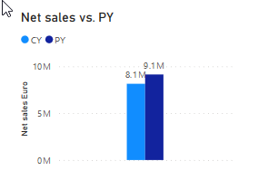
I started with this. Simple and easy. This visual is also ideal to use the drill functions. But then users started to complain. They were saying they couldn't understand the variance in % (and absolute value). And then it got already tricky. I could revert back to a simple table showing all information like Net Sales CY, var. % and var. Abs. But I would say that's a step backward. Adding another chart showing only the var. % didn't really work, because a) the sort order was different and b) I cannot anylonger drill, or I have to always drill on two charts. I considered having tooltips, but that was not sufficient.
So to all experts out there. How have you solved this challenge? Any tips?
Looking forward hearing back soon.
Best,
P
- Mark as New
- Bookmark
- Subscribe
- Mute
- Subscribe to RSS Feed
- Permalink
- Report Inappropriate Content
Hi @PhMeDie
The different visuals in the desktop are also different. So you must first clarify your purpose. What kind of effect you want to achieve, what kind of calculation result you get, what kind of comparison result you need to provide to customers, etc., are all you need to confirm. After clarifying your purpose, choose the corresponding visual.
It would be best if you already have actual cases or data that you can provide. Please also attach the results you want.
The following link is an introduction to visual in desktop, you can take a look .
https://docs.microsoft.com/en-us/power-bi/consumer/end-user-visual-type
Best Regards
Community Support Team _ Ailsa Tao
If this post helps, then please consider Accept it as the solution to help the other members find it more quickly.
- Mark as New
- Bookmark
- Subscribe
- Mute
- Subscribe to RSS Feed
- Permalink
- Report Inappropriate Content
Firstly you need to ask yourself what is the objective of what you are trying to tell the users? having more than one visual definitely makes sense as combining absolute values and %'s is confusing
There is nothing wrong with a table either but you could can compliment it with other visuals.
What is your actual requirement? You are trying to show the variance of this year vs last year and what do you need to drill down on? I am not quite understanding why you arent able to have 2 charts. If you can share some dummy data I could mock something up for you.
https://www.sqlbi.com/ref/power-bi-visuals-reference/ is also useful on deciding what visuals to use
If I took the time to answer your question and I came up with a solution, please mark my post as a solution and /or give kudos freely for the effort 🙂 Thank you!
Proud to be a Super User!
Helpful resources

Microsoft Fabric Learn Together
Covering the world! 9:00-10:30 AM Sydney, 4:00-5:30 PM CET (Paris/Berlin), 7:00-8:30 PM Mexico City

Power BI Monthly Update - April 2024
Check out the April 2024 Power BI update to learn about new features.

| User | Count |
|---|---|
| 114 | |
| 100 | |
| 81 | |
| 70 | |
| 62 |
| User | Count |
|---|---|
| 148 | |
| 116 | |
| 104 | |
| 90 | |
| 65 |

