- Power BI forums
- Updates
- News & Announcements
- Get Help with Power BI
- Desktop
- Service
- Report Server
- Power Query
- Mobile Apps
- Developer
- DAX Commands and Tips
- Custom Visuals Development Discussion
- Health and Life Sciences
- Power BI Spanish forums
- Translated Spanish Desktop
- Power Platform Integration - Better Together!
- Power Platform Integrations (Read-only)
- Power Platform and Dynamics 365 Integrations (Read-only)
- Training and Consulting
- Instructor Led Training
- Dashboard in a Day for Women, by Women
- Galleries
- Community Connections & How-To Videos
- COVID-19 Data Stories Gallery
- Themes Gallery
- Data Stories Gallery
- R Script Showcase
- Webinars and Video Gallery
- Quick Measures Gallery
- 2021 MSBizAppsSummit Gallery
- 2020 MSBizAppsSummit Gallery
- 2019 MSBizAppsSummit Gallery
- Events
- Ideas
- Custom Visuals Ideas
- Issues
- Issues
- Events
- Upcoming Events
- Community Blog
- Power BI Community Blog
- Custom Visuals Community Blog
- Community Support
- Community Accounts & Registration
- Using the Community
- Community Feedback
Register now to learn Fabric in free live sessions led by the best Microsoft experts. From Apr 16 to May 9, in English and Spanish.
- Power BI forums
- Forums
- Get Help with Power BI
- Desktop
- Re: How i can solved this? (issue with graph label...
- Subscribe to RSS Feed
- Mark Topic as New
- Mark Topic as Read
- Float this Topic for Current User
- Bookmark
- Subscribe
- Printer Friendly Page
- Mark as New
- Bookmark
- Subscribe
- Mute
- Subscribe to RSS Feed
- Permalink
- Report Inappropriate Content
How i can solved this? (issue with graph label)/ Como soluciono esto? (problema con etiquetas de gra
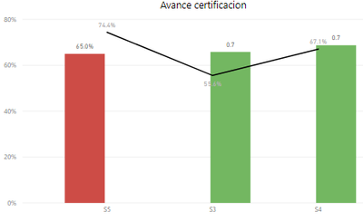
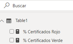
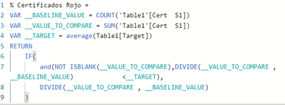
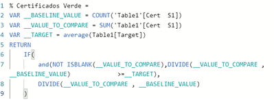
as you can see the bars in green are showing the label as a decimal, i need to show as a percentage, any idea?. BTW i am using calculated fields for that.
Como pueden ver las barras verdes estan mostrando las etiquetas en decimal, necesito que se muestren como porcentaje, algun idea?, por cierto, estoy utilizando campos calculados
Solved! Go to Solution.
- Mark as New
- Bookmark
- Subscribe
- Mute
- Subscribe to RSS Feed
- Permalink
- Report Inappropriate Content
Hi @JoseDavidM
Click on the all measures which are coming as number and click "%" on the home ribbon.
Hope it resolves your issue? Did I answer your question? Mark my post as a solution! Appreciate your Kudos, Press the thumbs up button!! Linkedin Profile |
- Mark as New
- Bookmark
- Subscribe
- Mute
- Subscribe to RSS Feed
- Permalink
- Report Inappropriate Content
Hi @JoseDavidM
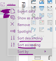
On right top hover over you will get three dots click that ans check as in below image.
Hope it resolves your issue? Did I answer your question? Mark my post as a solution! Appreciate your Kudos, Press the thumbs up button!! Linkedin Profile |
- Mark as New
- Bookmark
- Subscribe
- Mute
- Subscribe to RSS Feed
- Permalink
- Report Inappropriate Content
Hi @JoseDavidM
Click on the all measures which are coming as number and click "%" on the home ribbon.
Hope it resolves your issue? Did I answer your question? Mark my post as a solution! Appreciate your Kudos, Press the thumbs up button!! Linkedin Profile |
- Mark as New
- Bookmark
- Subscribe
- Mute
- Subscribe to RSS Feed
- Permalink
- Report Inappropriate Content
thank you, another question, as you can see in the image the X Axis is not in order (should be S3, S4, S5) how i can change the order of the columns in the graph?
- Mark as New
- Bookmark
- Subscribe
- Mute
- Subscribe to RSS Feed
- Permalink
- Report Inappropriate Content
Hi @JoseDavidM
On right top hover over you will get three dots click that ans check as in below image.
Hope it resolves your issue? Did I answer your question? Mark my post as a solution! Appreciate your Kudos, Press the thumbs up button!! Linkedin Profile |
Helpful resources

Microsoft Fabric Learn Together
Covering the world! 9:00-10:30 AM Sydney, 4:00-5:30 PM CET (Paris/Berlin), 7:00-8:30 PM Mexico City

Power BI Monthly Update - April 2024
Check out the April 2024 Power BI update to learn about new features.

| User | Count |
|---|---|
| 118 | |
| 107 | |
| 70 | |
| 70 | |
| 43 |
| User | Count |
|---|---|
| 148 | |
| 106 | |
| 104 | |
| 89 | |
| 65 |
