- Power BI forums
- Updates
- News & Announcements
- Get Help with Power BI
- Desktop
- Service
- Report Server
- Power Query
- Mobile Apps
- Developer
- DAX Commands and Tips
- Custom Visuals Development Discussion
- Health and Life Sciences
- Power BI Spanish forums
- Translated Spanish Desktop
- Power Platform Integration - Better Together!
- Power Platform Integrations (Read-only)
- Power Platform and Dynamics 365 Integrations (Read-only)
- Training and Consulting
- Instructor Led Training
- Dashboard in a Day for Women, by Women
- Galleries
- Community Connections & How-To Videos
- COVID-19 Data Stories Gallery
- Themes Gallery
- Data Stories Gallery
- R Script Showcase
- Webinars and Video Gallery
- Quick Measures Gallery
- 2021 MSBizAppsSummit Gallery
- 2020 MSBizAppsSummit Gallery
- 2019 MSBizAppsSummit Gallery
- Events
- Ideas
- Custom Visuals Ideas
- Issues
- Issues
- Events
- Upcoming Events
- Community Blog
- Power BI Community Blog
- Custom Visuals Community Blog
- Community Support
- Community Accounts & Registration
- Using the Community
- Community Feedback
Register now to learn Fabric in free live sessions led by the best Microsoft experts. From Apr 16 to May 9, in English and Spanish.
- Power BI forums
- Forums
- Get Help with Power BI
- Desktop
- How do I stop "count of" for a line chart with two...
- Subscribe to RSS Feed
- Mark Topic as New
- Mark Topic as Read
- Float this Topic for Current User
- Bookmark
- Subscribe
- Printer Friendly Page
- Mark as New
- Bookmark
- Subscribe
- Mute
- Subscribe to RSS Feed
- Permalink
- Report Inappropriate Content
How do I stop "count of" for a line chart with two values Year and Spend?
I am working with a data set that I have input manually and I cannot seem to get the Year and Spend columns to show on a standard bar chart. Power BI keeps formatting it as a "Count of" spend when I put anything into the values box of the visual. All I am looking for is a way to show the amount spent per MAT code in this timeline.
This is a screenshot of the data set https://i.imgur.com/iUFh39O.png I have tried changing the data type and other diagrams and so on.
My two questions are: is there a fix? and if not why and when does Power BI change the data to "count of" data?
- Mark as New
- Bookmark
- Subscribe
- Mute
- Subscribe to RSS Feed
- Permalink
- Report Inappropriate Content
Hi @Anonymous ,
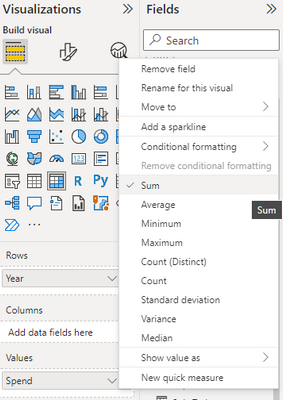
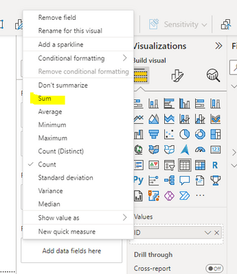
Right click on the value field and you could choose to show the value as sum, average, count or other options.
However the value will always be aggregated if the value one x-axis is the same.
So if your table is like:
2022 1
2022 2
2022 3
The result would be like:
2022 6
It is by design.
Best Regards,
Jay
If this post helps, then please consider Accept it as the solution to help the other members find it.
- Mark as New
- Bookmark
- Subscribe
- Mute
- Subscribe to RSS Feed
- Permalink
- Report Inappropriate Content
Why is that by default? I mean right now I have a data set that shold clearly be represented as a line but it will only show the data as a "count of" type of table. For example here is only of my rows and I cannot get this data to plot as a line across time. It keeps gettign categorized as a "count of"
- Mark as New
- Bookmark
- Subscribe
- Mute
- Subscribe to RSS Feed
- Permalink
- Report Inappropriate Content
Hello!
If I'm understanding you correctly, you want something like the following?
| Year | Spend |
| 2022 | SUM(Spend) |
This sounds like Power BI is defaulting the "Spend" field's aggregation to counting, which you can change to summation on either the visual itself or on the report as a whole (which will require re-adding that field into your visual, as each visual tracks the aggregation of its values independently).
To change it on the visual itself, right-click on the "Spend" field in the "Values" section to see what your aggregation options are, and select "Sum" like this:
If you want to change the default aggregation method for the "Spend" field across the whole report, you can do so by clicking the field in your "Fields" pane and adjusting that behavior to "Sum" in the ribbon that gets navigated to automatically:
I hope this helps!!
- Mark as New
- Bookmark
- Subscribe
- Mute
- Subscribe to RSS Feed
- Permalink
- Report Inappropriate Content
Hi @Anonymous ,
If you right click on the field that is showing count in your visual, you will be presented with some options as below.
Helpful resources

Microsoft Fabric Learn Together
Covering the world! 9:00-10:30 AM Sydney, 4:00-5:30 PM CET (Paris/Berlin), 7:00-8:30 PM Mexico City

Power BI Monthly Update - April 2024
Check out the April 2024 Power BI update to learn about new features.

| User | Count |
|---|---|
| 118 | |
| 107 | |
| 70 | |
| 70 | |
| 43 |
| User | Count |
|---|---|
| 148 | |
| 104 | |
| 104 | |
| 89 | |
| 66 |


