- Power BI forums
- Updates
- News & Announcements
- Get Help with Power BI
- Desktop
- Service
- Report Server
- Power Query
- Mobile Apps
- Developer
- DAX Commands and Tips
- Custom Visuals Development Discussion
- Health and Life Sciences
- Power BI Spanish forums
- Translated Spanish Desktop
- Power Platform Integration - Better Together!
- Power Platform Integrations (Read-only)
- Power Platform and Dynamics 365 Integrations (Read-only)
- Training and Consulting
- Instructor Led Training
- Dashboard in a Day for Women, by Women
- Galleries
- Community Connections & How-To Videos
- COVID-19 Data Stories Gallery
- Themes Gallery
- Data Stories Gallery
- R Script Showcase
- Webinars and Video Gallery
- Quick Measures Gallery
- 2021 MSBizAppsSummit Gallery
- 2020 MSBizAppsSummit Gallery
- 2019 MSBizAppsSummit Gallery
- Events
- Ideas
- Custom Visuals Ideas
- Issues
- Issues
- Events
- Upcoming Events
- Community Blog
- Power BI Community Blog
- Custom Visuals Community Blog
- Community Support
- Community Accounts & Registration
- Using the Community
- Community Feedback
Register now to learn Fabric in free live sessions led by the best Microsoft experts. From Apr 16 to May 9, in English and Spanish.
- Power BI forums
- Forums
- Get Help with Power BI
- Desktop
- Re: How do I ensure theme data colors are applied ...
- Subscribe to RSS Feed
- Mark Topic as New
- Mark Topic as Read
- Float this Topic for Current User
- Bookmark
- Subscribe
- Printer Friendly Page
- Mark as New
- Bookmark
- Subscribe
- Mute
- Subscribe to RSS Feed
- Permalink
- Report Inappropriate Content
How do I ensure theme data colors are applied in a specific order?
Hi all
I have a stacked bar chart, which displays outstanding debt by customer, with a legend for the ageing bucket. The Ageing Bucket categories are:
1 - 0 Days
2 - 30 Days
3 - 60 Days
4 - 90 Days
5 - 120 Days
6 - 150 Days
7 - 180 Days
8 - 180+ Days
I want the bar chart legend data colors to go from dark green to dark red, left to right. My JSON has the following in the DataColors section:
"dataColors": ["#48740f", "#6c9a25", "#89bf36", "#aacc66", "#f2b52c" ,"#D79A12", "#bb7711", "#a11919"],
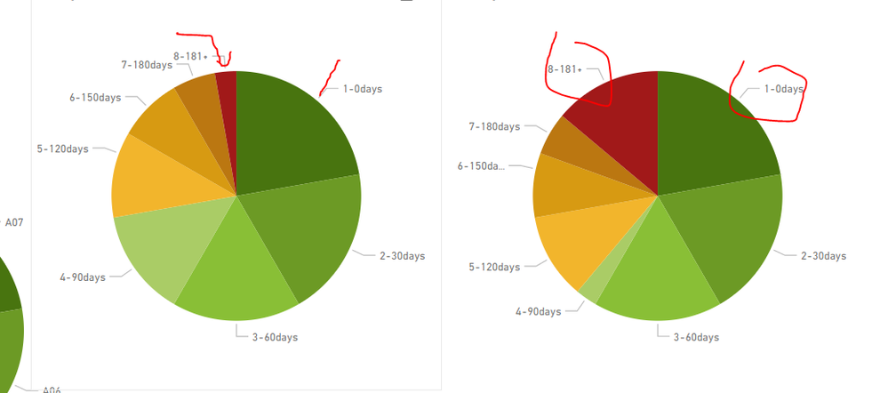
When I import this theme, the data colors are not being applied in left to right order, ie category '1 - 0 Days' to have a colour of dark green, to category '8 - 180+ Days' to have a data colour of dark red:
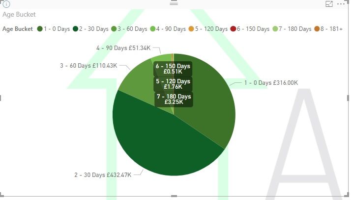

Does anyone know how I can ensure the data colours are applied as default in correct order? I have a few other visuals, so I need to make sure they are always applied in the order of the JSON file:
1 - 0 Days #48740f
2 - 30 Days #6c9a25
3 - 60 Days #89bf36
4 - 90 Days #aacc66
5 - 120 Days #f2b52c
6 - 150 Days #D79A12
7 - 180 Days #bb7711
8 - 180+ Days #a11919
Many thanks for all help
Solved! Go to Solution.
- Mark as New
- Bookmark
- Subscribe
- Mute
- Subscribe to RSS Feed
- Permalink
- Report Inappropriate Content
hi,@ansa_naz
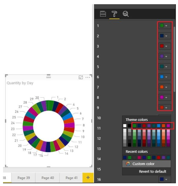
After my research, Power BI uses the color along the horizontal of the color-picker, which could avoid two similar colors getting together.
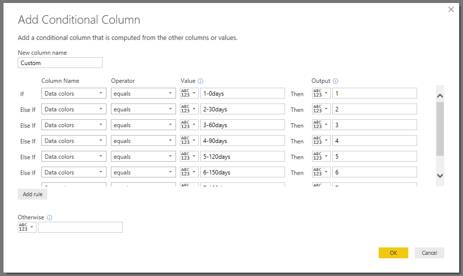
So you can do these follow my steps
Step1:
Add a conditional column in PowerQuery
Step2:
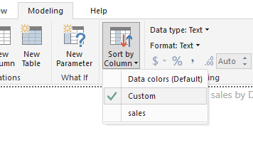
Use group By function
select field Data color and Click Modeling ->Sort by column->Custom
Result:
By the way, due to the cache, It will not be effective immediately, you need to save and reopen the pbix.
Best Regards!
Lin
If this post helps, then please consider Accept it as the solution to help the other members find it more quickly.
- Mark as New
- Bookmark
- Subscribe
- Mute
- Subscribe to RSS Feed
- Permalink
- Report Inappropriate Content
Thanks! This worked except I had to make a change. In modelling, I selected 'Age Buckets' field and sorted by 'Custom' column
Helpful resources

Microsoft Fabric Learn Together
Covering the world! 9:00-10:30 AM Sydney, 4:00-5:30 PM CET (Paris/Berlin), 7:00-8:30 PM Mexico City

Power BI Monthly Update - April 2024
Check out the April 2024 Power BI update to learn about new features.

| User | Count |
|---|---|
| 112 | |
| 100 | |
| 76 | |
| 74 | |
| 49 |
| User | Count |
|---|---|
| 145 | |
| 108 | |
| 107 | |
| 89 | |
| 61 |
