- Power BI forums
- Updates
- News & Announcements
- Get Help with Power BI
- Desktop
- Service
- Report Server
- Power Query
- Mobile Apps
- Developer
- DAX Commands and Tips
- Custom Visuals Development Discussion
- Health and Life Sciences
- Power BI Spanish forums
- Translated Spanish Desktop
- Power Platform Integration - Better Together!
- Power Platform Integrations (Read-only)
- Power Platform and Dynamics 365 Integrations (Read-only)
- Training and Consulting
- Instructor Led Training
- Dashboard in a Day for Women, by Women
- Galleries
- Community Connections & How-To Videos
- COVID-19 Data Stories Gallery
- Themes Gallery
- Data Stories Gallery
- R Script Showcase
- Webinars and Video Gallery
- Quick Measures Gallery
- 2021 MSBizAppsSummit Gallery
- 2020 MSBizAppsSummit Gallery
- 2019 MSBizAppsSummit Gallery
- Events
- Ideas
- Custom Visuals Ideas
- Issues
- Issues
- Events
- Upcoming Events
- Community Blog
- Power BI Community Blog
- Custom Visuals Community Blog
- Community Support
- Community Accounts & Registration
- Using the Community
- Community Feedback
Register now to learn Fabric in free live sessions led by the best Microsoft experts. From Apr 16 to May 9, in English and Spanish.
- Power BI forums
- Forums
- Get Help with Power BI
- Desktop
- Re: How do I create this bubble chart?
- Subscribe to RSS Feed
- Mark Topic as New
- Mark Topic as Read
- Float this Topic for Current User
- Bookmark
- Subscribe
- Printer Friendly Page
- Mark as New
- Bookmark
- Subscribe
- Mute
- Subscribe to RSS Feed
- Permalink
- Report Inappropriate Content
How do I create this bubble chart?
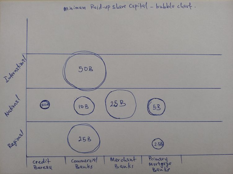
I need help creating a bubble chart with the data set attach below.
I also attached a mock-up drawing of how I want the bubble chart to look like. I have tried different permutations but couldn't get a hang of it. I hope somebody can help me here. I am new to Power BI but I am very interested in learning it. I recognise the best way to learn it is to try it on data that I am interested in.
| Financial Institution Type | Category | Minimum paid-up share capital |
| COMMERCIAL BANKs | REGIONAL | 10,000,000,000 |
| COMMERCIAL BANKs | NATIONAL | 25,000,000,000 |
| COMMERCIAL BANKs | INTERNATIONAL | 50,000,000,000 |
| MERCHANT BANKs | NATIONAL | 15,000,000,000 |
| PRIMARY MORTGAGE BANKs | NATIONAL | 5,000,000,000 |
| PRIMARY MORTGAGE BANKs | REGIONAL | 2,500,000,000 |
| CREDIT BUREAUs | NATIONAL | 500,000,000 |
Thanks in advance
Solved! Go to Solution.
- Mark as New
- Bookmark
- Subscribe
- Mute
- Subscribe to RSS Feed
- Permalink
- Report Inappropriate Content
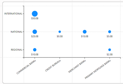
Here is an example of what you can do with Charticulator. I just put your two categorical fiels on X and Y and assigned the dollar amt to the bubble size. I also added a measure to give the text formatted in Billions. Here is a video to help you get started with it.
(9) Season 1 - Charticulator - YouTube
Pat
Did I answer your question? Mark my post as a solution! Kudos are also appreciated!
To learn more about Power BI, follow me on Twitter or subscribe on YouTube.
@mahoneypa HoosierBI on YouTube
- Mark as New
- Bookmark
- Subscribe
- Mute
- Subscribe to RSS Feed
- Permalink
- Report Inappropriate Content
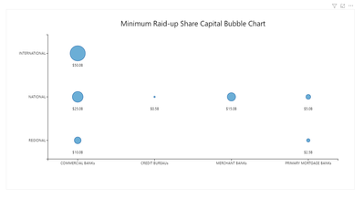
@Ajax I have created a custom visual for this problem. You can use this. Hope this solves your problem.
Snapshot of the visual:
Link for custom visual : https://drive.google.com/file/d/1-ex0TQWBNDyG8xG6hwi4RKo-tYAxRgos/view?usp=sharing
** If you liked my solution, please give it a thumbs up. And if I did answer your question, please mark this post as a solution, so that it comes in top of the search and help others. Thank you ! Good Luck 👍 |
- Mark as New
- Bookmark
- Subscribe
- Mute
- Subscribe to RSS Feed
- Permalink
- Report Inappropriate Content
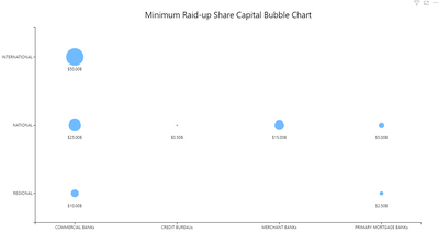
@Ajax Changing the number format is not available from Power BI desktop. I have increased the decimal places to two as shown in the snapshot below. Whatever, the decimal places you will used during the visual creation will be fixed. I have uploaded the updated visual on the drive and shared the link below. Hope this helps.
For the PDF export, please try and extend the chart to the size of the page. Hope it will resolve the export issue.
Link: https://drive.google.com/file/d/11AH3IOCZotDWCfmh2BHc4EPm1jnXM_w9/view?usp=sharing
** If you liked my solution, please give it a thumbs up. And if I did answer your question, please mark this post as a solution, so that it comes in top of the search and help others. Thank you ! Good Luck 👍 |
- Mark as New
- Bookmark
- Subscribe
- Mute
- Subscribe to RSS Feed
- Permalink
- Report Inappropriate Content
Here is an example of what you can do with Charticulator. I just put your two categorical fiels on X and Y and assigned the dollar amt to the bubble size. I also added a measure to give the text formatted in Billions. Here is a video to help you get started with it.
(9) Season 1 - Charticulator - YouTube
Pat
Did I answer your question? Mark my post as a solution! Kudos are also appreciated!
To learn more about Power BI, follow me on Twitter or subscribe on YouTube.
@mahoneypa HoosierBI on YouTube
- Mark as New
- Bookmark
- Subscribe
- Mute
- Subscribe to RSS Feed
- Permalink
- Report Inappropriate Content
Also, which particular chart type did you use?
- Mark as New
- Bookmark
- Subscribe
- Mute
- Subscribe to RSS Feed
- Permalink
- Report Inappropriate Content
Sorry for the delay. Attached is the pbix file so you can see the visual, along with the measures I created.
Pat
Did I answer your question? Mark my post as a solution! Kudos are also appreciated!
To learn more about Power BI, follow me on Twitter or subscribe on YouTube.
@mahoneypa HoosierBI on YouTube
- Mark as New
- Bookmark
- Subscribe
- Mute
- Subscribe to RSS Feed
- Permalink
- Report Inappropriate Content
This is very close to what I want. So, can you send a screenshot of when you put each component of the data on the power BI analysis page? Also, I obverved that the "video" you gave a link to was actually a channel that contains many videos. please which of the video do i watch or could you just past the link to that video directly. Thanks
- Mark as New
- Bookmark
- Subscribe
- Mute
- Subscribe to RSS Feed
- Permalink
- Report Inappropriate Content
You can probably do this using Charticulator
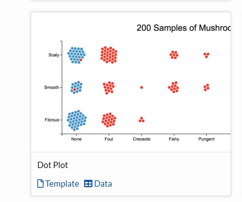
There is a sample in Templates which looks looks similar:
You can even download the template and sample data used to help you build it
Did I answer your question? Mark my post as a solution!
In doing so, you are also helping me. Thank you!
Proud to be a Super User!
Paul on Linkedin.
- Mark as New
- Bookmark
- Subscribe
- Mute
- Subscribe to RSS Feed
- Permalink
- Report Inappropriate Content
Hello@Ajax ,
As far as I understand, you are asking Y-axis to have multiple categories and though you are a new member, but your question is of advanced nature.
Power BI does not have this feature yet! (I might be wrong).
Please refer here:
https://community.powerbi.com/t5/Desktop/Multiple-Y-Axes/m-p/916383
You can vote here:
https://ideas.powerbi.com/ideas/idea/?ideaid=6efe0269-d94d-46b7-a6fb-c4c4df2be604
- Mark as New
- Bookmark
- Subscribe
- Mute
- Subscribe to RSS Feed
- Permalink
- Report Inappropriate Content
@Ajax Please find below the snapshot of the fields which I used to create this chart.
** If you liked my solution, please give it a thumbs up. And if I did answer your question, please mark this post as a solution, so that it comes in top of the search and help others. Thank you ! Good Luck 👍 |
- Mark as New
- Bookmark
- Subscribe
- Mute
- Subscribe to RSS Feed
- Permalink
- Report Inappropriate Content
@Ajax Check the below snapshot, if this works for you.
** If you liked my solution, please give it a thumbs up. And if I did answer your question, please mark this post as a solution, so that it comes in top of the search and help others. Thank you ! Good Luck 👍 |
- Mark as New
- Bookmark
- Subscribe
- Mute
- Subscribe to RSS Feed
- Permalink
- Report Inappropriate Content
Also, it has to have 3 sections of "Regional", "National" and "International". It is very important.
- Mark as New
- Bookmark
- Subscribe
- Mute
- Subscribe to RSS Feed
- Permalink
- Report Inappropriate Content
Yes, this is what I want. But how do I do it on power BI? Actually, the data I have is huge. I only took a small sample for this question. I want to be able to create a power BI template for this type of visualization for this type of data going forward. So, can you send a screenshot of when you put each component of the data on the power BI analysis page?
- Mark as New
- Bookmark
- Subscribe
- Mute
- Subscribe to RSS Feed
- Permalink
- Report Inappropriate Content
@Ajax I have created a custom visual for this problem. You can use this. Hope this solves your problem.
Snapshot of the visual:
Link for custom visual : https://drive.google.com/file/d/1-ex0TQWBNDyG8xG6hwi4RKo-tYAxRgos/view?usp=sharing
** If you liked my solution, please give it a thumbs up. And if I did answer your question, please mark this post as a solution, so that it comes in top of the search and help others. Thank you ! Good Luck 👍 |
- Mark as New
- Bookmark
- Subscribe
- Mute
- Subscribe to RSS Feed
- Permalink
- Report Inappropriate Content
Thanks is this visual link still available? can' see it
- Mark as New
- Bookmark
- Subscribe
- Mute
- Subscribe to RSS Feed
- Permalink
- Report Inappropriate Content
I have been able to download it and import it. very brilliant of you. Thank you. Just a little thing, How do i increase the decimal places of the numbers to like 3 decimal places? E.g. I have 35,000,000 which is simply showing as 0.0B instead of 0.035B. Also, how do i expand the size of the whole chart so that it fits well on an A4 paper? When i exported the chart to pdf, it only convered like 30% of the paper. I will like the chart to cover like 80% of the sheet. Please show me where to effect the necessary changes. Thank you
- Mark as New
- Bookmark
- Subscribe
- Mute
- Subscribe to RSS Feed
- Permalink
- Report Inappropriate Content
@Ajax Changing the number format is not available from Power BI desktop. I have increased the decimal places to two as shown in the snapshot below. Whatever, the decimal places you will used during the visual creation will be fixed. I have uploaded the updated visual on the drive and shared the link below. Hope this helps.
For the PDF export, please try and extend the chart to the size of the page. Hope it will resolve the export issue.
Link: https://drive.google.com/file/d/11AH3IOCZotDWCfmh2BHc4EPm1jnXM_w9/view?usp=sharing
** If you liked my solution, please give it a thumbs up. And if I did answer your question, please mark this post as a solution, so that it comes in top of the search and help others. Thank you ! Good Luck 👍 |
- Mark as New
- Bookmark
- Subscribe
- Mute
- Subscribe to RSS Feed
- Permalink
- Report Inappropriate Content
@Ajax Have you tride the updated visual?
** If you liked my solution, please give it a thumbs up. And if I did answer your question, please mark this post as a solution, so that it comes in top of the search and help others. Thank you ! Good Luck 👍 |
- Mark as New
- Bookmark
- Subscribe
- Mute
- Subscribe to RSS Feed
- Permalink
- Report Inappropriate Content
I can't download the file. could you please mail it to me at dipoajax@gmail.com. Thanks.
- Mark as New
- Bookmark
- Subscribe
- Mute
- Subscribe to RSS Feed
- Permalink
- Report Inappropriate Content
Helpful resources

Microsoft Fabric Learn Together
Covering the world! 9:00-10:30 AM Sydney, 4:00-5:30 PM CET (Paris/Berlin), 7:00-8:30 PM Mexico City

Power BI Monthly Update - April 2024
Check out the April 2024 Power BI update to learn about new features.

| User | Count |
|---|---|
| 113 | |
| 100 | |
| 78 | |
| 76 | |
| 52 |
| User | Count |
|---|---|
| 144 | |
| 109 | |
| 108 | |
| 88 | |
| 61 |
